Yesterday afternoon I was walking through the galleries on the second floor of my building (Grohmann Museum on the Milwaukee School of Engineering campus), when I saw this cozy little nook in a way I hadn’t before. So I took a few pictures.
It’s hard trying to explain the hidden “image” inherent in something you’ve noticed that has suddenly suggested itself in the moment as a potential photograph to “capture.” Here is the photo from yesterday that was my favorite. It feels the most “calm” and “balanced,” “clean” and “open,” which is what I felt when I saw that corner in a new way.
That same old, familiar corner I’ve seen thousands of times before, lol
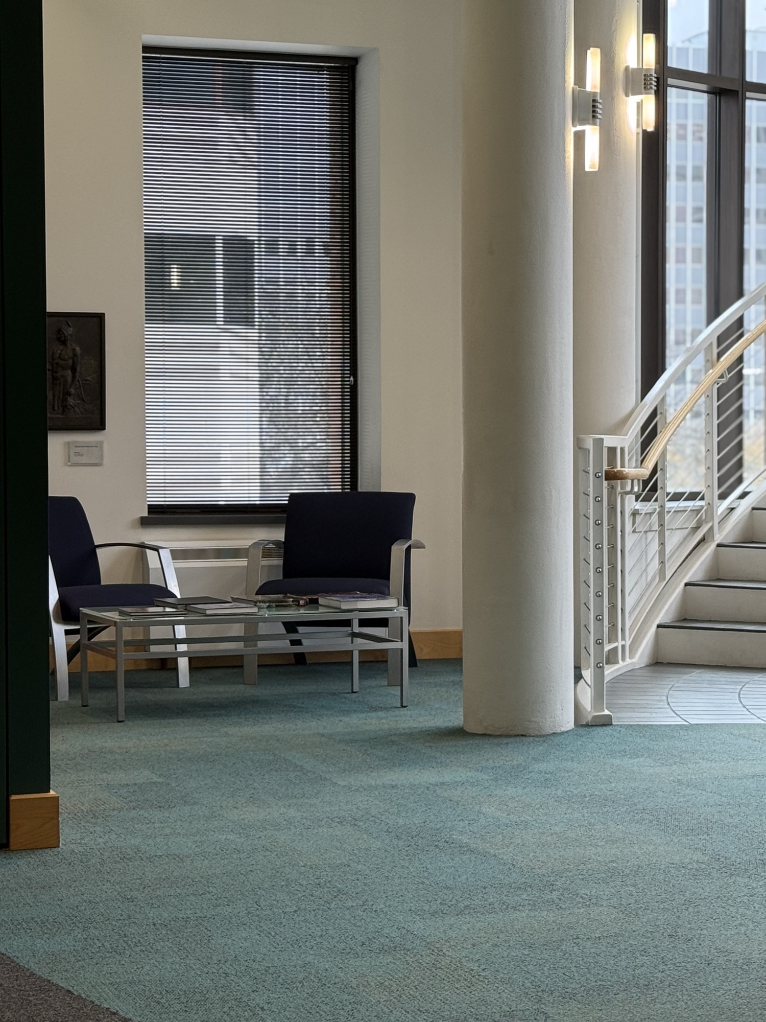
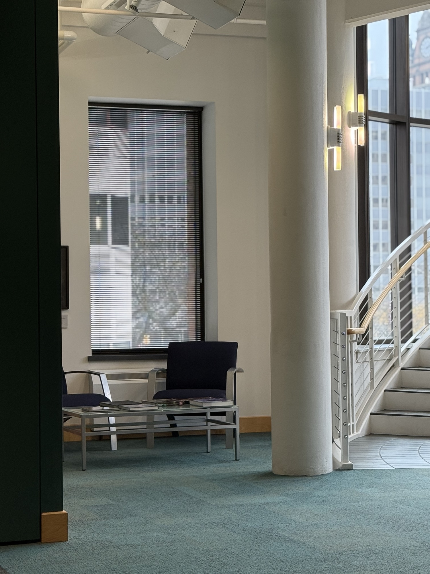 “THE ONE” – calm, open, balanced, clean, elegantly composed (at least to my eye). It has very litte floor. It also includes the most ceiling (see the ductwork above) of any photo I took. In the end, I needed more space above the chairs than below in order to capture and convey that open, clean, airy feeling that I sensed when I took note of those chairs yesterday.
It took eight photos till I saw something I was happy with. Here are some of the others. Why didn’t they do the job? In looking at the rejects later, I found it was almost as hard to pinpoint why I don’t like some photos as it was to pinpoint why I do like “THE ONE.” Here are a few of them, with captions to say what I did and didn’t like. (Today’s post is strictly an FYI, thought-process, behind-the-scenes kind of discussion, in case you also like photography and enjoy analyzing why a photo does or doesn’t “work.”)
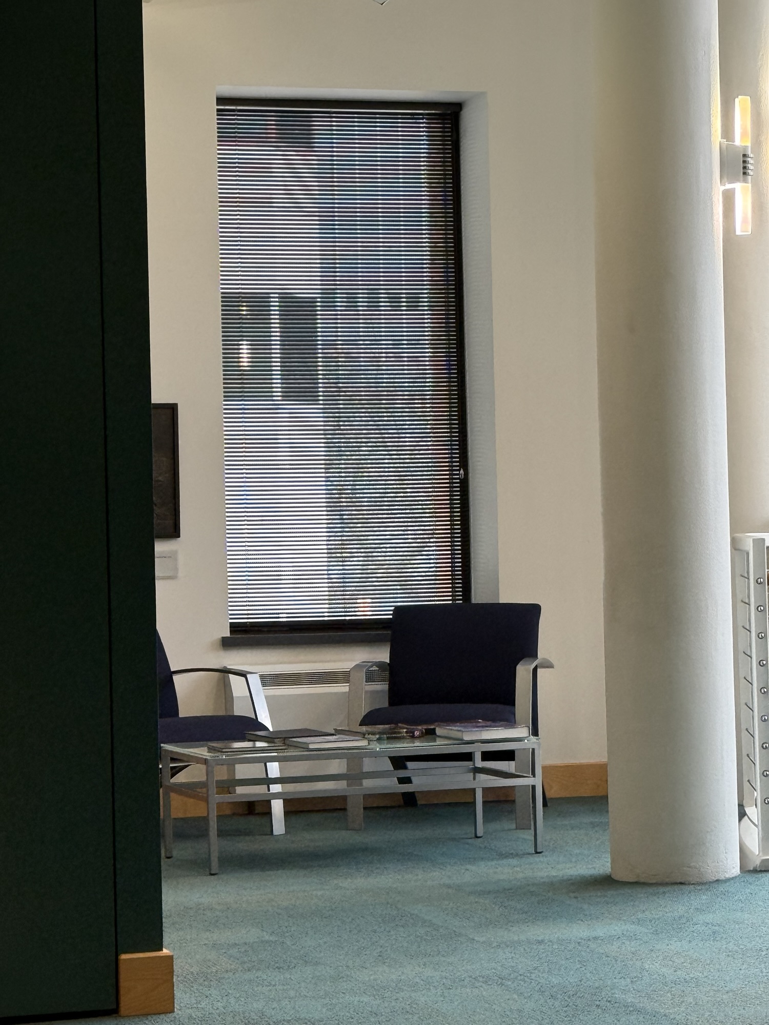
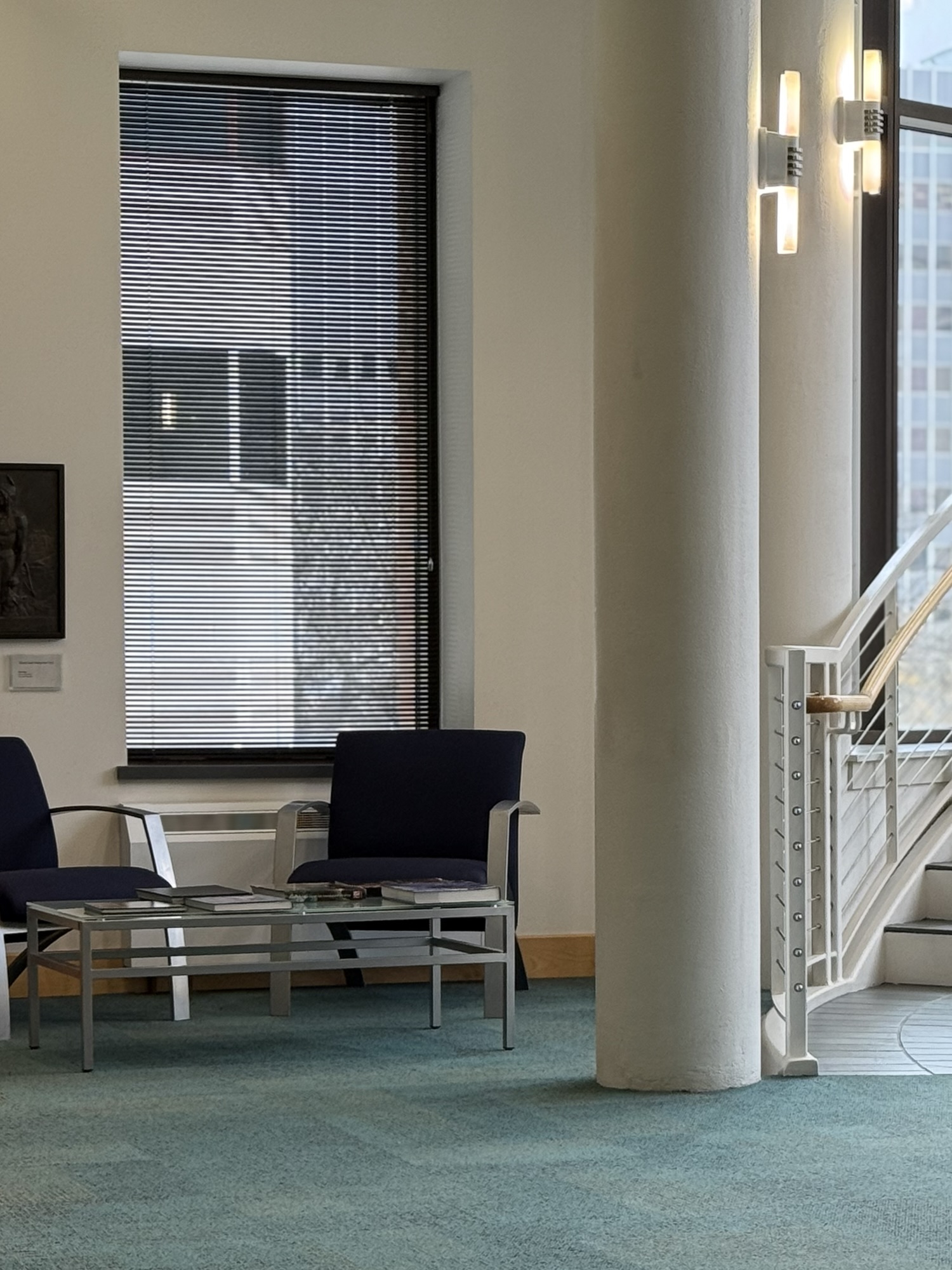
 Reject #1 – Too close to the subject, too much floor (so the chairs are in the wrong place to capture what I “saw”), and even though I liked seeing more of the second chair revealed, I no longer felt the composition overall was as balanced. If I had wanted to emphasize the chairs and seating area rather than the overall calmness and balance and clarity of the entire space, this one might have worked.
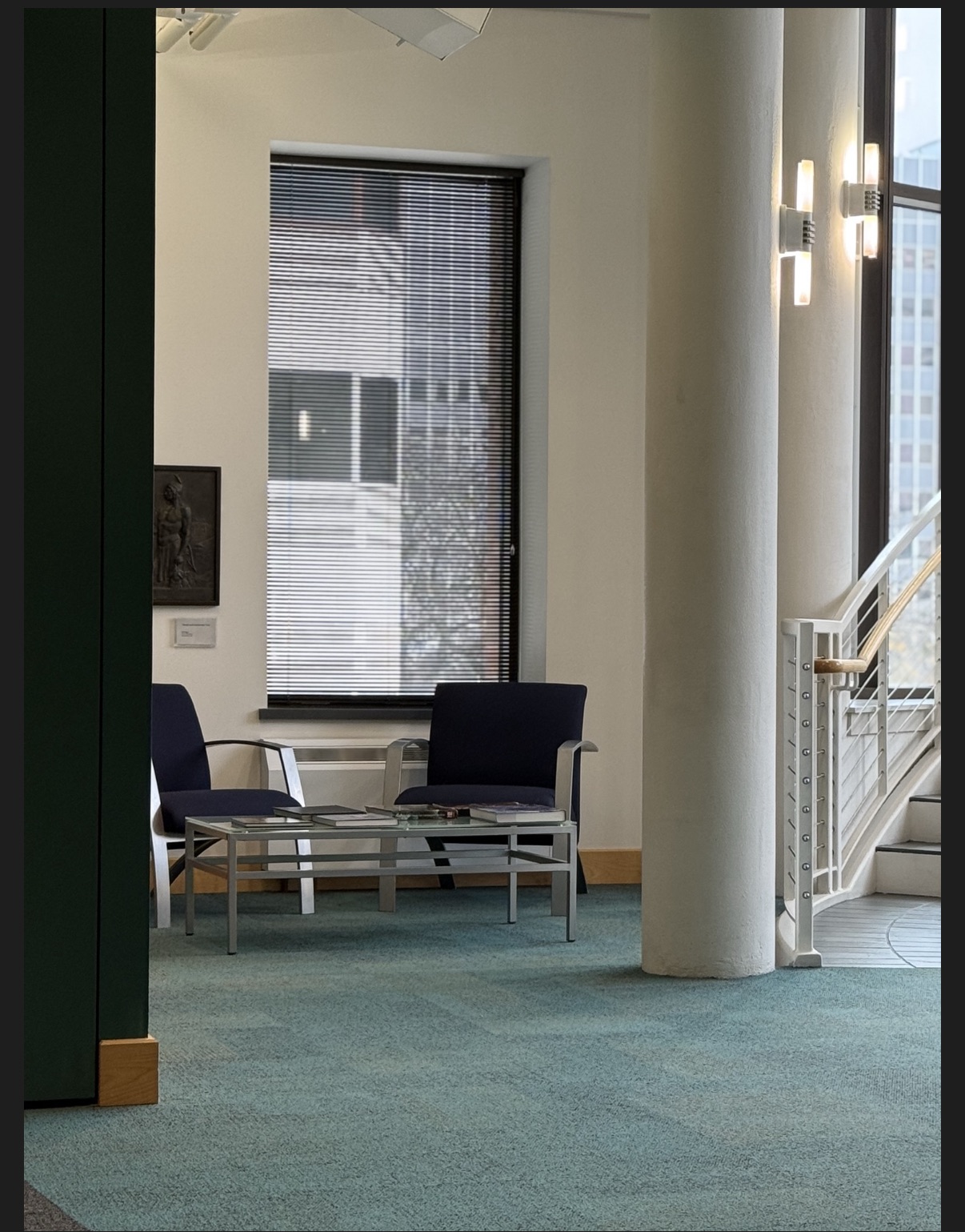
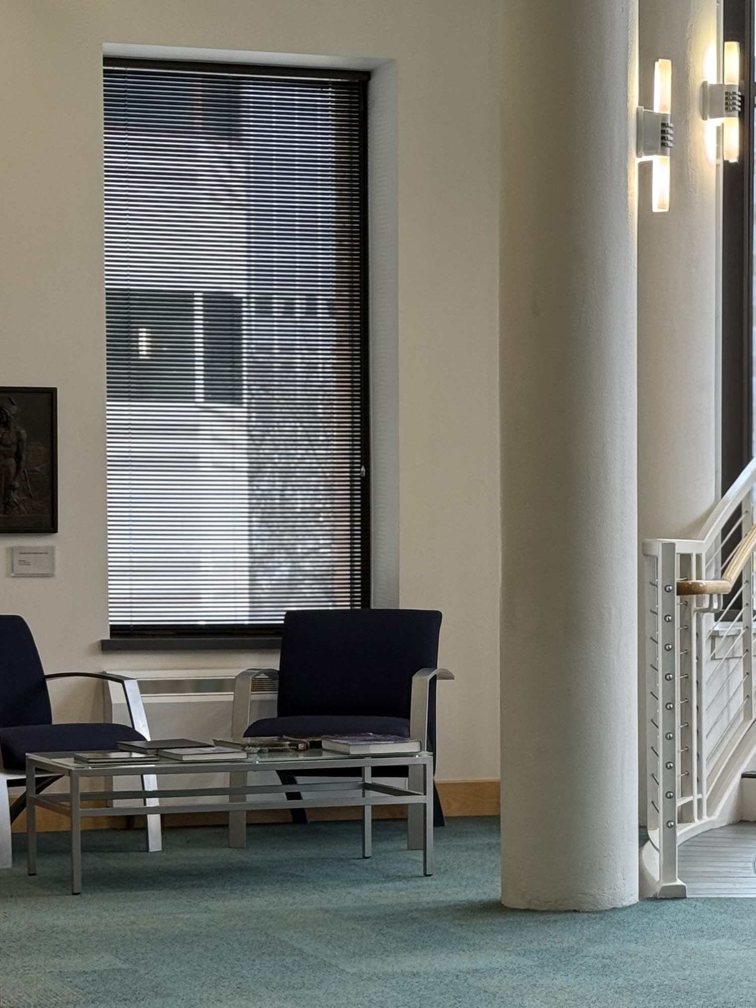
 Reject #2 – Too much of the wall on the left, too close to the subject. No staircase. You don’t feel the “clean,” “open,” “airy” lightness. Plus the pillar is tilted too much. I know that could be edited/corrected, but I still don’t like the overall composition, and tilting it wouldn’t change that basic fact.
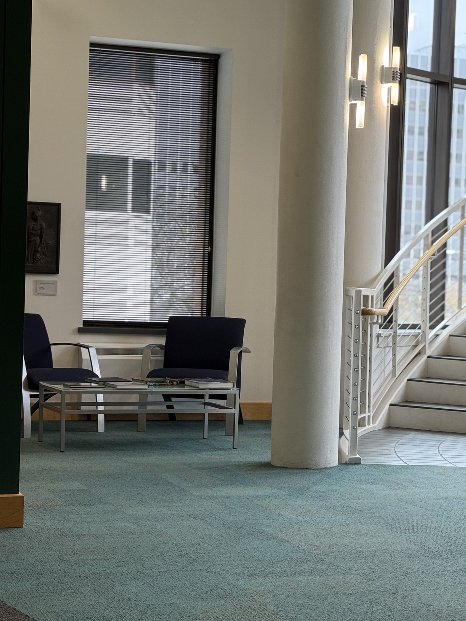 Reject #3 – Too little of the green wall, too much staircase, creating a left-to-right imbalance. Plus, it’s too tilted, and even though I could have straightened things out with editing, in the end there was also too much floor and too little ceiling, so again, I didn’t like the compositional balance, neither top to bottom nor side to side.
I have more rejects, but the differences there are even more minute, and this sampling is probably enough for you to get the idea. One photo works; other photos don’t. It’s so strange, but that’s how it is.
And sometimes you can have a good photo but it’s not “THE ONE” for reasons outside of the actual image. Here’s an example of how miniscule the differences between a good and bad photo can be (for me anyway) and why I might sometimes 86 something that’s not really that bad. This last photo was practically perfect. I really, really liked it. It’s got those nice vertical lines and feels very, very balanced. Except . . . too much floor. Too much of a “floor” to “ceiling” ratio, that is.
 Reject #4 – I actually like this one very much. Except for the fact that it doesn’t give me the overall feeling of space and light, I like this photo a lot. It feels very balanced, and it shows more of the seating area in terms of chairs than my favorite photo does. But there’s not enough ceiling to balance out the amount of floor I have. It just doesn’t give me the height and open space of “THE ONE.”
But, suppose I cropped it, to reduce that ratio of floor to ceiling?
 Reject#4 (cropped) – I managed to get less floor, but now the pillar feels too close to the horizontal center and sort of dominates the picture.
Meh . . . but better, so trying again . . .
 More balanced. Could be “THE ONE,” except it homes in too much on the chairs, thereby diminishing the overall sense of height and space in that corner. But this could be a twin to “THE ONE.” Like “THE CO-ONE.” 🙂 Except, hmmm, maybe I cut away too much of the floor. And the window on the right is completely gone. As are the stairs. Oh well, it’s not “THE ONE,” so not the end of the world if I butchered it 😂
Actually, that last photo may be my favorite photo purely as a photo. Even though it didn’t capture quite what I saw while walking through the galleries, it has something else I can see now while looking at the photo for itself, separate from the experience. All the individual elements that seem somewhat scattered and singular in “THE ONE” are here compactly wedded together within the more intimate composition of a tightly cropped picture. Every element of light and dark, every line, every shape interlocks like a jigsaw puzzle. A rather geometrical jigsaw puzzle, now that I think about it, with lots of perpendicular lines and balanced patterns of shape and color . . . aka my usual type of photo, lol
So there you have it. My post for the day, a little journey through minutiae on the way to “THE ONE.”
Isn’t it ironic how the phrase “it works” is simultaneously both the least and the most accurate and precise way of summing up what makes art “art.” Crazy, but it’s all in the eye of the beholder. And if enough “beholders” somehow happen to agree that something “works,” then who knows? Maybe you’re looking at the next Mona Lisa.


