
I’m showing Spotlight in my political science class this week and next. We don’t have a lot of time to talk about the press in our course, but I wanted to work in some reflection on the place of news media in American political culture. I like using films in my classes whenever I can because they deliver such a tremendous amount of information and nuance for the class time given up.
Spotlight is my positive bookend to the more negative, cynical view of media found in the first film of the quarter, Wag the Dog.
In my film studies class, I always show the most recent Academy Award winner for Best Picture as the final film of that course. In spring 2016, that film was Spotlight. Obviously students in my political science class are watching with a very different agenda than we had in my film studies class a year ago spring.
This time around (in political science), we are thinking about the role of “the press” as the Fourth Estate in civic life. Especially given the rapidly disintegrating sustainability of the news media’s traditional business model, not to mention the rise of “fake news” and accusations of partisanship and bias in news coverage, I think it’s important to think deeply about the press both at its lazy, credulous worst and at its most noble best. Wag the Dog and Spotlight do a pretty nice job of highlighting the opposite ends of the ethics/competence spectrum.
Today I learned that it’s impossible for me to shut down the film-studies side of my brain, even when I’m in political-science mode. While watching Spotlight with my students this afternoon, I kept noticing the colors. I haven’t seen Spotlight since showing it in my film studies class over a year ago. I’d forgotten all about its production design. But, boy, it all came back in a flash.
Take a look at these screenshots. (You can click on each image to enlarge it.)
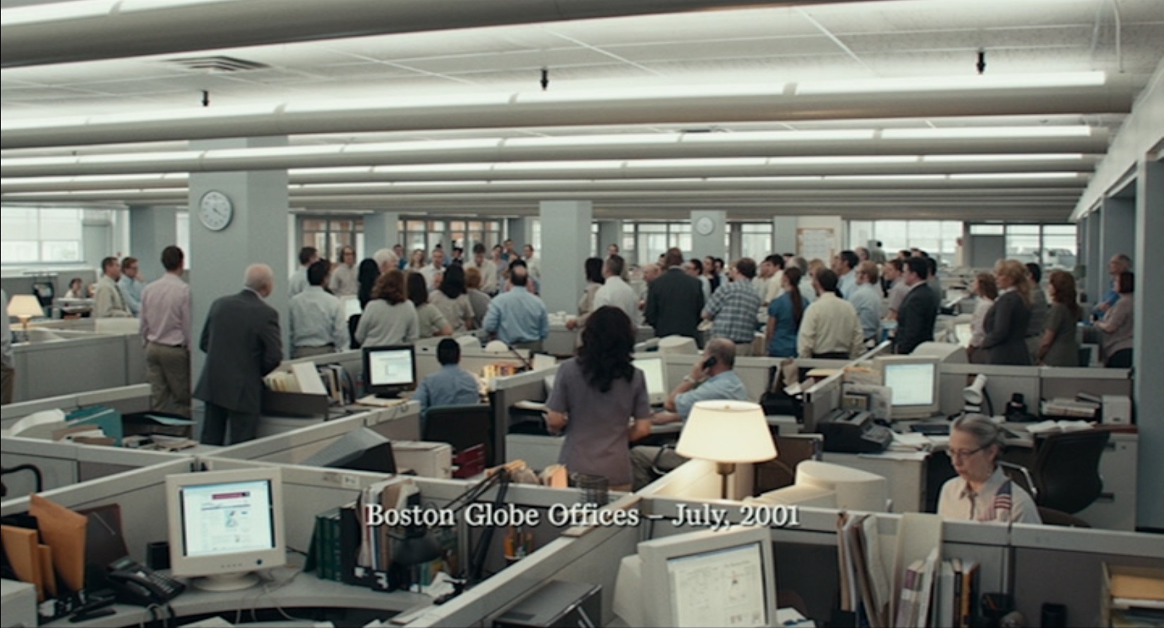
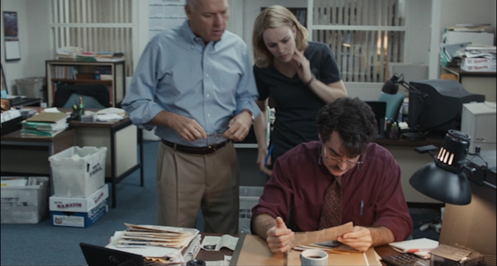

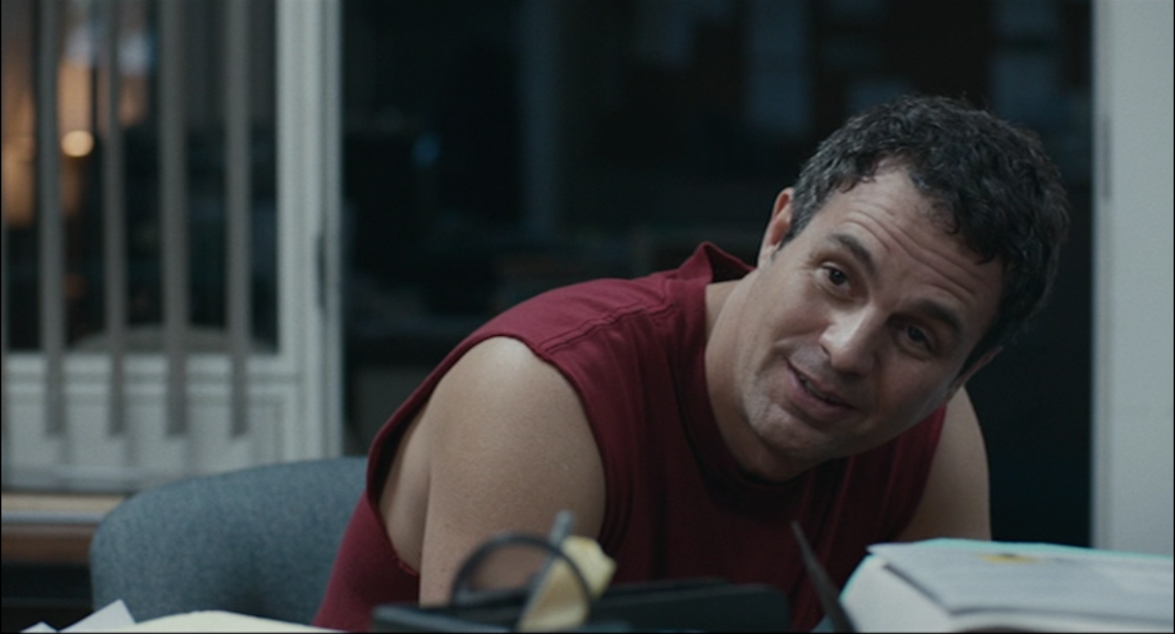
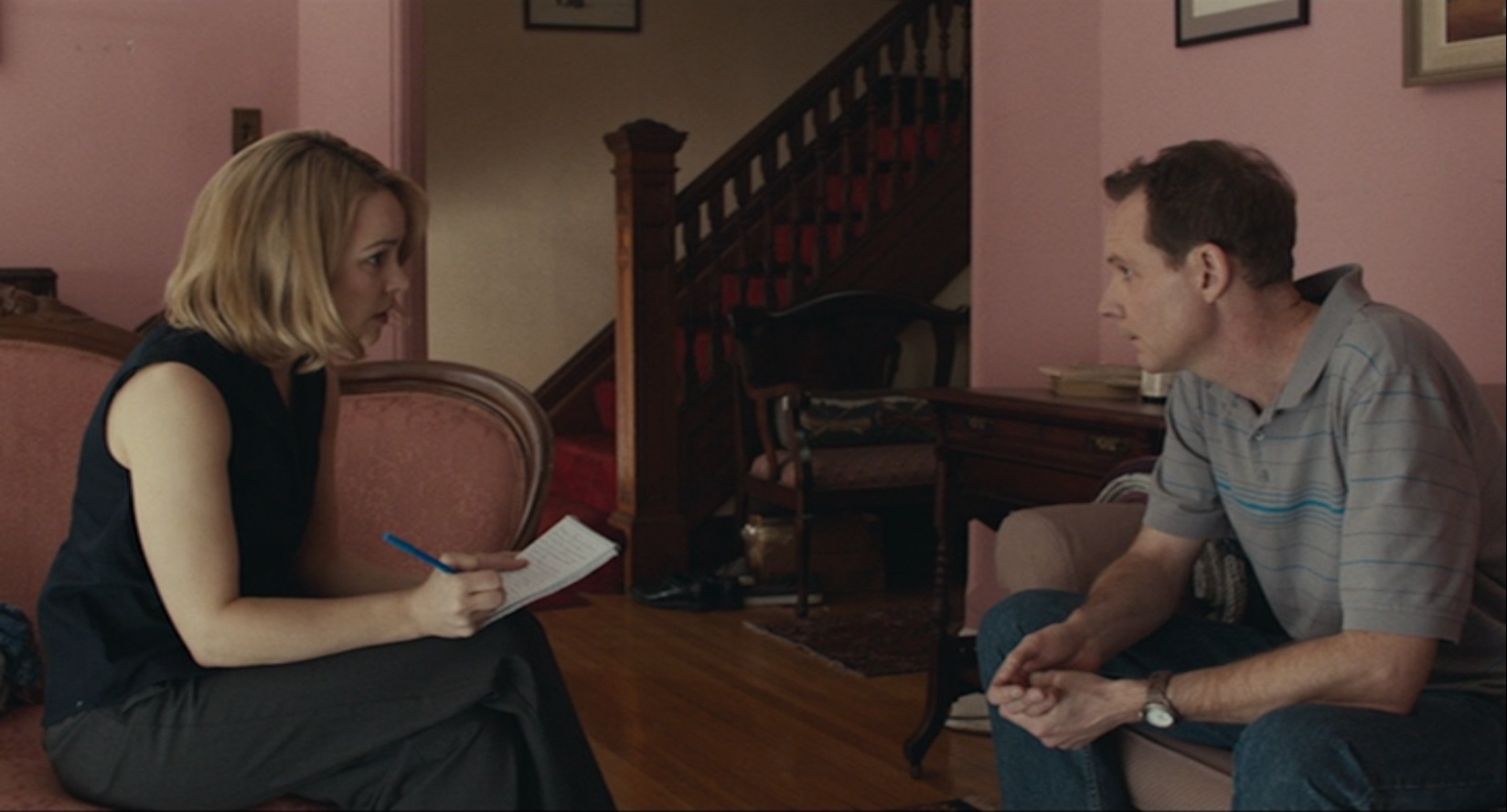
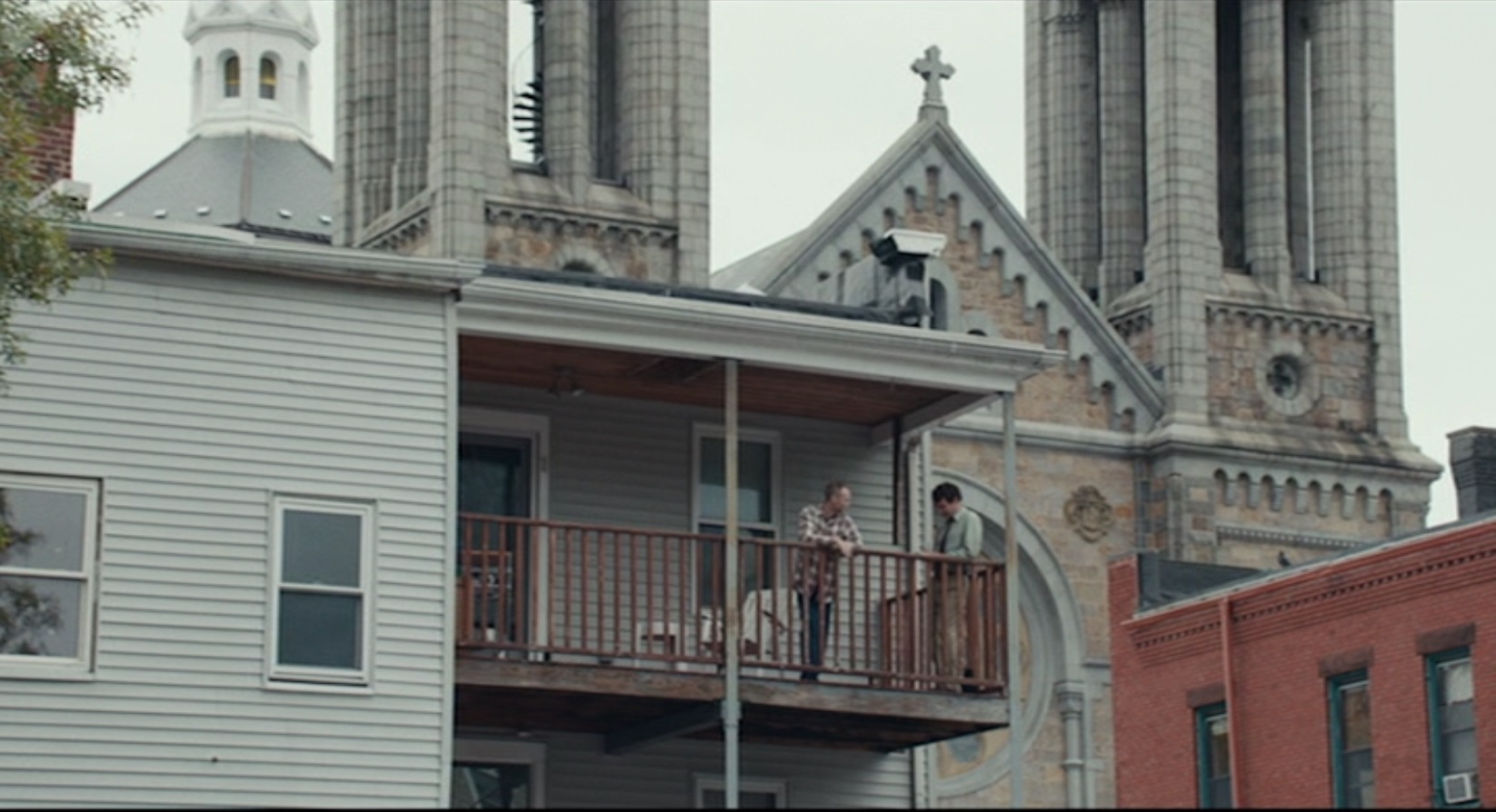
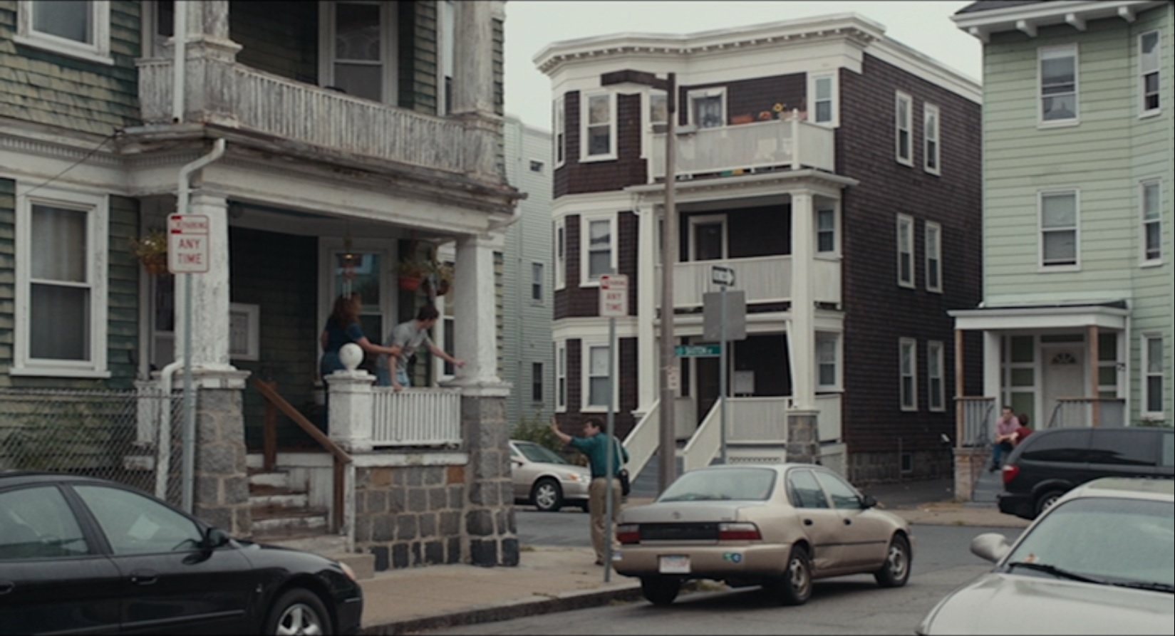
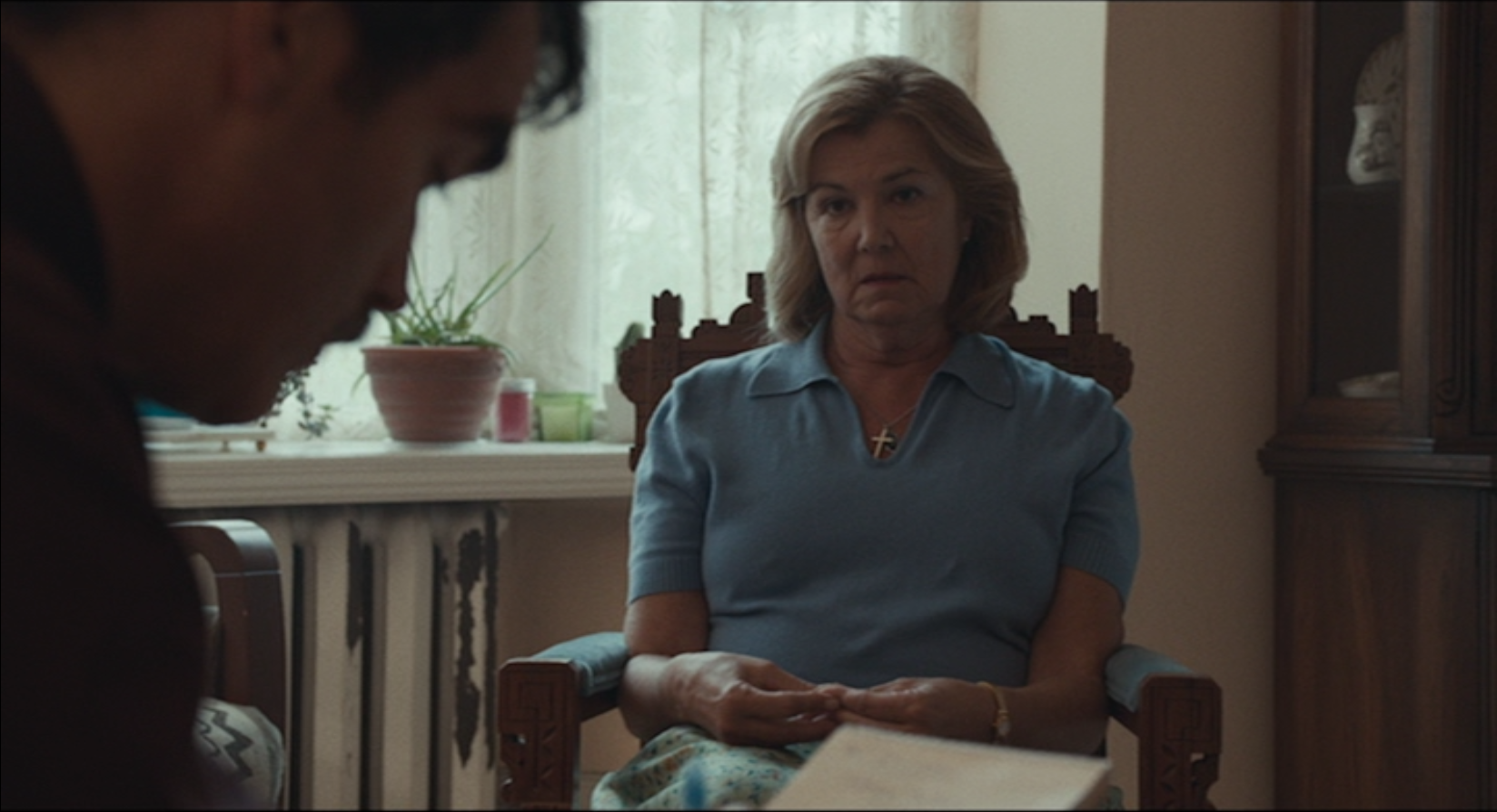
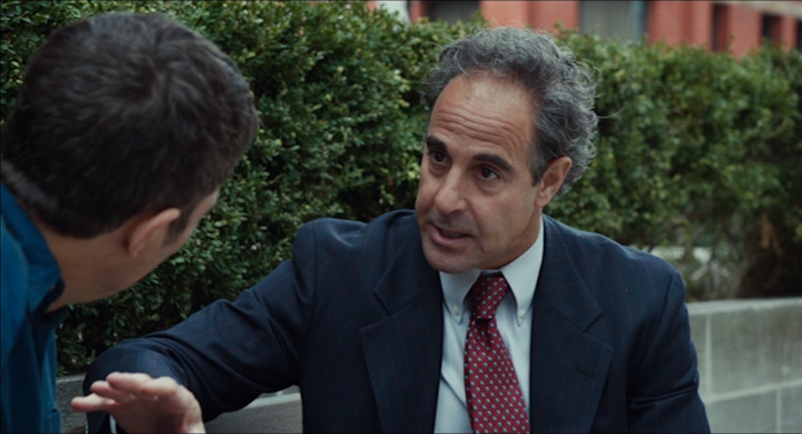
Can you see what’s going on with the colors? Red, green, and blue are EVERYWHERE. Even items that would normally be white or gray or beige are tinged with hints of red, green, and blue instead. (Balancing out the red, green, and blue are black and yellow/gold/brown, the latter often showing up especially in richly colored wood.)
I’m not sure there’s necessarily a thematic purpose behind the color palette used in Spotlight, but it does occur to me that red, green, and blue (RGB) are the primary hues in an additive color system. Cyan, yellow, and magenta (CYM) are the primary hues in a subtractive color system.
Check out this cool photo from Wikipedia. I like to show it to my film studies students because it’s such a great visual demonstrating these color principles in action.
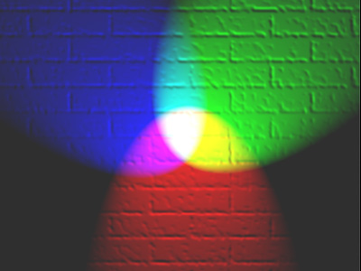 “RGB illumination” by en:User:Bb3cxv via Wikipedia (CC by 3.0)
White light contains all the wavelengths in the color spectrum. Black essentially has none.
So actually, now that I think about it, if I wanted to make some kind of point about the color design in Spotlight, I might talk about how the RGB colors add up to a white light that echoes and amplifies two related themes.
First, that white is associated with purity, and second that light is associated with truth.
The film’s title refers not only to the Spotlight team itself (a special unit of investigative reporters at The Boston Globe) but also to their act of spotlighting and bringing into the light a problem hidden away too long in metaphoric darkness.
Good. I’m so glad I have my blog and was able to get all this out of my head and into a form that could be shared with someone who might appreciate it 🙂
Now it’s time to pack up all my student papers to grade this weekend and head home.
Have a great Friday night, everyone!
Would you like new posts delivered to your inbox? To subscribe, click here.


How ironic that I just challenged you to post black and white photos. It’s hard for me to work in black and white. Color is so important to make a picture striking, but I’m trying to see things in a different way this week.
LikeLike
I’m excited about the black and white challenge. (I hope it’s okay to put it off for a few days, though.)
LikeLike
That is interesting! I think a lot of this works on our subconscious and we never have words to describe it. You do a wonderful job!!!
LikeLiked by 1 person
Thank you, Karen!
LikeLike
Your class sounds super interesting! I’d be very interested in a class like that.
Good luck with marking papers–I’ll be doing that too…solidarity!
LikeLiked by 1 person
Solidarity!
LikeLike