
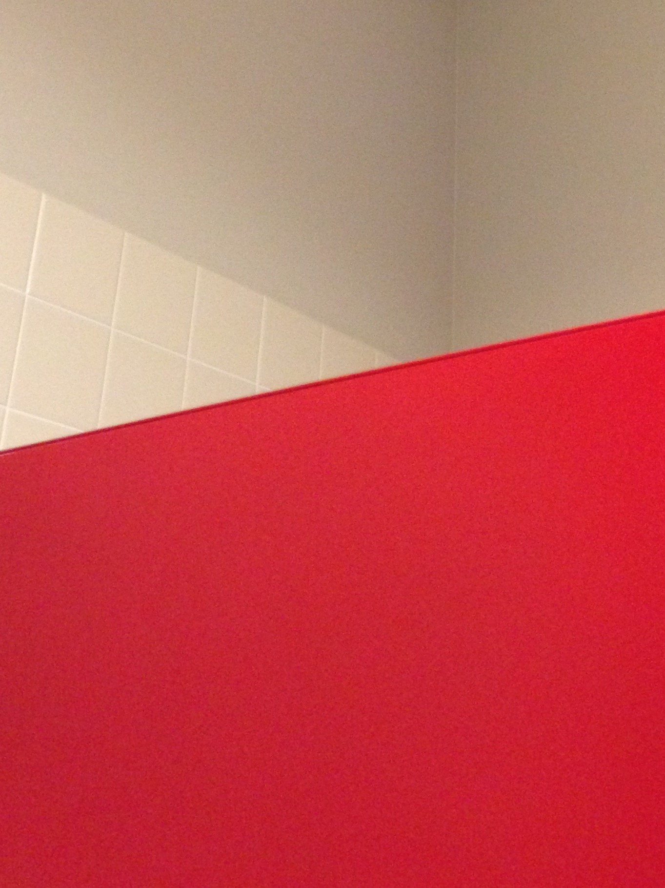
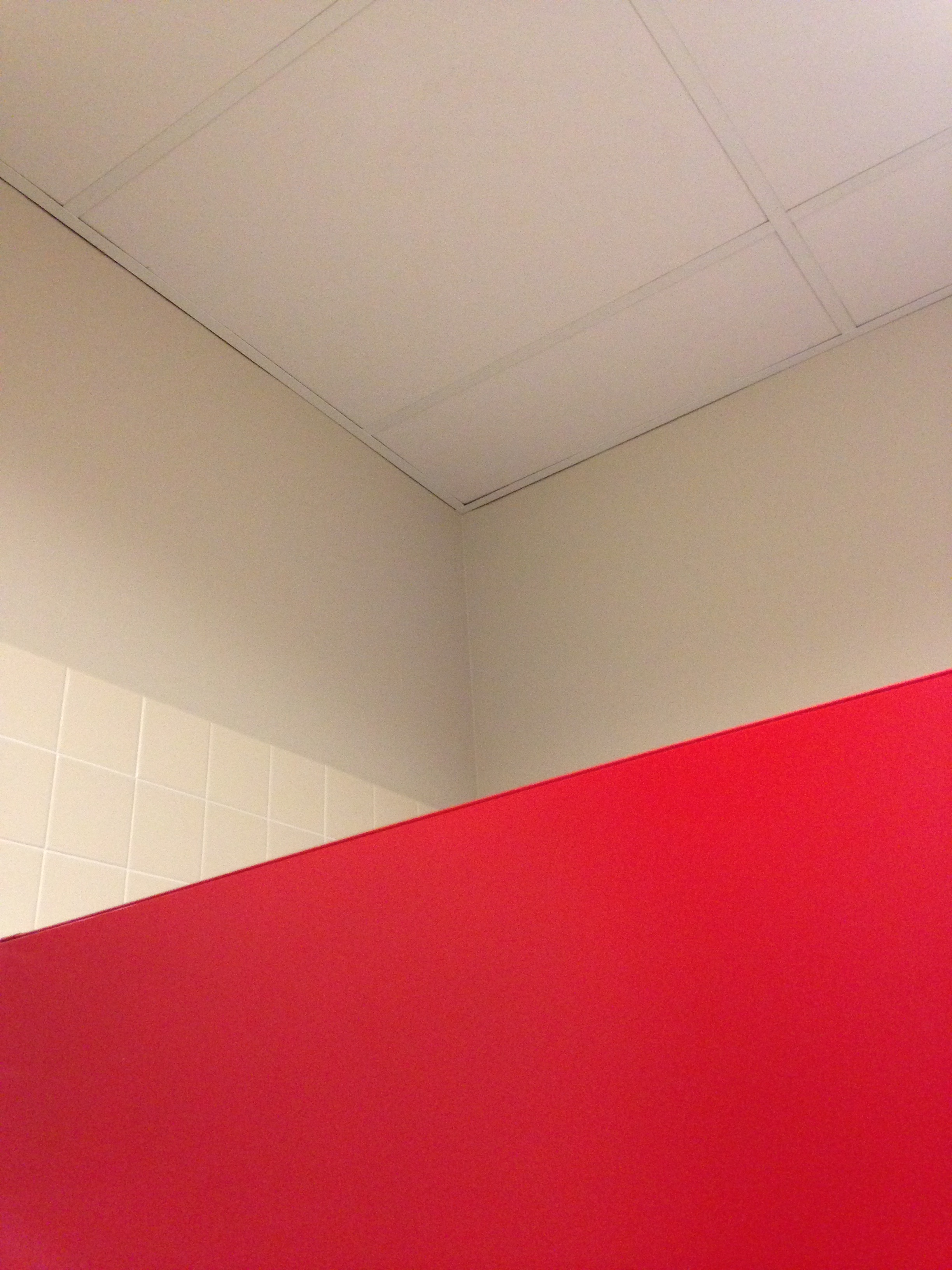
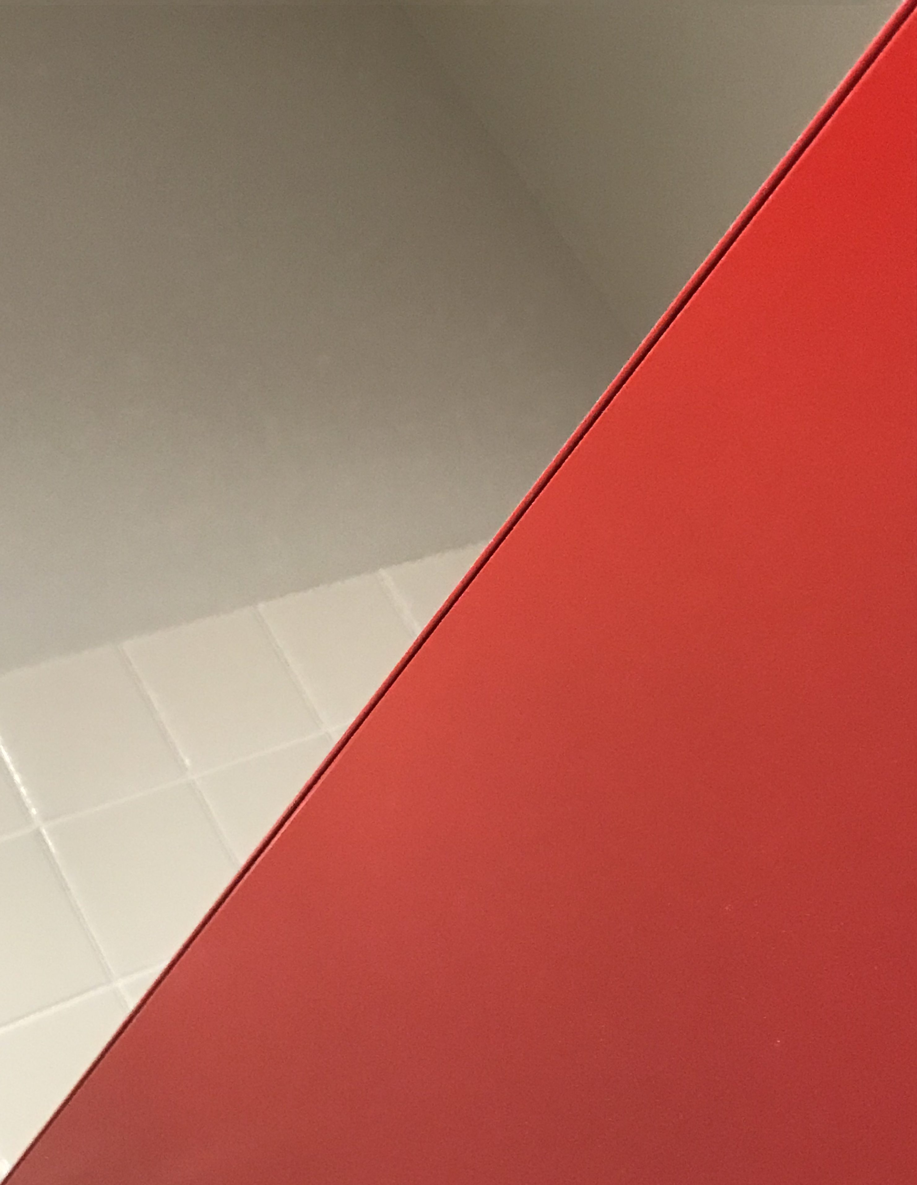
Sort of. One day I suddenly noticed the bright red of the bathroom stall in my building. Took a photo. Decided to edit it so that it no longer bore strong resemblance to a bathroom stall. Because, really: Who takes pictures of a bathroom stall?
edited version
original
Tell the truth. If you saw this photo and didn’t know what it was, would it still scream out “BATHROOM STALL”? Not that it really matters, I guess. I liked that red, and I liked the lines. So then I took another one just to change it up a little. I don’t know; the red is way too dominant. Maybe if there was more light so the other side would balance out the red’s intensity? And I would need to bring my good camera to work one day so I could get a sharper focus.
Except that getting a better image of this subject is probably not a very worthwhile use of my time 🙂
Oh hey, look at what I just noticed on the card advertising the Grohmann Museum’s current special exhibit!
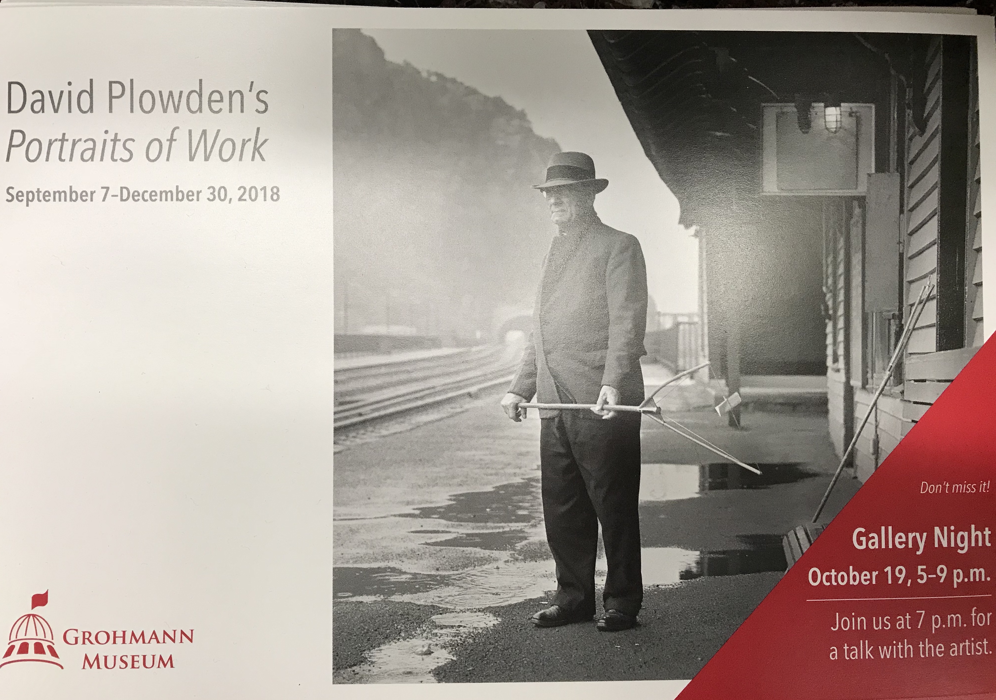
Coincidence???
Well, yes, of course it is.
But maybe also a case of great minds thinking alike. Although probably not 🙂


Too funny!! Art is everywhere! Especially in the eye of the beholder. I like it!! Actually, I can’t say as I’ve seen too many red bathroom stalls. Pretty cool!!
LikeLiked by 1 person
I couldn’t believe it this past Fri when I visited the ladie’s room at the MOWA. Yup, I was re-living your color blocking blog. I wonder if it was the same painter/designer for public lavatories? I was trying to recall if it was the same red as your photo and decided it had abit of orange to this red hue than your photo. The white tile was 4 mini squares to your large tile.
LikeLike
I’ll have to check yours out. Maybe it’s an art museum thing?😂
LikeLike
If you do? take the same pix to compare & we all would like to see the comparison.. at least I would. ;>)
LikeLiked by 1 person
Will do!
LikeLike