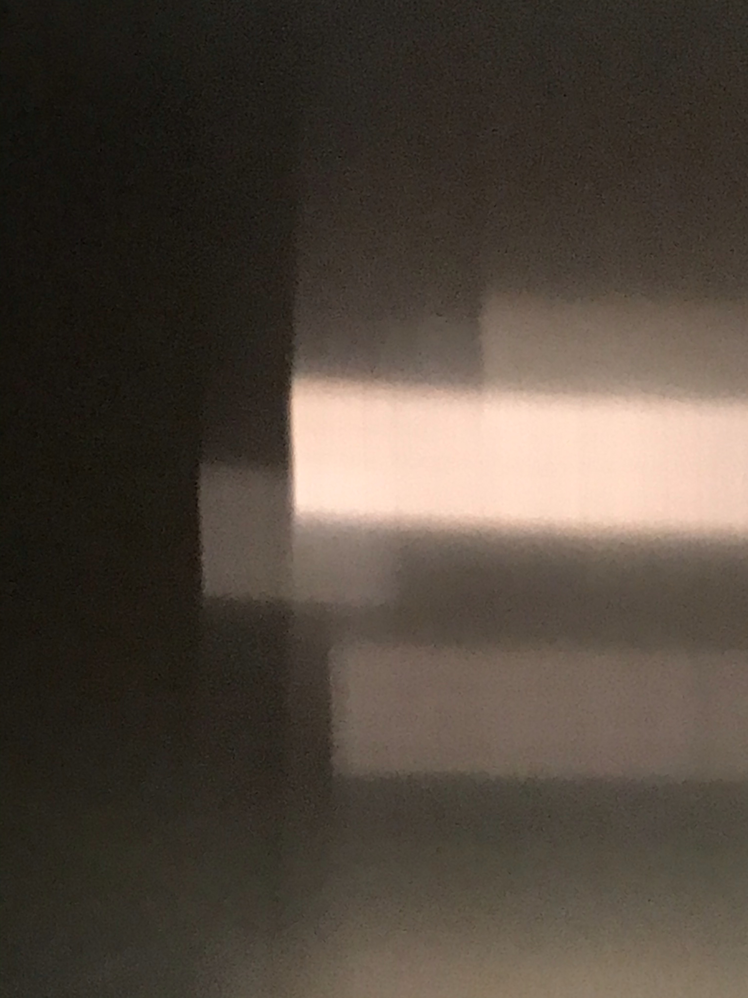
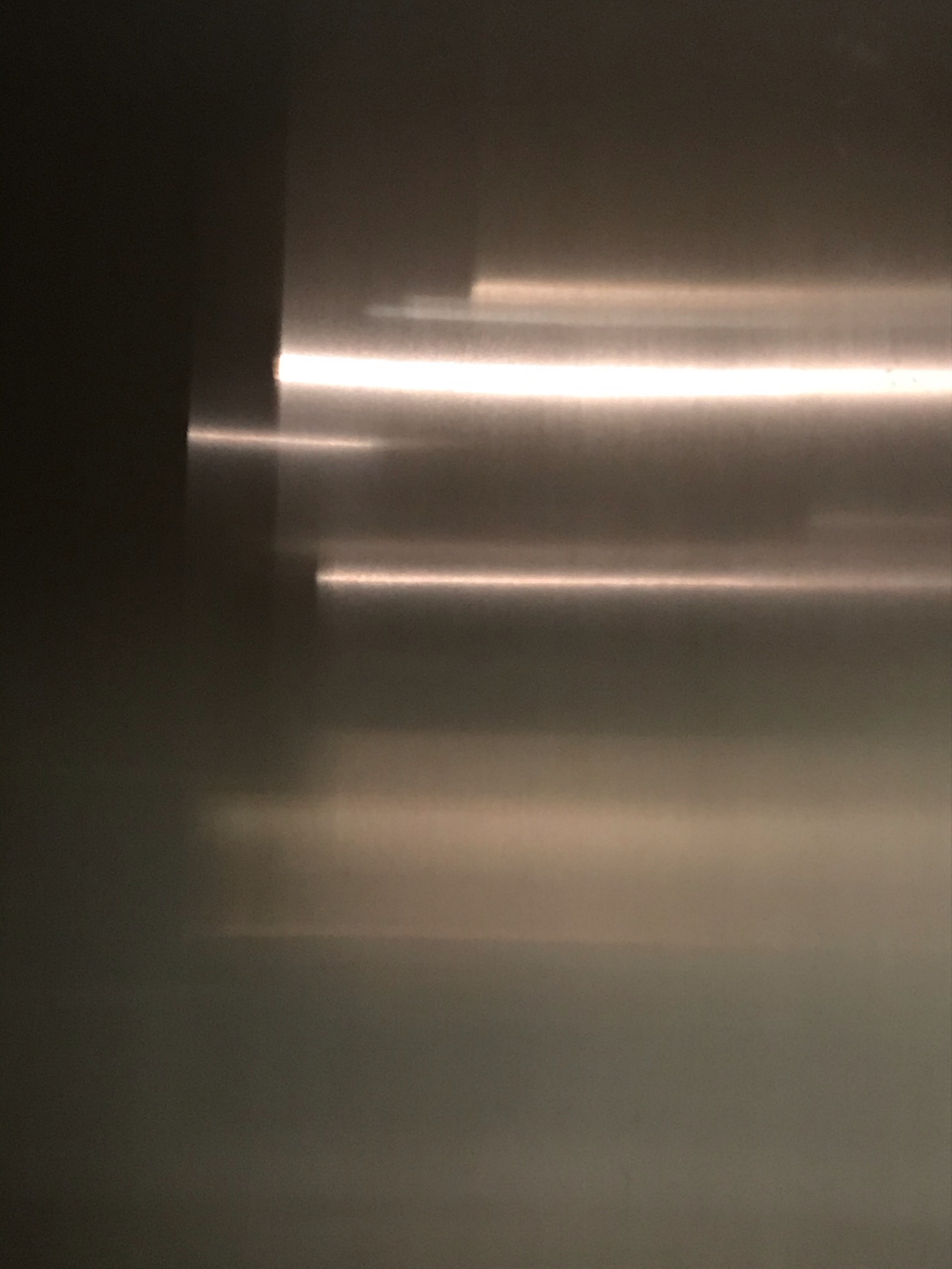
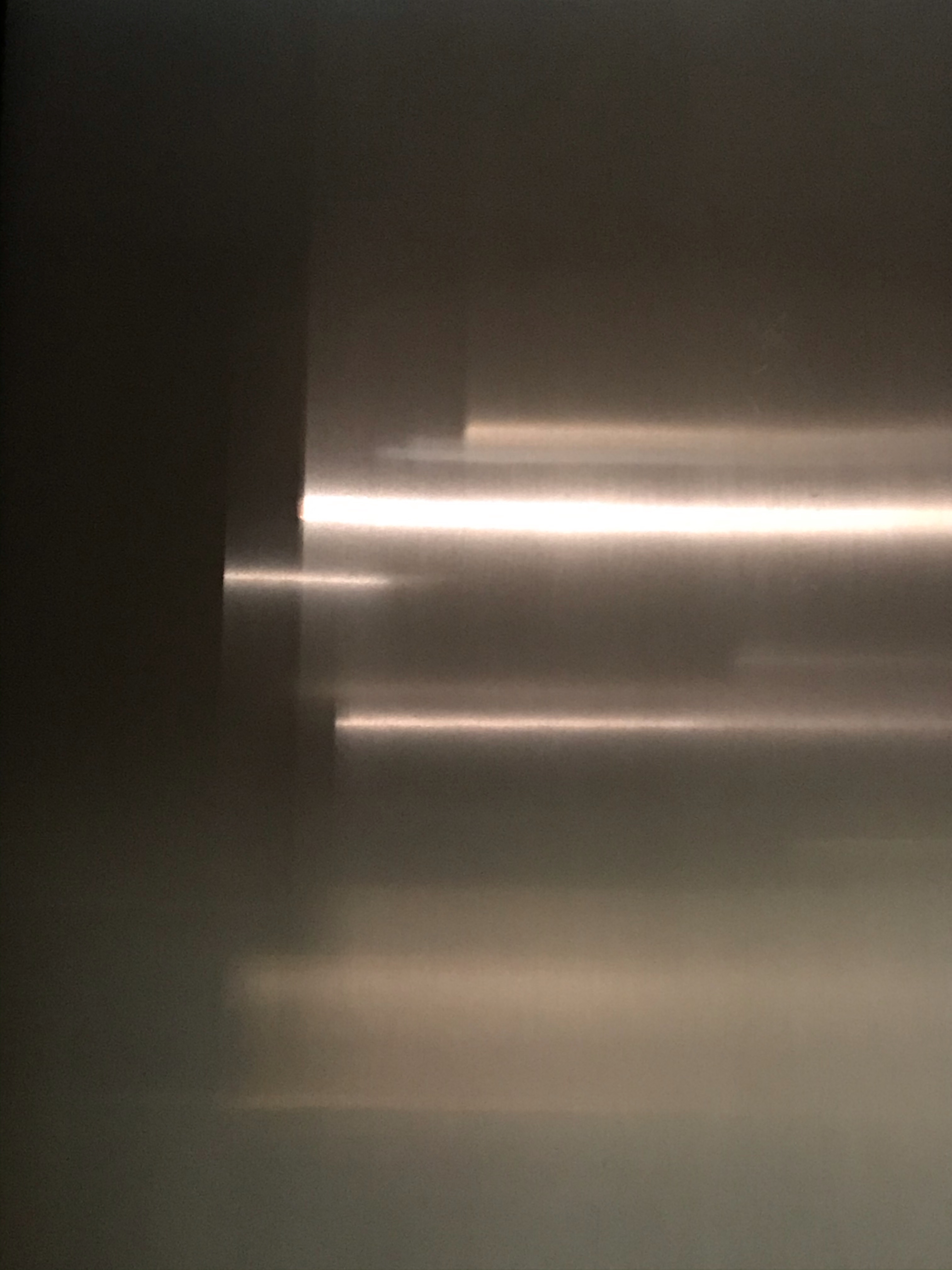
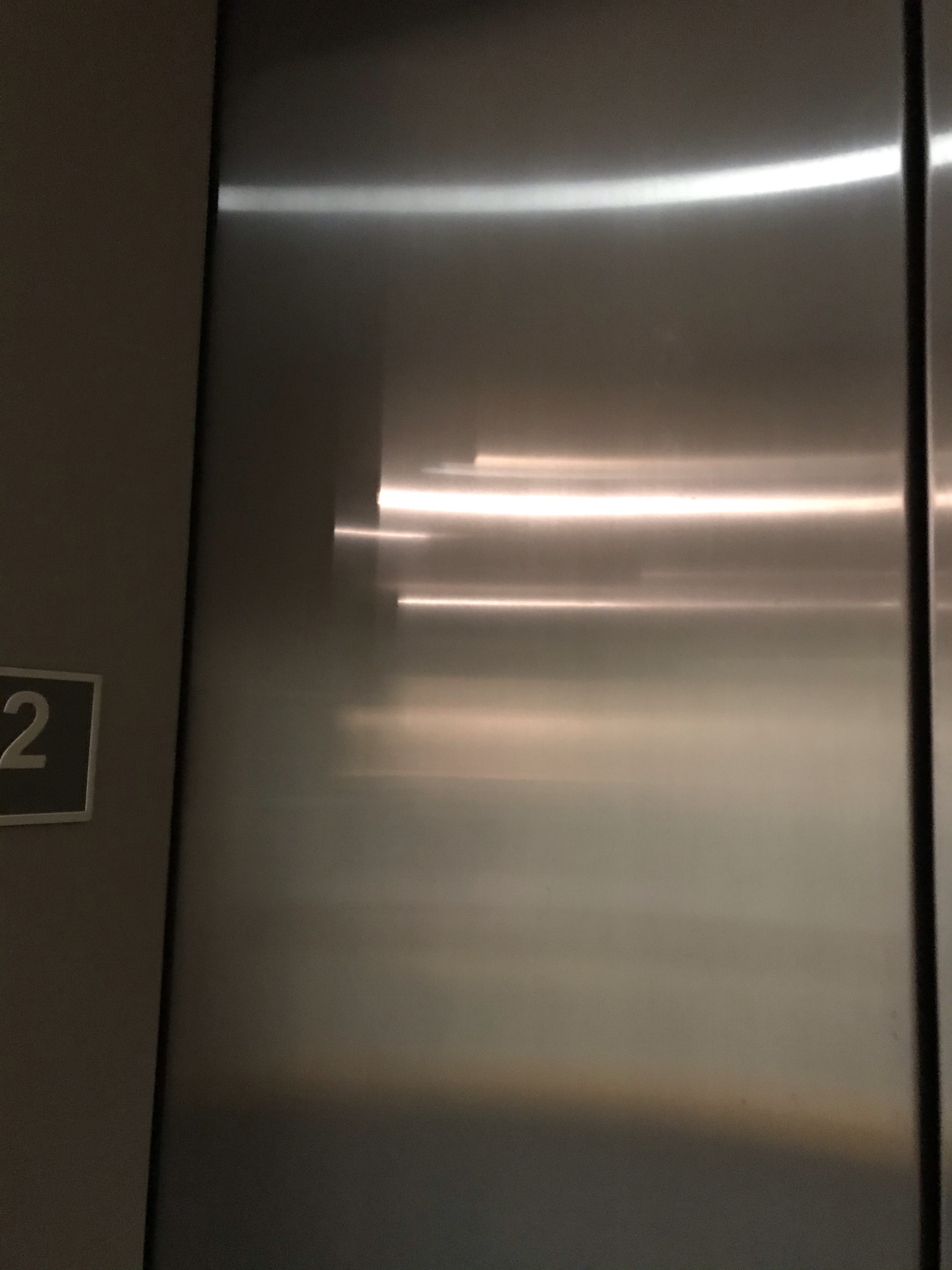
I saw these fun images while waiting for the elevator in the Grohmann Museum today and thought I’d share. Moving from left to right, most abstract to least. The two images in the middle are basically the same image, with slight differences in composition. Not sure which one I like best of those two. Maybe the one on the left?
About Katherine Wikoff
I am a college professor (PhD in English, concentration rhetoric) at Milwaukee School of Engineering, where I teach film and media studies, political science, digital society, digital storytelling, writing for digital media, and communication. While fragments of my teaching and scholarship interests may quite naturally meander over to my blog, this space is intended to function as a creative outlet, not as part of my professional practice. Opinions are my own, etc.


I like the one on the left too!
LikeLiked by 1 person
So did the museum director, who left me a comment on Facebook. I guess we all have the same eye for composition!😄
LikeLike
Yes, it has good composition but it reminds me of the opening for a scene where when it comes clear it will tell us that we are at the Tip Top Motel and that they have a Vacancy. The camera will pan pull back, pan right and we’ll see our heroine in a Catillac convertible pulling into the parking lot. I’m still waiting. Ha!
I like the way the middle two give me the feeling a motion!
LikeLiked by 1 person
I can see it!
LikeLike