
I had to drive someone to St. Luke’s Hospital yesterday for an MRI. (Driving people to medical appointments seems to be the story of my life lately! 🙂 ) After dropping them off at the front door, I entered the parking garage and spiraled up the ramp to find a spot. Then walking to the elevator with my rolling briefcase (so I could get some work done while waiting for the procedure to be finished), I noticed a sign saying what floor I was parked on.
I say “noticed” because I had so many other things running through my mind that I wasn’t actually paying attention AT ALL to which floor/ramp I was on. In fact, I might have gotten into the elevator still preoccupied by other things, without a single thought about where I had parked, if not for this one word.
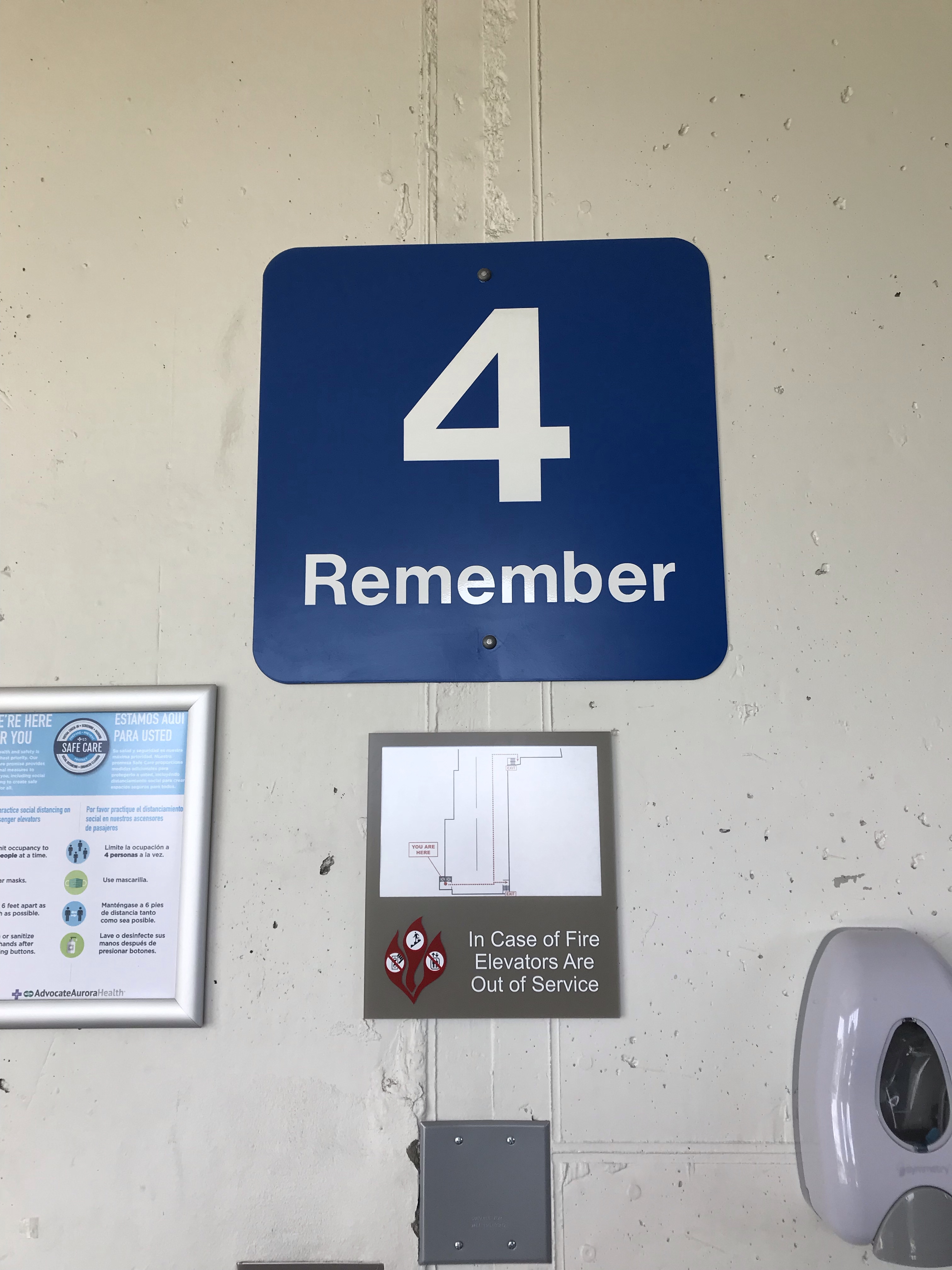
I had already looked directly a sign with the large numeral “4” on one of the structure’s pillars. Noting it, but in an abstract kind of way. Only when the word “Remember” registered did I realize that I ought to have already taken note of the floor/ramp I was parked on.
That’s nice, I thought, snapping out of my reverie. The instruction to “remember” ensured that I actually did!
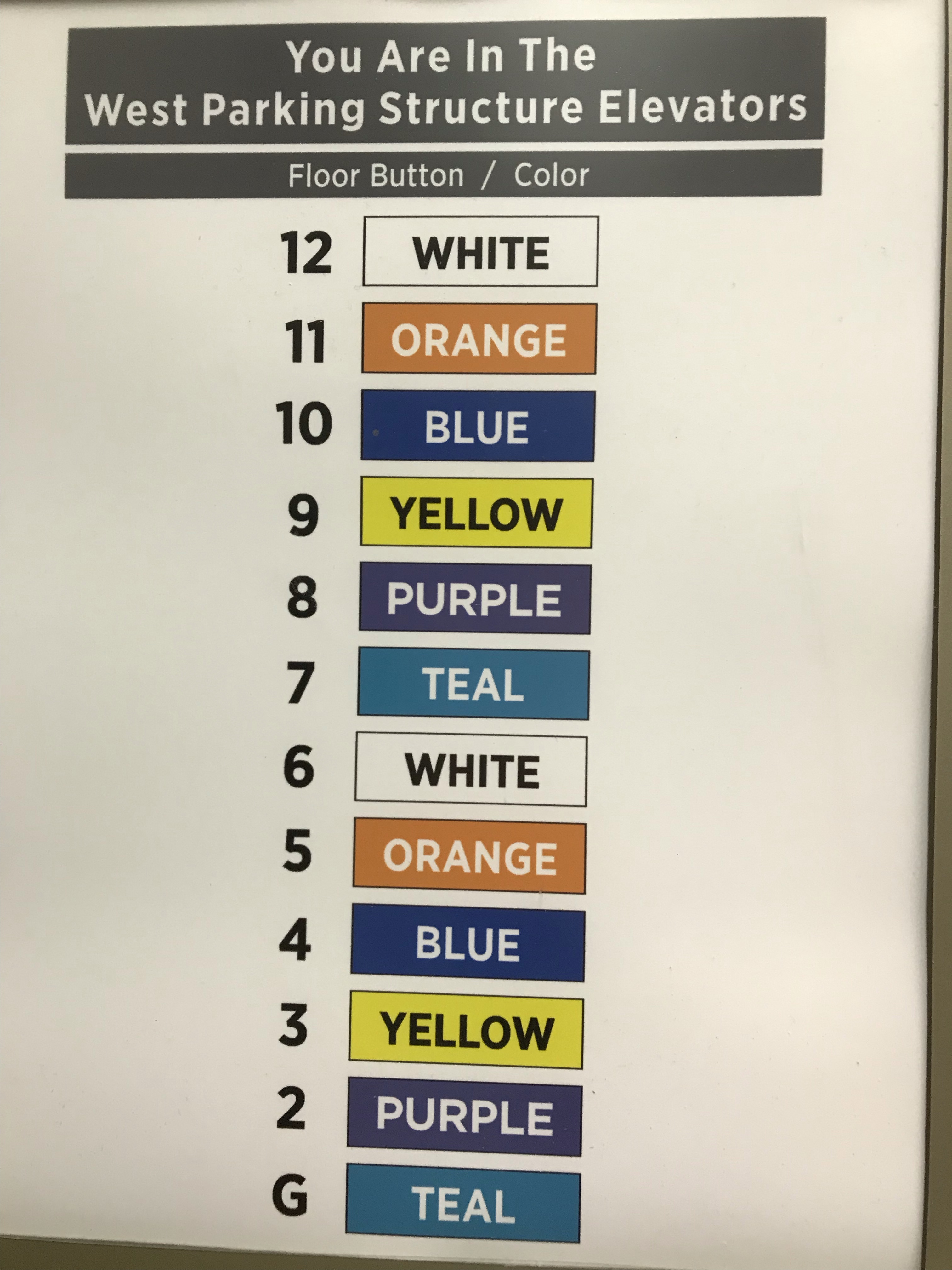
Upon entering the elevator, I got another pleasant surprise. There to one side was another sign. This list of floors reinforces the connection between the ramp number’s numeral and color AND writes out the name of the color inside each appropriately colored box.
I like it when signs use words. Often, I think, designers swing too far in the direction of using nothing but nonverbal symbols (icons, colors, etc.) to convey messages. Apple does it beautifully, but most designers aren’t Jony Ive. Words may be less “elegant,” but they often get the job done more efficiently than images alone.
For example, I am completely worthless with these symbols for opening and closing elevator doors.
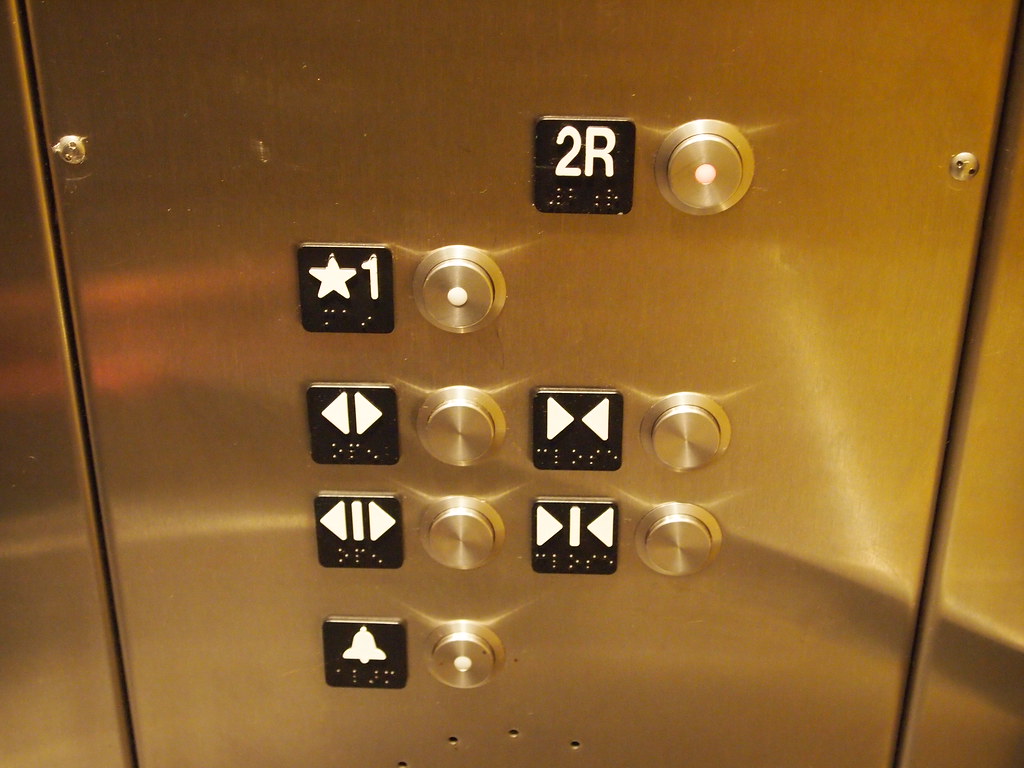 “Elevator Buttons” by orijinal is licensed under CC BY 2.0
These “arrow” icons have become ubiquitous in the past few years and seem to have completely replaced the words “open” and “close.”
But how often have I frantically tried to figure out which set of arrows means “open” as someone races to catch the elevator as the doors are sliding closed? I can never translate the concepts fast enough to help that poor person out.
Possibly using the arrow icons benefits illiterate people or people who don’t understand English, but adding the words “open” and “close” beside the arrows—or even including the words as another set of buttons (because why should we need TWO different iterations of arrows, as shown in this photo, if symbols are so much better than words?)—would be far better for me, not to mention all the people who have missed the elevator because I couldn’t “read” the symbols fast enough.
Decisions about signage fall under the umbrella of what I think of as UX (user experience) design, except that UX is almost exclusively understood nowadays to mean digital experiences only. That’s too bad, because designing and curating experiences of all kinds is going to become increasingly important moving forward into the digital future. It seems to me that there’s way too much fragmentation and confusion surrounding the idea of UX in nondigital contexts.
Sometimes nondigital UX is called simply “experience design.” I’ve seen that referred to as “XD.” Here’s an article from the XD Agency (styled “THEXDAGENCY” on their website) titled “UX VS. XD” that talks about the differences that they see between the two fields.
Here’s another article, titled”10 Principles of Physical Experience Design,” by Ripon DeLeon, Director of Physical Experience Design at Capital One. He uses the acronym PXD to refer to the concept of designing experiences in the physical world.
And to muddy the waters even more, here’s one from the Interaction Design Foundation on “The Classic Types of Experience.” According to this article there are many kinds of experience, including physical, mental, emotional, social, and spiritual.
Yet another term used to describe this idea of designing experience is “Experience Architecture,” or, to use letters, “XA.” Here’s the Wikipedia article on experience architecture (link).
Obviously there’s lots of ambiguity in the still-emerging subfields of the overall domain of experience design. And as the Web 4.0 (Internet of Things) and beyond takes shape, there’s bound to be even more confusion, because virtual and augmented reality will conflate our experience of both physical and digital worlds in ways that boggle the mind too much even to speculate on.
Sorry for rambling! I started with a couple of parking lot signs and then lost track of where I was going once I began thinking about how comprehensive yet inadequate “UX” is as a term for the design of human experience in a world that has one foot planted firmly in analog soil and while the other floats suspended in a digital sea of zeros and ones.
My main point is that good design demonstrates caring and empathy, and St. Luke’s deserves props for signage that embraces these principles. Many people entering a hospital parking structure are probably distracted (or distraught) enough that they’ll have difficulty remembering where they left their car. Adding a gentle instruction to “remember” on ramp markers and placing a color-coded list of floors inside the structure’s elevator should improve the odds that this already-stressed group of people will be able to locate their vehicles when they return.
Would you like new posts delivered to your inbox? To subscribe, click here.


At Froedtert, each level has a color (blue), a symbol (seagull), a sound (Waves and seagulls, and a number Level 2. No smell that I know of or nothing to touch (a feathered wing?) but using more senses helps us remember. Great Blog.
LikeLiked by 1 person
Oh wowI I love the totality of “experience” you’re describing!
LikeLike
Interesting. I don’t recall that experience on my last visit there. Is this a very new elevator installation?
LikeLiked by 2 people
This is so true! I am just like you, Katherine, in being somewhat dyslexic when it comes to icons. It’s like my brain just doesn’t register the information in the same way. (And how many times have I hit the wrong symbol and closed the elevator doors as someone was running to catch it?!) A really interesting topic and I wish the technology geniuses would put half as much thought into their user designs as you have in this post!
LikeLiked by 1 person
Thank you, Mel. I agree—if only those designers would talk with us!!!!
LikeLiked by 1 person
I do remember as far back as I can on the colored line system St. Luke’s used to get you to go where you needed to go. However, what if you were colored blind? Maybe they have a system in place for that already since I was always focused on the floor, lol. Interesting point on words to help in directing people to their destination. There really should be a universal button system with words since braille is included. English words help those to learn the language as well. I guess I never used or noticed the open close symbols since the triangles are up or down on the outside and press the number for the floor to get off and let the elevator do its thing. I do remember the Remember parking lot level sign which I found very helpful when my mind was on family hospital situation. You always have interesting day to day topics or views that we take for granted.
Good read KW.
LikeLiked by 1 person
Thank you, Rose! I remember going to St. Luke’s back in the 1980s when I was a paralegal. Probably to get medical records. Anyway, yes! I remember the colored lines. Like I’d stop at the front desk and ask where Radiology was and they’d say just follow the blue/yellow/whatever line. I don’t know when hospitals started routinely doing this, but I think St. Luke’s must have been one of the very first.
LikeLiked by 1 person
Thank you for all the references on the conceptual differences in the field of UX. I began studying the field driven by the idea of “helping users through good design”, but got lost at some point in the digital aspect of it. Your article was a nice reminder that, while immersed in our devices, we still live in a physical world. Big thanks! 🙂
LikeLiked by 2 people
Thank you so much for your insights! I think we all tend to get lost in the digital aspect, as you said. I guess it’s like we’re so focused on the “trees” that we sort of don’t notice the “forest” that’s all around us, LOL
LikeLiked by 2 people