
WAY far away . . .
I was walking down the hill to go into the back door entrance of my parking garage when I saw the man walking ahead of me in the distance. I liked the composition of what I suddenly saw as a photo. Pulled out my phone, took two pictures, stuck my phone back in my purse pocket.
When I got to my car inside the garage, I took a look at the pictures to decide which one to upload. To my surprise, there were four pictures, not two. I finally realized they were actually only two pictures, but for some reason I got a lighter and darker version of each one. I have no idea what happened, since I was trying to walk and take a picture in bright sunlight at the same time. Too much going on for me, lol. I couldn’t decide between the two versions, so I’m posting both here. Do you like one better than the other?
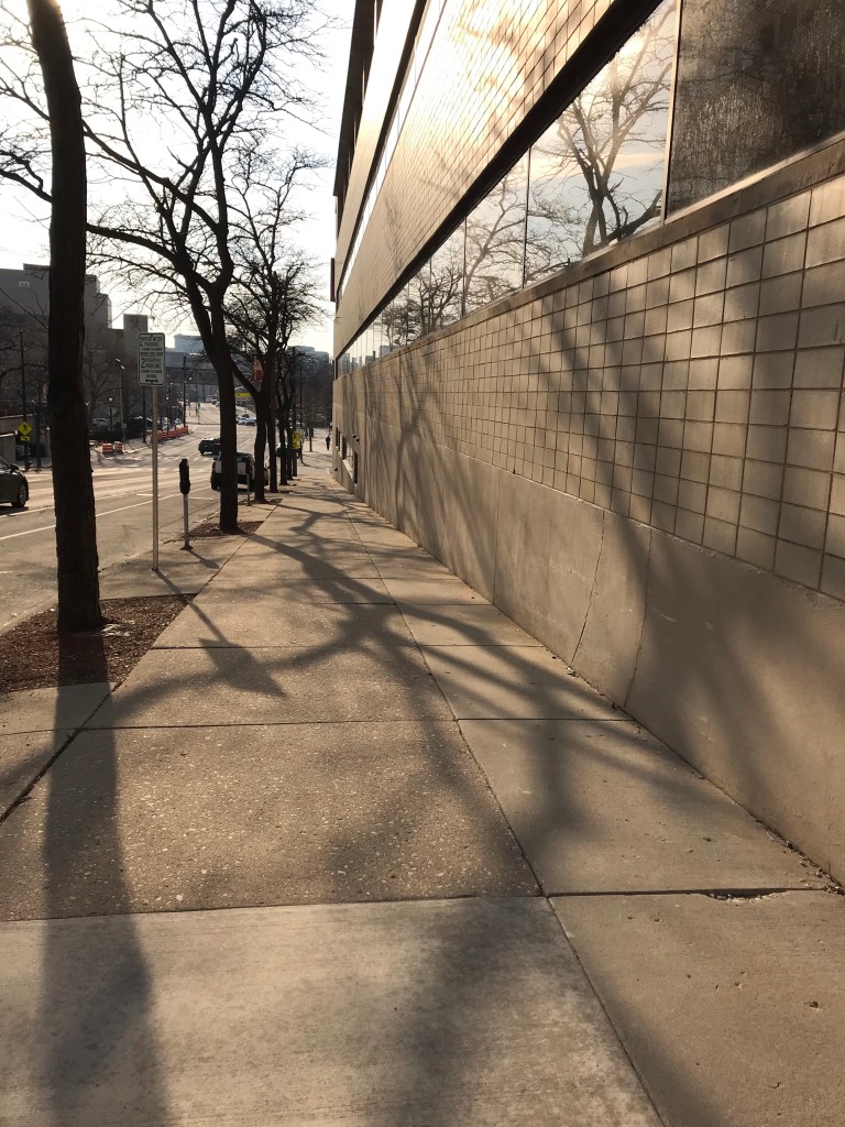
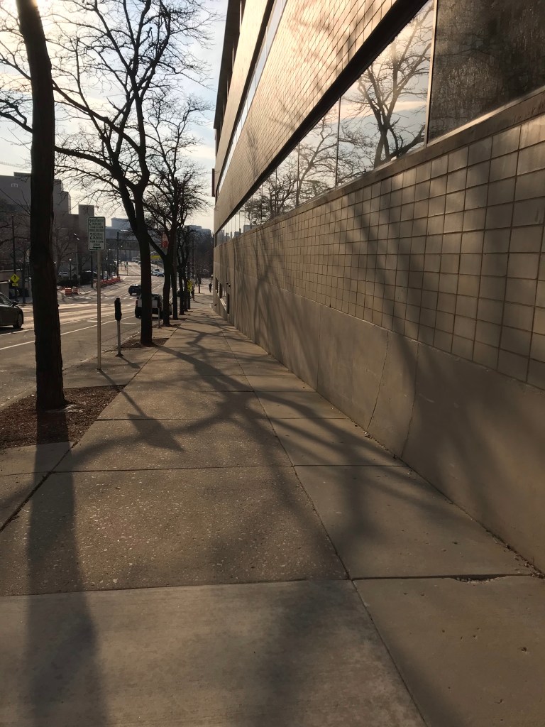
And can you see the man who is the subject of the picture? He’s way, way in the distance. Seemed a lot shorter in person. I think my iPhone must have a wider angle lens, which stretches out distance. In fact, I’m pretty certain it does, because 1) when I take pictures of buildings at a distance, the lines run at a slight diagonal instead of an up-and-down right-angled perpendicular and 2) if I take a photo of several people in a group shot, the people at either end of the line look much wider than they actually are. (PSA: So always stand in the middle when posing for any group shot!) Both of these are distortions that happen with wide-angle lenses.
In any case, I hope you can see the human in this photo that made this whole image worth capturing for me❤️
Would you like new posts delivered to your inbox? To subscribe, click here.


I’d vote for the lighter one. The darker one shows off the clouds better but otherwise seems muddy. And the clouds aren’t really the point. Looking at the cars, one can tell your camera made these very close but lighter one is just a fraction of a second earlier. (The yellow (crosswalk?) sign is in front of the car’s hood (on the far left) but over it in the second pic.)
LikeLiked by 1 person
I think I like the lighter one, too.
LikeLike
For some reason I like the second one. I think the light on the windows is brighter.
LikeLiked by 1 person
I can see that, now that you mention it. And the whole thing feels softer, somehow.
LikeLike
Definitely the first for me. I like the crisper shadows and the figure is more visible. I often take photos with a distant figure. I think it adds perspective and give the photo a focal point.
LikeLiked by 1 person