Because many of the courses I teach in the User Experience (UX) program at Milwaukee School of Engineering are subjects that didn’t even really exist 40 years ago and are still growing and developing domain parameters by the day (e.g., Digital Society, Writing for Digital Media, Digital Storytelling), I subscribe to A LOT of newsletters and other publications to keep up.
This morning I was glad to see that one of my favorite general design publications had a new issue in my inbox. The title of one article especially intrigued me: “The UX Crisis: Why 1 in 3 digital experiences are failing (and how to fix it).”
So I clicked through.
Yes, definitely something I wanted to read!
Given that I am always looking for new design challeges for my students, and this article seemed to provide plenty of food for thought, I decided to print it out so I’d have the hard copy handy for marking up with my own notes.
Except, oh well.
My “user experience” of this article turned out to be a “fail” of the very type described therein.
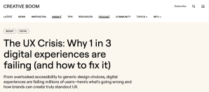
The Promise (of the article’s commitment to good UX)
 Article title bemoaning poor UX
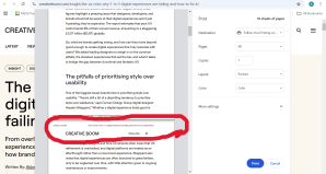
The Reality
 My attempt to print the article but realizing that some text was blocked by a ‘subscribe’ bar that is invisible on the screen (therefore unable to be x’d out)
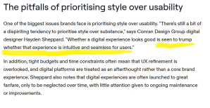
The Excluded Text
 Text excluded from the “print screen” by the “subscribe” bar
Oops, it seems like Creative Boom is deliberately setting out to frustrate anyone trying to print the article (or save it as a PDF) and to ensure that the only way someone can “experience” their article is to read it on their website. To put it another way, by forcing a site-specific, digital-only experience on its users (for ad $$ reasons? for increasing pressure to become a subscriber, which I thought I was already anyway?), Creative Boom limits users’ ability to shape their own experiences of the text and creates unnecessary friction as a result.
Very frustrating and disappointing. I guess I won’t be carrying around and making notes on this article after all.
I hate pop-ups and constant harassment to “subscribe” or to “lock in a 10% discount with your first order” and all the similar in-your-face aggressions of this type that websites inflict on someone who just wants to read an article or look at a potential purchase. Maybe I’ll subscribe, maybe I’ll buy—but first I want to be able to check things out and think about it a little without having to fend off the hard sell.
Call it “site abandonment,” “drop off,” “bounce,” or whatever other term might seem relevant—my decision to leave the Creative Boom website and give up on any further study of or reflection on this piece is (in my opinion) exactly the type of UX “fail” that was the whole point in the first place.
And I guess I expect better from a design publication.
[UPDATE — But, silver lining: As soon as I pressed “publish” on this post, I realized that at least this whole experience has given me an idea for a new design challenge. So there’s that! 🙂 ]


Your post touches on a topic that’s annoyed me for a long time. Totally agree!
A good friend of mine is married to a commercial artist, and she’s told me how aggravating it is for him that computer software made everyone a “graphic designer”. It’s harder for him to find work because companies now just have someone in the office whip stuff out with PowerPoint or whatever. And I think this is true with web design as well. Why pay big bucks to a trained professional big when “anyone” can design a website using a toolkit and templates. With AI it’s even easier, just prompt.
In consequence, lots of software has a less-than-ideal UI. And thus, a crappy UX. Software design became a popular cottage industry, and lots of unqualified, even incompetent, people are “writing code”. I despair over how much poorly written software I see. It’s like abstract art. Everyone thinks their kid could crank out something just as good. But software design is HARD and requires training and experience.
As an aside: Ever since the ‘web began I’ve been bemused by the tug-of-war between the original intent of http/HTML (content with meta-tags but rendered according to the user’s style preferences) and designers who want total control over how their content looks. At this point, that battle seems decided in favor of near-total control. Another triumph of style over content. But the API tools that have evolved to grant that control also allow egregious tricks like you experienced trying to print the article. (One would think the obvious downside of attempting total control over anything would be well-known by now, but humanity never seems to learn the important lessons.)
LikeLiked by 1 person
I totally agree with everything you’ve said and particularly find your “aside” to be intriguing. Yes, the idea that a user should be able to shape their own experience ought to be at the center of web design, including content. Instead, it seems like “branding” and the me, me, me orientation of the company’s own identity and interests take priority every time. I haven’t thought about my hostility to “branding” in a minute, mostly because the party line of total branding seems to pervade all aspects of every website’s design to the point where it appears both inevitable/inherent/intrinsic and widely expected/accepted. Words, colors, fonts, navigation style—everything is now “on brand” to the point where it begins to feel (to me) inauthentic and impersonal and quite detached from the user, who ought to be at the very center.
LikeLiked by 1 person
I totally agree back. 👍🏼
LikeLiked by 1 person
😂
LikeLiked by 1 person