
Yesterday Karen commented that she liked the black-and-white quality of the middle staircase photo. And that was really interesting to me, because even though it looked black and white, it was actually a color photo. Something about the way light was reflecting caused the green slate of the steps to fade away.
So then I fooled around with trying out some of the black-and-white filters in my iPhone camera, just to see what the image might look like in black and white. Here are the results.
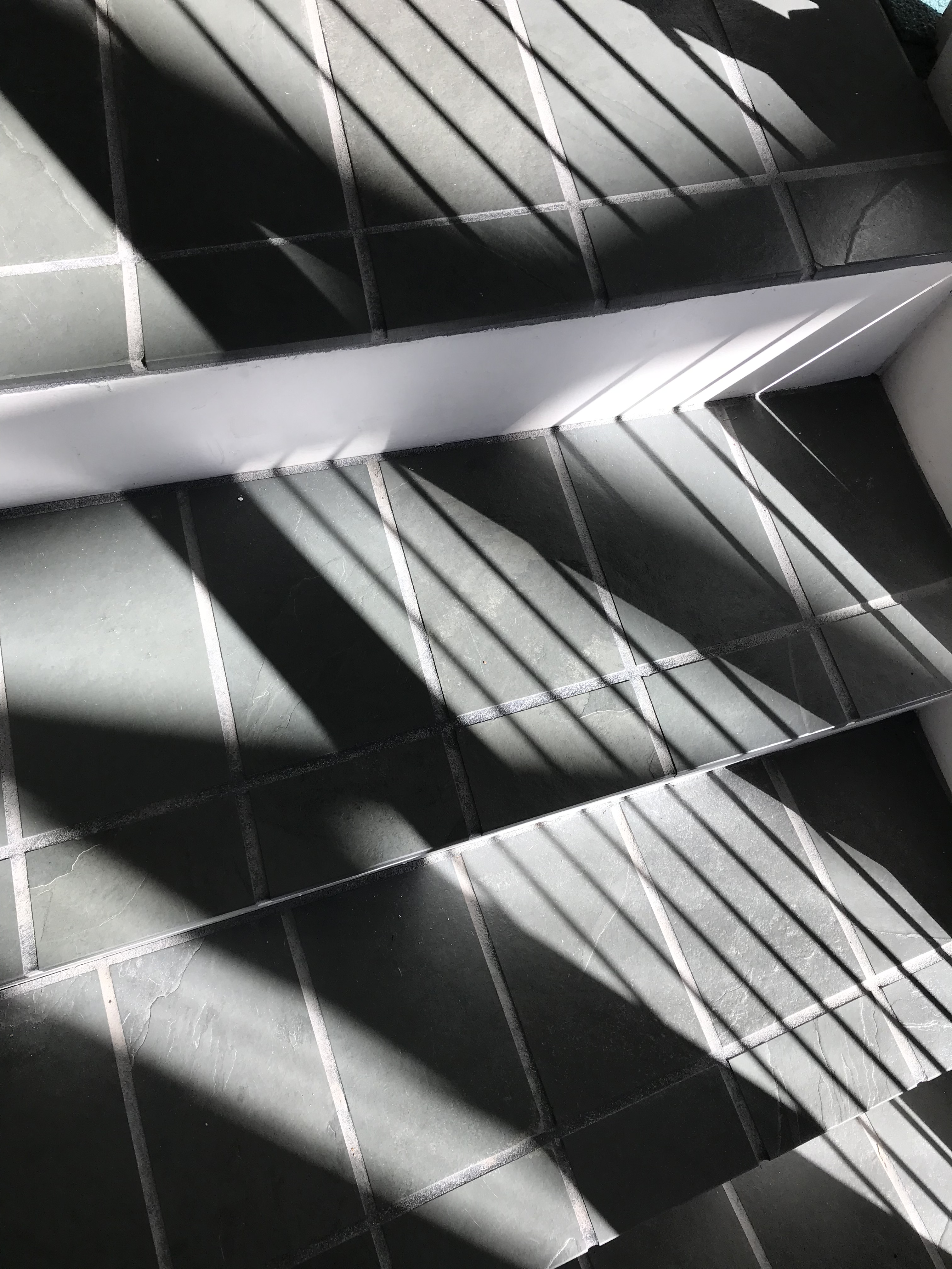
First, here is the original photo. You can barely make out the green tint of the stairs’ natural color. (I can tell at a glance that this one is my original, though, because of the tiny triangle of green at the upper right corner. I’m not sure what that was, but it was background that showed beyond the staircase riser. I thought about cropping it out but decided not to because I didn’t have time. Now I’m glad I didn’t because that little green patch is my quick “cheat” for telling the original apart from the mono black-and-white 😄)
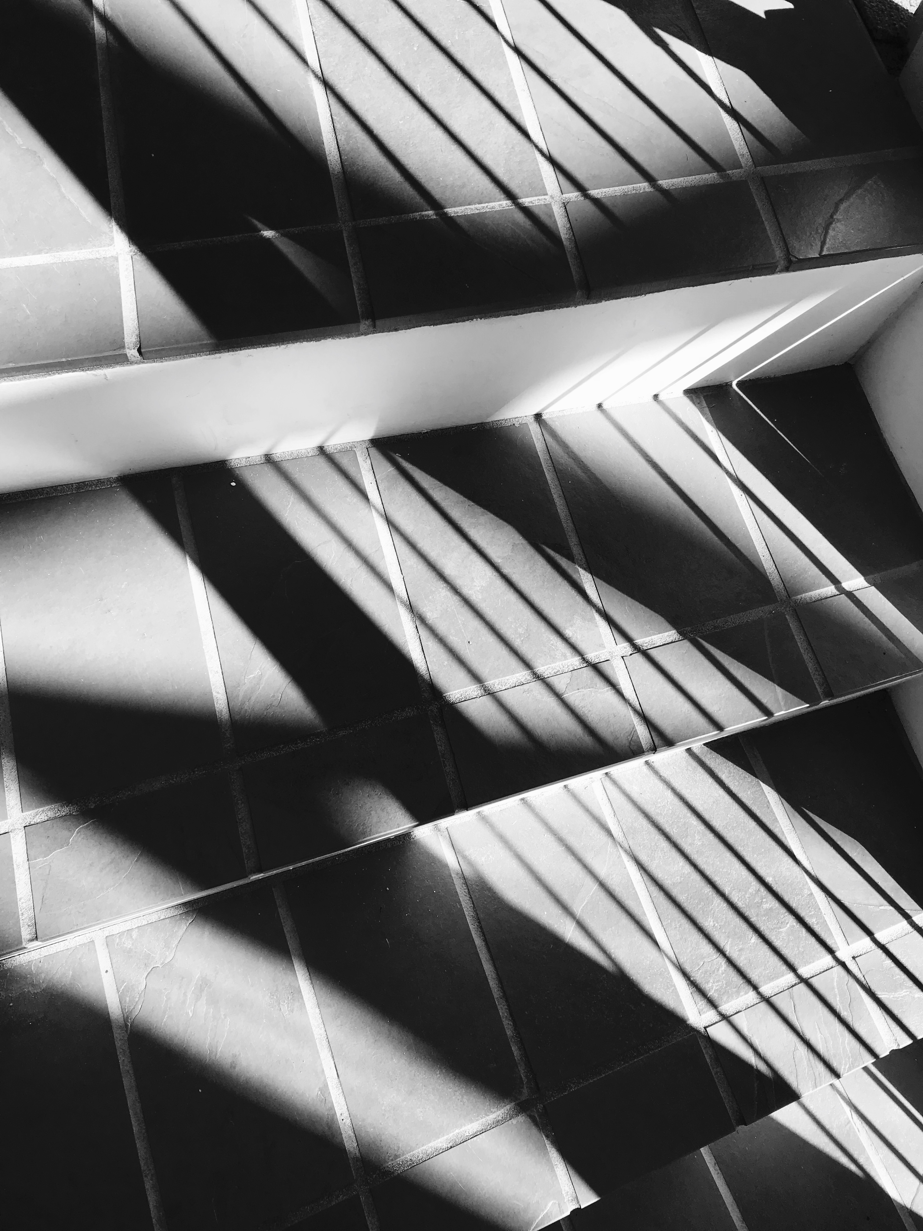
Here is my first pass at black and white. It’s the “Mono” filter.
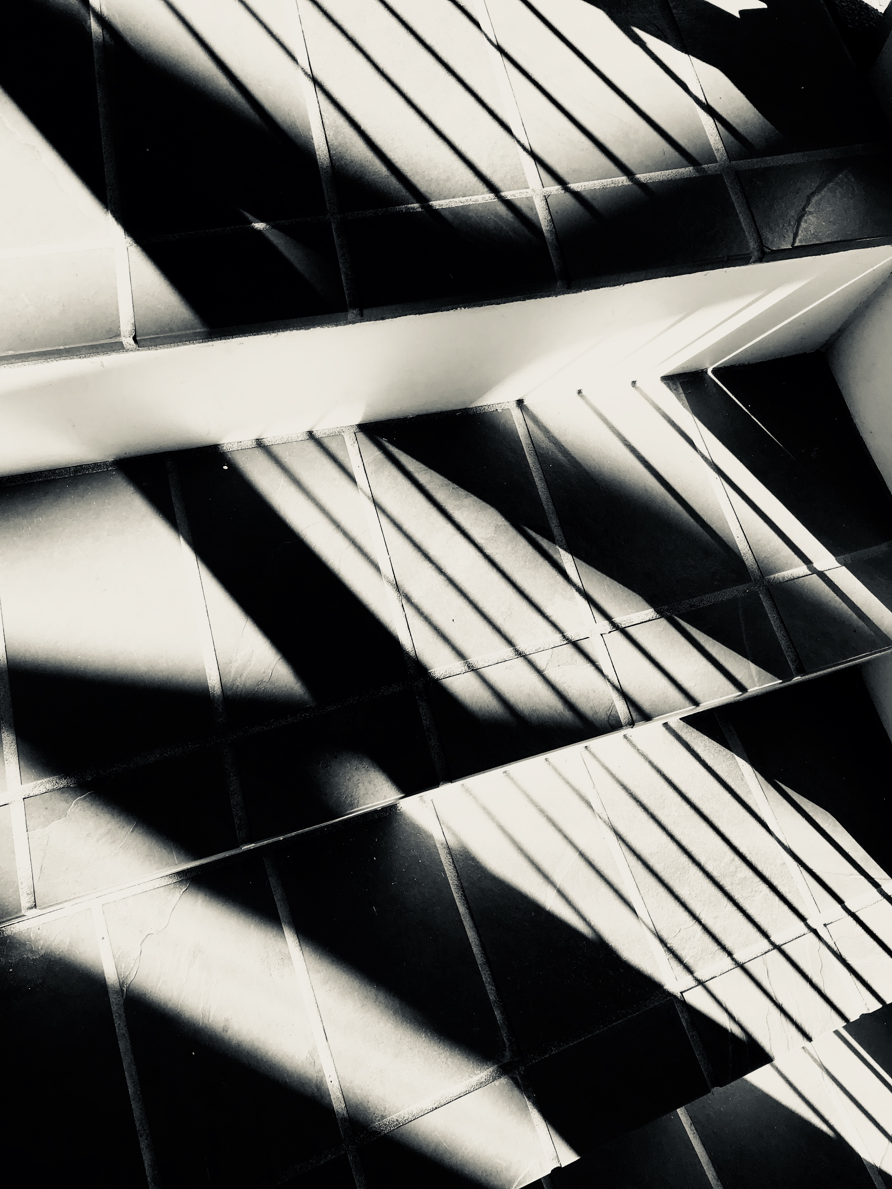
Next the “Silvertone” filter.
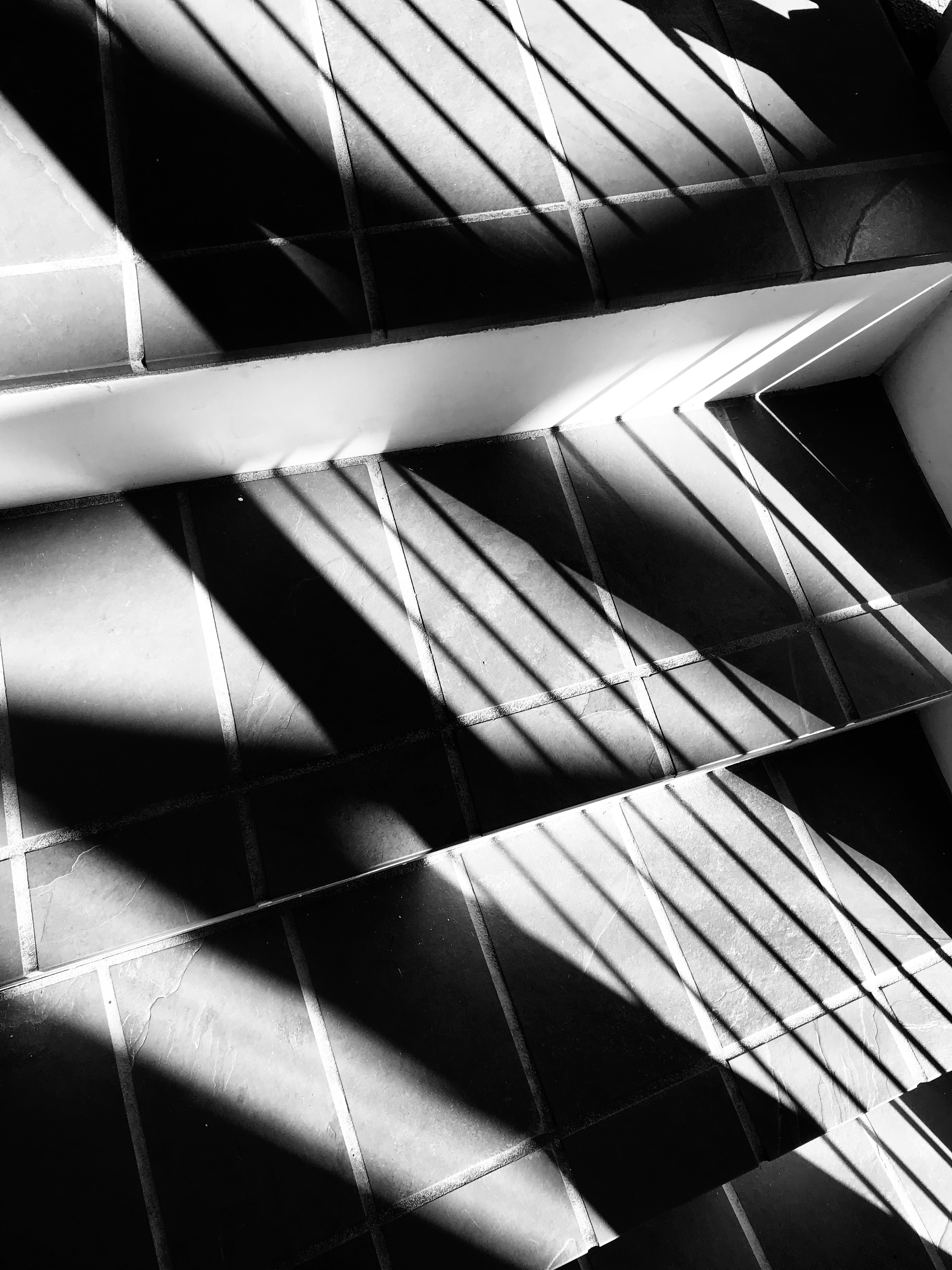
And finally, the “Noir” filter.
Of all these, I think I may like the original best, with its tiniest hint of green underlying the overall black-and-white effect. But they all appeal to me in different ways. Which do you like most?
(Side by side here in the same order: original, mono, silvertone, noir.)
Would you like new posts delivered to your inbox? To subscribe, click here.


Interesting. I, too, thought they were black and white.
LikeLiked by 1 person
I guess I am a purist! lol I like the actual black and white. I can see the hint of green on the original now, too!
LikeLiked by 1 person
I like the Noir. Maybe because it is slightly crisper than the others. Darker darks and lighter lights. Although the others, like the second road more traveled, are “really about the same.”
LikeLiked by 1 person