
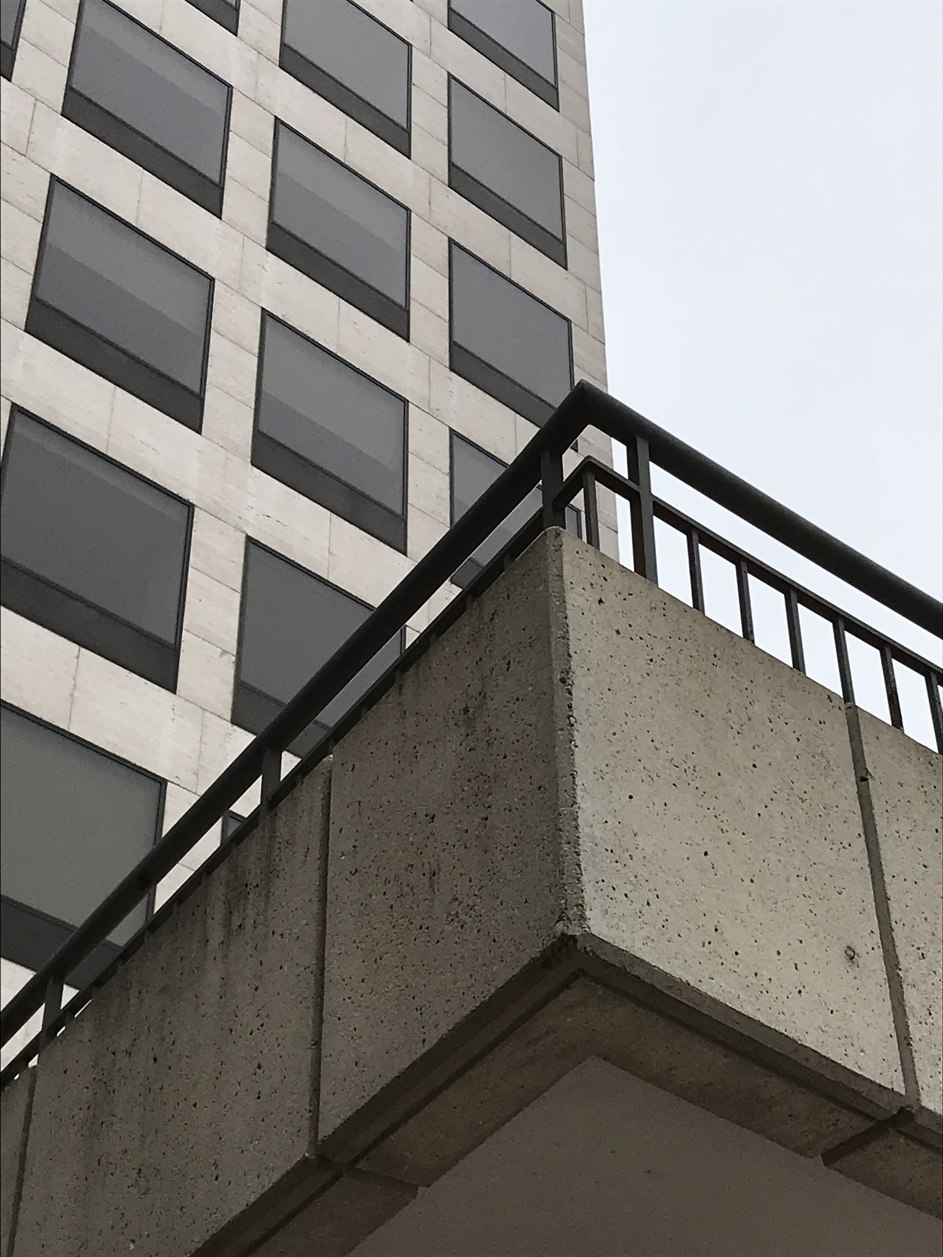
I happened to look up as I was walking into the Red Arrow Starbucks this morning, and I saw a photo. I took a couple pictures but can’t decide which of these I like best. They’re practically the same, just taken from slightly different angles and therefore having slightly different compositions.
I think maybe I prefer the first one, because I like the upward-jutting angle of the cement and railing of the plaza above and the way it dominates the lower half and foreground of the picture.
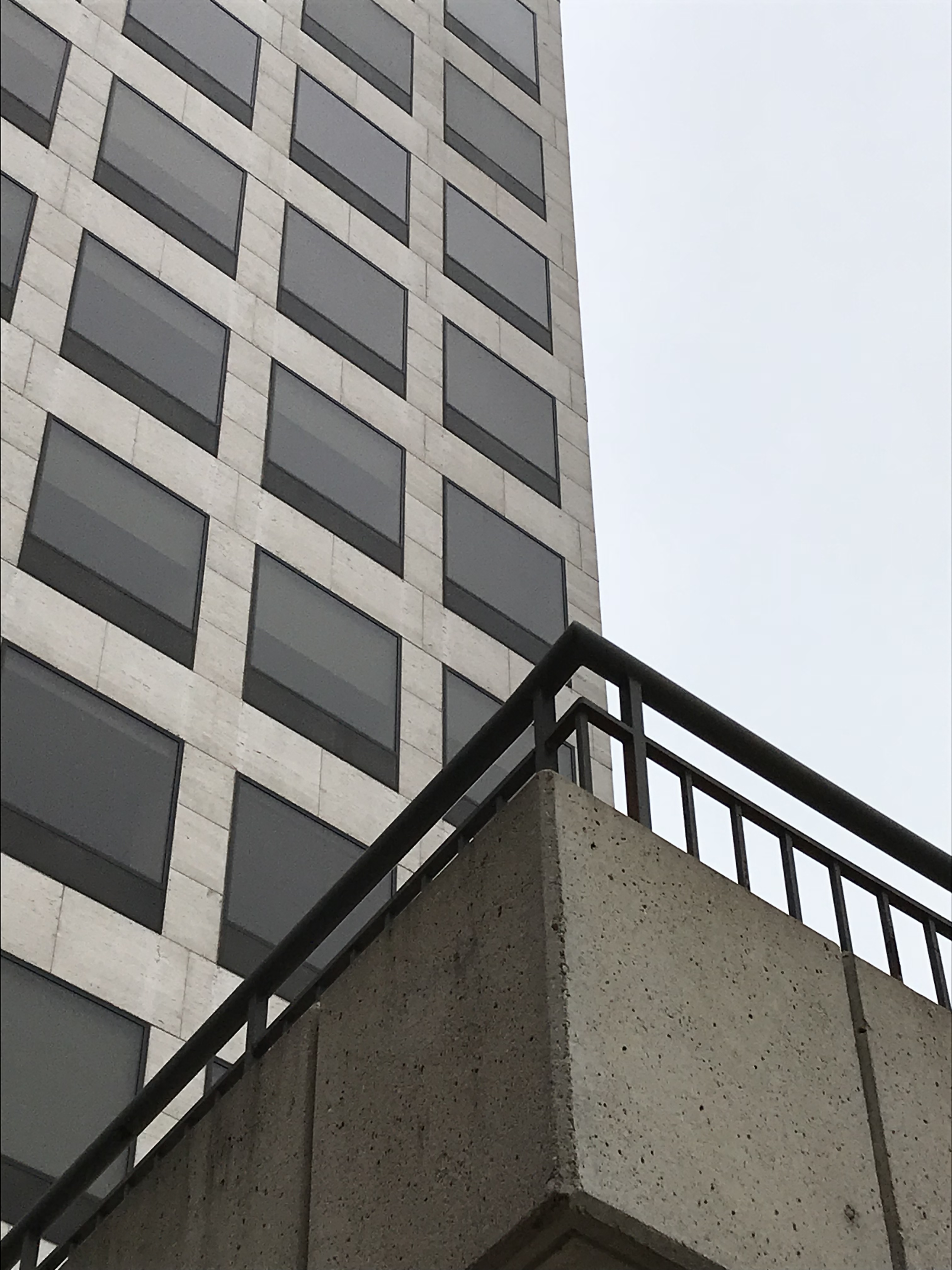
But I’m including my second photo, too. Taken from slightly farther away and therefore from a shallower angle, it doesn’t emphasize the concrete’s angle so much. I also like the colors here better. The gray-blue sky sort of changes the way I perceive the office building. It’s features seem softer and more monochromatic, with less contrast among the different colors. The overall effect is more calm than the first photo. Where the first photo feels darker, more dynamic and bold, somehow the second feels lighter, more peaceful and quiet.
Here they are side by side for easier comparison. Each has different arguments in its favor. Maybe there’s no clear “best” choice. But since I find myself mired in indecision, I thought I’d throw the question out to you. Which do you like best?


I like the contrast in the first photo. If it were my photo I would’ve eliminated the underside of the
over hang by the point of the bottom peak. The two structures just play off of each other. Cool
observation.
LikeLiked by 1 person
The first one is more dramatic but I think I like the balance of the second one best.
LikeLiked by 1 person
I like the second. The first seems very front heavy, with the emphasis on the cement. I like the lightness of the second with the emphasis on the windows.
LikeLiked by 1 person