
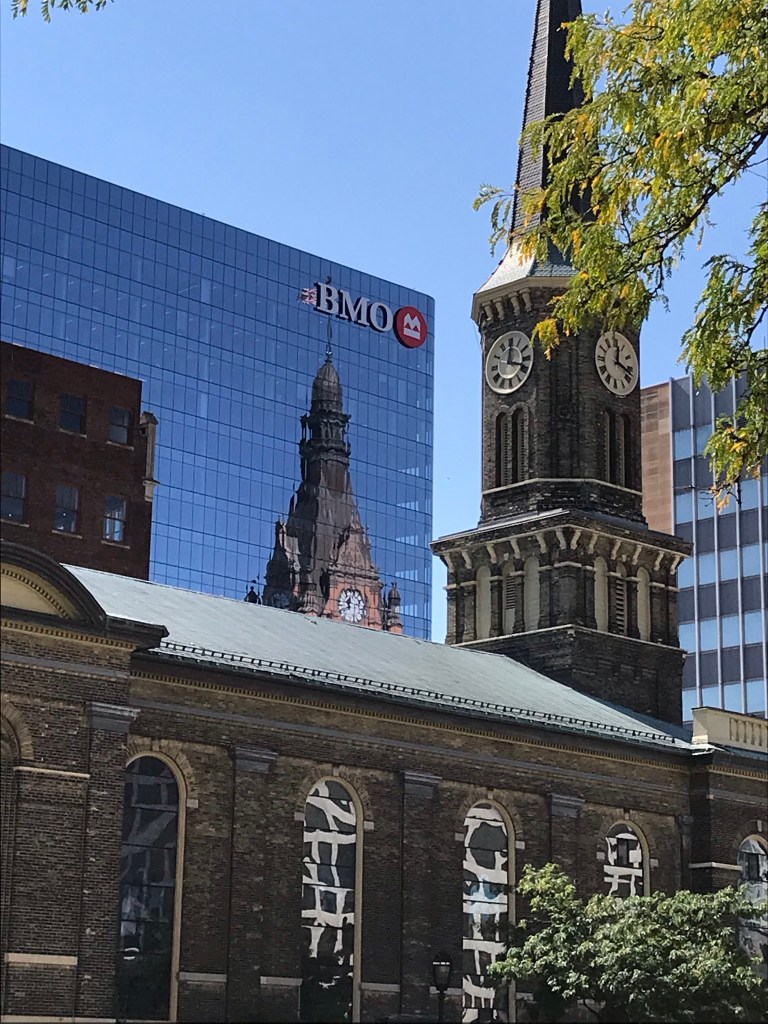
I was walking back from the Library and Science Buildings shortly after noon today and saw City Hall reflected in the BMO Harris building—a reflection I realized was new to me from this vantage point, since I guess I haven’t walked this sidewalk since the pandemic began. Yes, in fact, I just checked and found that the BMO Tower was new in 2020, so that makes sense.
Anyway, I was just really struck by the way City Hall looked in the reflection. Maybe it’s the tint/color of the glass, maybe it’s something about the construction of the windows themselves? But the City Hall reflection in this building’s windows looked different than it does in the windows of other downtown office buildings. (By the way, I’ve shot MANY photos of City Hall reflected in office buildings. If you search my blog for “city hall reflections” you’ll no doubt find a bunch of them😄)
In this first picture today I was trying to capture City Hall itself (well, its reflection) the best I could with my phone. And I do like this photo., although now I can see the little fringe of leaves in the upper left that ought to be cropped out.
But then I wanted to get Old St. Mary’s spire completely in the photo to correspond with City Hall’s, so I took this second photo.
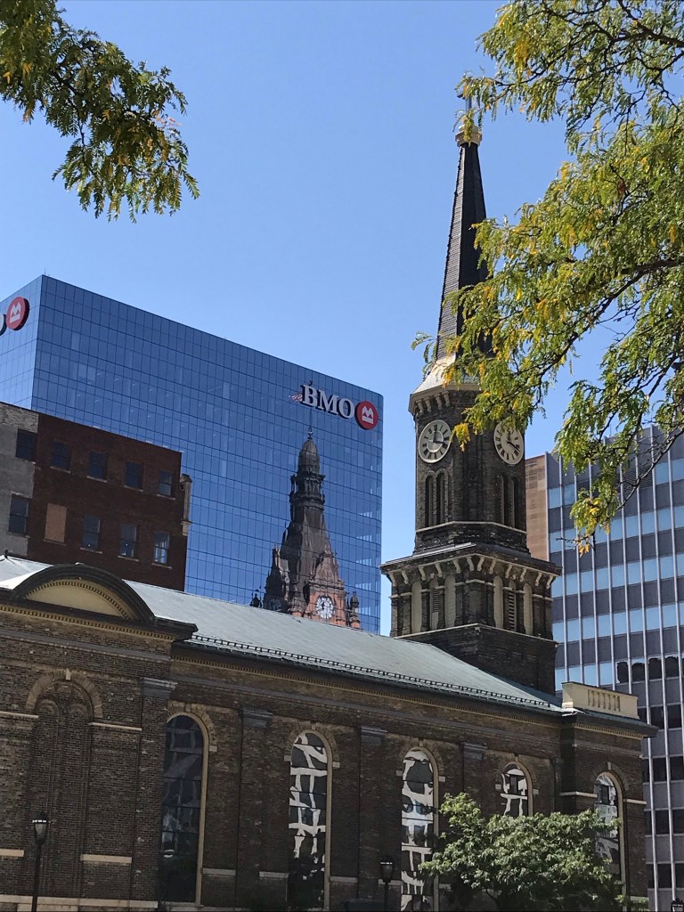
I couldn’t decide which one I liked best, and neither could my family when I asked for their opinions, so I’m just putting them both up.
What do you think?


Hi Katherine. Tough call. They are both excellent. After viewing and sleeping on it I choose the top photo. To me, it “feels” more dynamic and spontaneous than the second photo. What makes it feel that way to me is that the top of the spire isn’t visible, whereas it is in the bottom shot. The bottom shot looks more staged because of that. But both look wonderful. Best, Babsje
LikeLiked by 1 person
That first photo is the one we all liked better at my house, too. And City Hall’s reflection was the thing that grabbed me in the first place. The first picture gets that image, in that way, far better than the second. What you say makes so much sense. The bottom one does feel “staged” now that you mention it. Like kind of “traditional,” for lack of a better word. Thank you, Babsje!
LikeLiked by 1 person
Didn’t you just want to take the loppers to take out that leafy piece covering the cross on top of the spire? lol With window technology advancing it’s amazing how the reflections of surrounding buildings are reflected during various weather conditions. I do like them both but leaning towards the second photo since the spires are different from one another. If it were just the one spire being reflected you could get away with the first photo which would show you visually what you were not seeing on the top of the church spire in the photo. But dig the modern white wavy lines in the old church windows.
Thanks Katherine, for taking the time to record what impacts you visually. I like to do that as well. It’s a fleeting moment in time that you can’t get back.
LikeLiked by 1 person
Yes, I agree! These are fleeting moments that you can’t get back. That’s what makes my phone so great: I always have a camera with me!
It took me awhile to notice and understand what was going on with the Old St. Mary’s windows. Then I realized that it was the white 330 Kilbourn building towers reflected in all the colors of stained glass and made jagged by the irregular little pieces of glass threaded together by lead solder. At first, when I focused mainly on the City Hall reflection, my unthinking take on the church windows was that it was some sort of latticework, like trellises or something.
LikeLike
The picture you captured as a whole is interesting to look at….well done 🙂
LikeLiked by 1 person
You’re welcome. The second one is almost too perfect – like a postcard. The first is more Art. 😊
LikeLiked by 1 person
I think I like the second one best because one gets to see the whole spire of the church. Your comment on having taken “MANY photos of City Hall reflected in office buildings” made me think of Claude Monet’s series is stacks of harvested wheat.
LikeLiked by 1 person
Well, I know I’m no Claude Monet, but THANK YOU!!!! Because I never thought of it that way, and that’s sort of cool to think that I have my own series of haystacks 😄❤️
LikeLike
For some reason, I think I like the first one. The faces of the clocks are clearer. But they are both interesting!
LikeLiked by 1 person
Thanks, Karen! It was definitely the large clock face of the City Hall reflection that first caught my eye. But then I kind of also liked the more “stately” feel of the one that shows the entire length of the two spires. Decisions, decisions . . . 😄
LikeLike