Panorama of the Panorama!

I stopped in this morning to see the Grohmann Museum’s new exhibit.

Although it opened May 27, I’ve only been in the building since then during hours when the gallery is closed. Last week was finals, and between holing up to grade over the weekend while also prepping to lead my Great Books event Wednesday evening (we talked about Annie Baker’s The Flick, which won the 2014 Pulitzer Prize for Drama), I just haven’t been around much in the daytime.

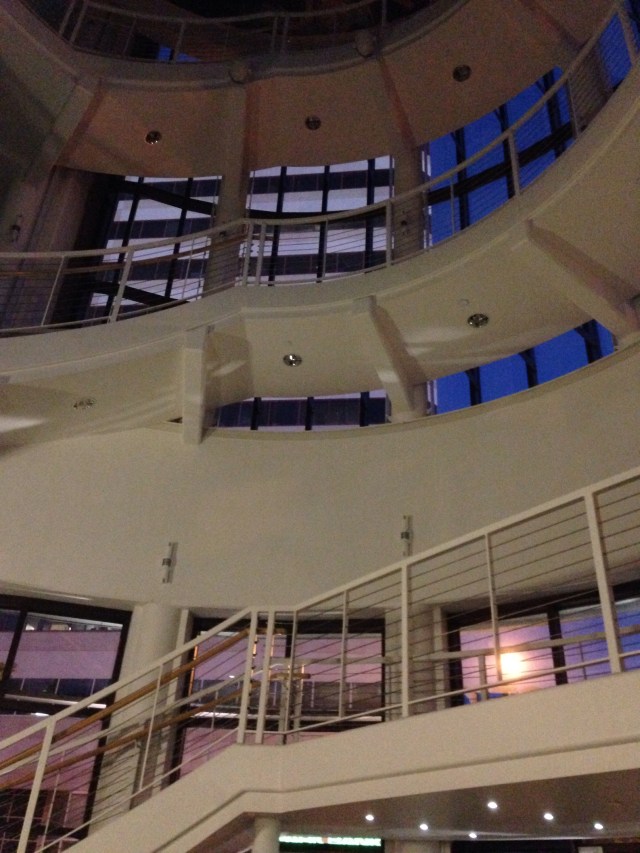
First of all, by the way (and just because . . .), here’s a photo I took of the Grohmann’s entrance atrium as I left the building around 9:00 Wednesday evening after dropping my laptop and other materials at my office when Great Books ended. The “gloaming” twilight made everything more striking somehow than it is during the day. The general public is never inside the museum at night except during Gallery Night, and then all the inside lights are on, meaning you’d never be able to see this exact view anyway, with the bluish-purple evening light illuminating the staircase through the arc of glass walls. So I thought I’d share 🙂
image

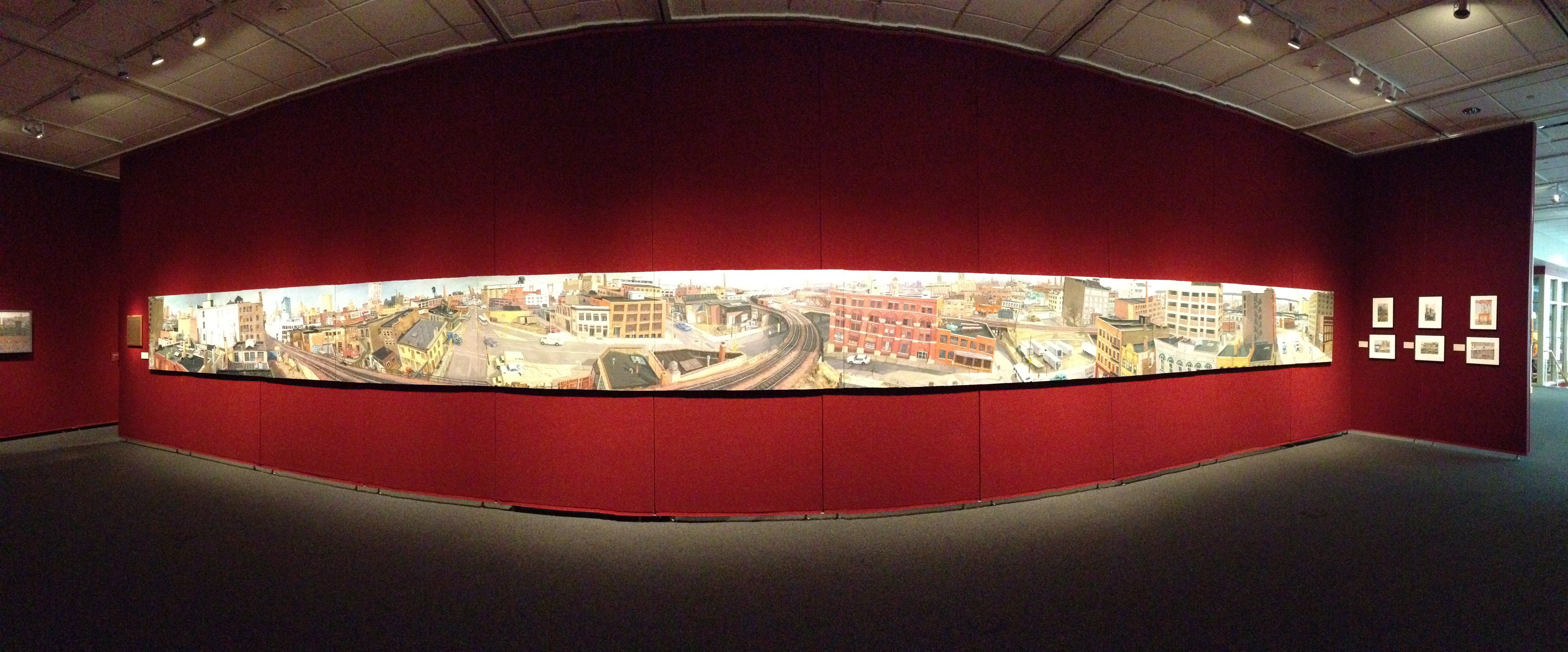
Okay, back to the new exhibit. It’s called “Milwaukee’s Industrial Landscapes: Paintings by Michael Newhall” and it runs May 27–August 21.

image

The showpiece of the exhibit is a massive 9-panel panorama of Milwaukee’s Walker’s Point neighborhood. It takes up a whole wall by itself! I couldn’t resist taking a “panorama of the panorama” just to see what it would look like. It’s pretty cool! (You can click on the photo to enlarge it to full screen.)
"Walker's Point Pan, 1984-87" by Michael Newhall

image

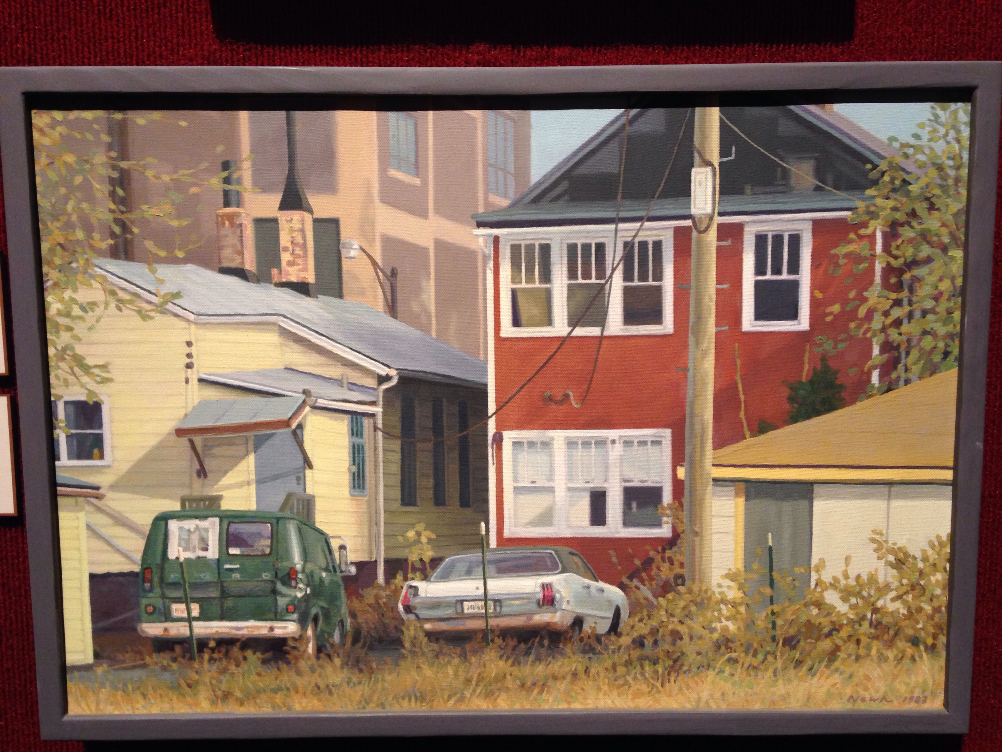
And then there’s also this other painting I liked that struck me as really different and intriguing.
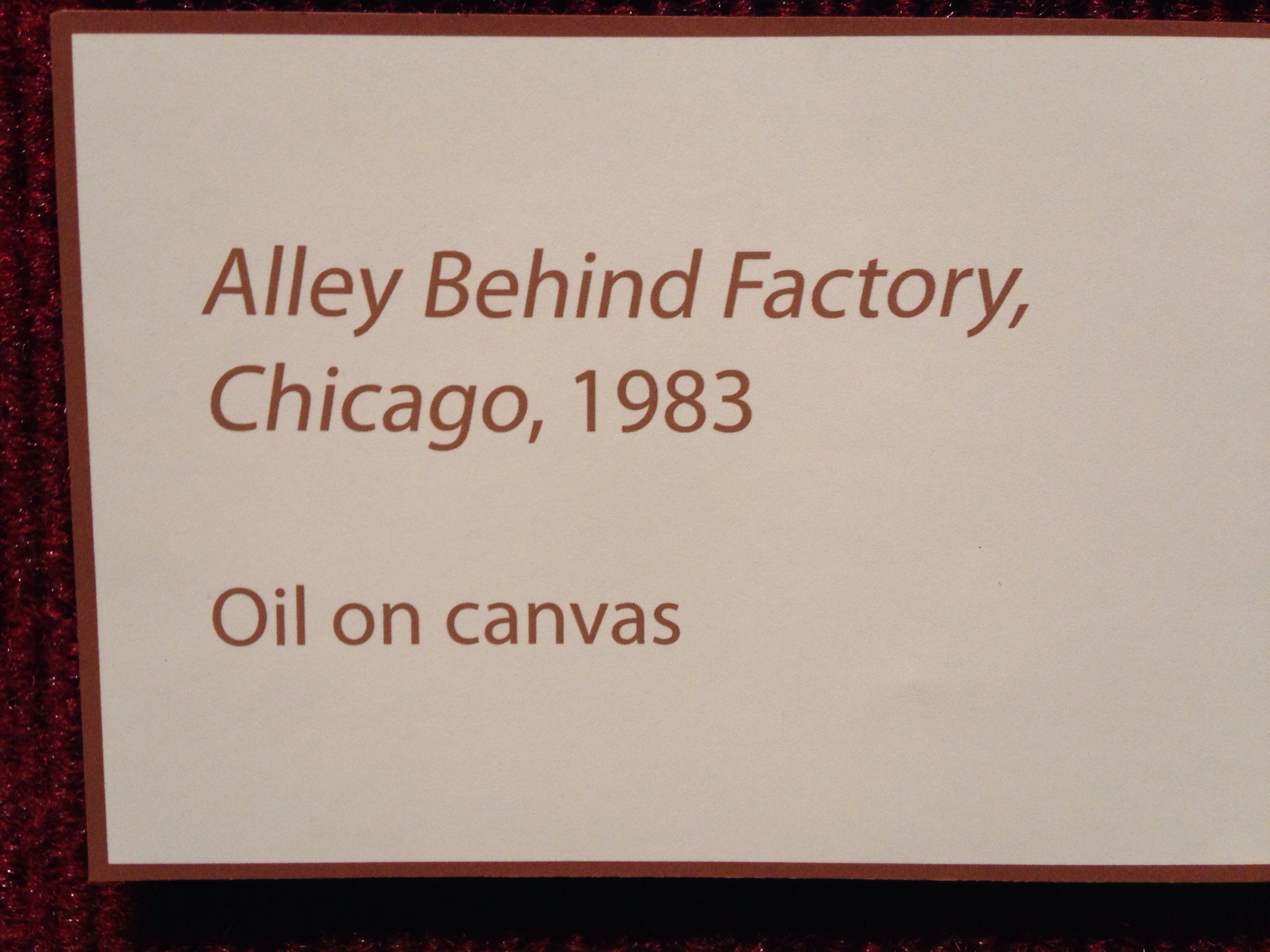
"Alley Behind Factory, Chicago, 1983" by Michael Newhall

image

You may be able to experience what I’m getting at if you click on the photo of the painting above to enlarge it. (Don’t double click, for you’ll get an enlargement so huge you can see the canvas weave, which is sort of fun but also way too big for the point I’m making 🙂 ) Or you can just look at the smaller section enlarged below (or even click on it to get a larger version of just this portion of the painting, if you like.)image
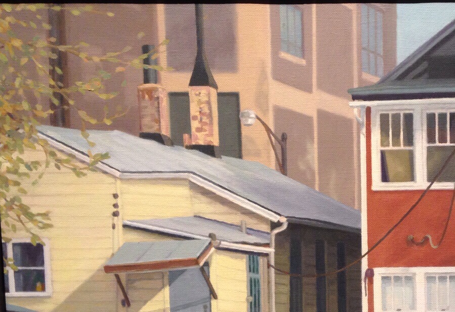
Look at how crisp the detail of the two houses is compared to the trailing tree branches in the foreground and the factory building in the background. It’s like this painting somehow approximates the shallow depth of field you might see in a photograph taken with a telephoto lens. I’ve never noticed a painting do this before (possibly because I just don’t visit enough galleries and museums), and I really like the effect this technique has on the painting.

Or maybe I should say on the viewer’s experience of this painting.

When I focus my gaze on the chimneys of the yellow house, suddenly the foreground and middle ground elements seem to come closer to me while the cocoa-colored factory in the background simultaneously recedes and rushes forward. Your mind’s eye recognizes the building’s distance while also perceiving its abnormally close presence and mass. It’s a very odd, disconcerting sensation of almost physical movement.

Can you feel it, too?
Posted in Art, Milwaukee, Photography | Tagged , , , , | 1 Comment

The Lilac Tree

‘The Lilac Tree’ features a natural field recording of a Blackbird in full song. Recorded 17 May 2016, Saham Hills, Norfolk, England.

Source: The Lilac Tree

(Note from me: Sounds like R2D2 here and there😄)

Posted in Nature | Tagged , , | Comments Off on The Lilac Tree

Tenacity (or, “Life finds a way.”)

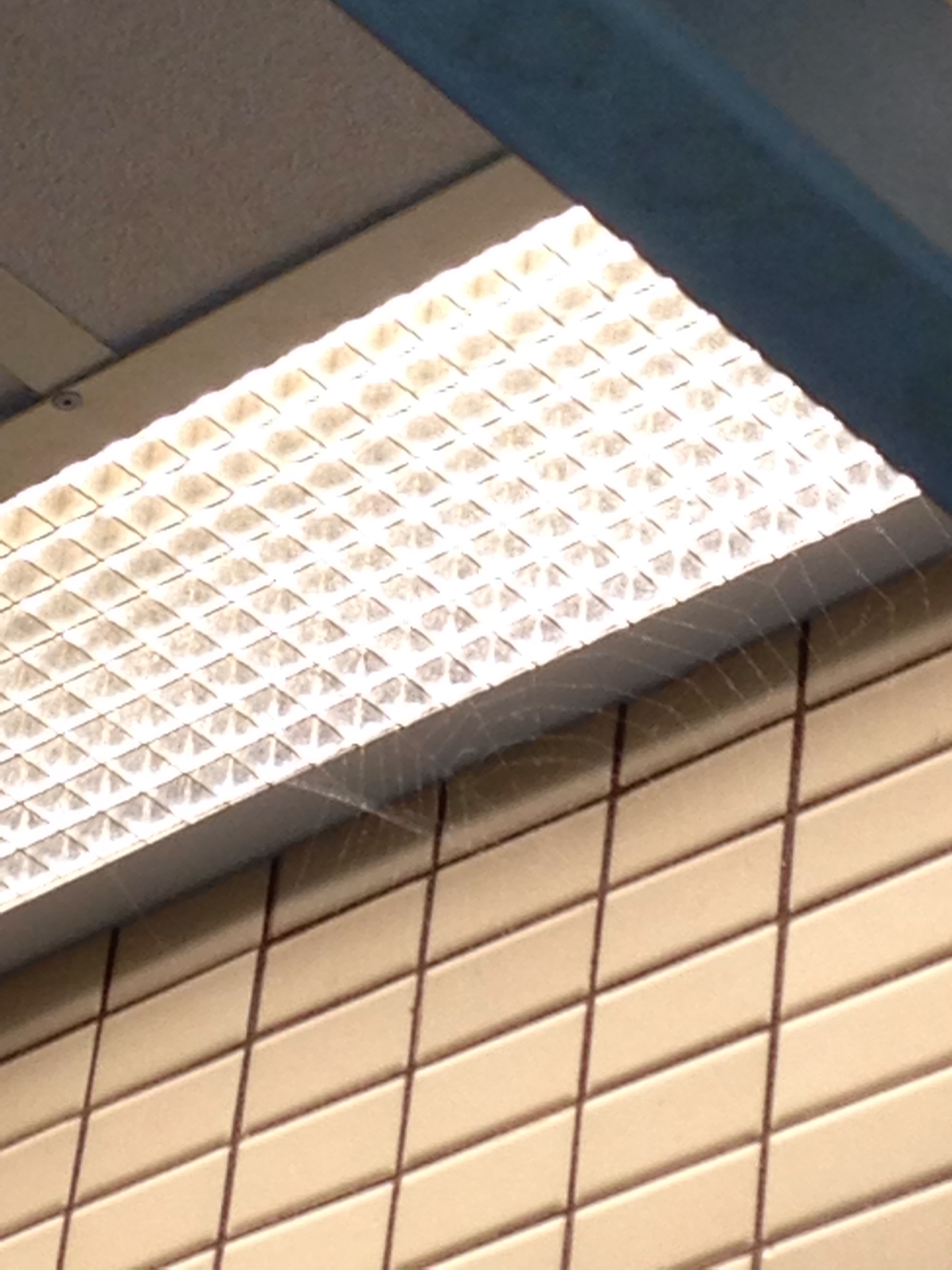
At first glance this probably looks like my usual abstract, geometrical whatever type of photo. (It surprises me to realize I even have a “usual” type of photo . . . )

spider web in public restroom

But look again.

Can you see it? That delicate little spiral framework of a spider’s web?

No matter how impregnable or sterile our human “fortresses” may seem, life really does find a way to”break through” and continue functioning—thriving, even!—despite our best efforts at control.

(Below, from Jurassic Park, an exchange that ends with one of my favorite movie lines ever 🙂 )


Posted in Life, Movies and film, Nature, Photography | Tagged , | 9 Comments

Blue Skies over the MSOE Campus Center / Blatz Brewery Bottle House

It’s been a nose-to-the-grindstone kind of day. Reading lots of student drafts in my two sections of film studies and compiling/composing feedback for the debate teams in my freshman studies class. I got to work shortly after 8:00 this morning and will be reading and commenting on student work into the evening. Fellow teachers know what I’m talking about.

Blue skies over MSOE Campus Center / Blatz Bottle House

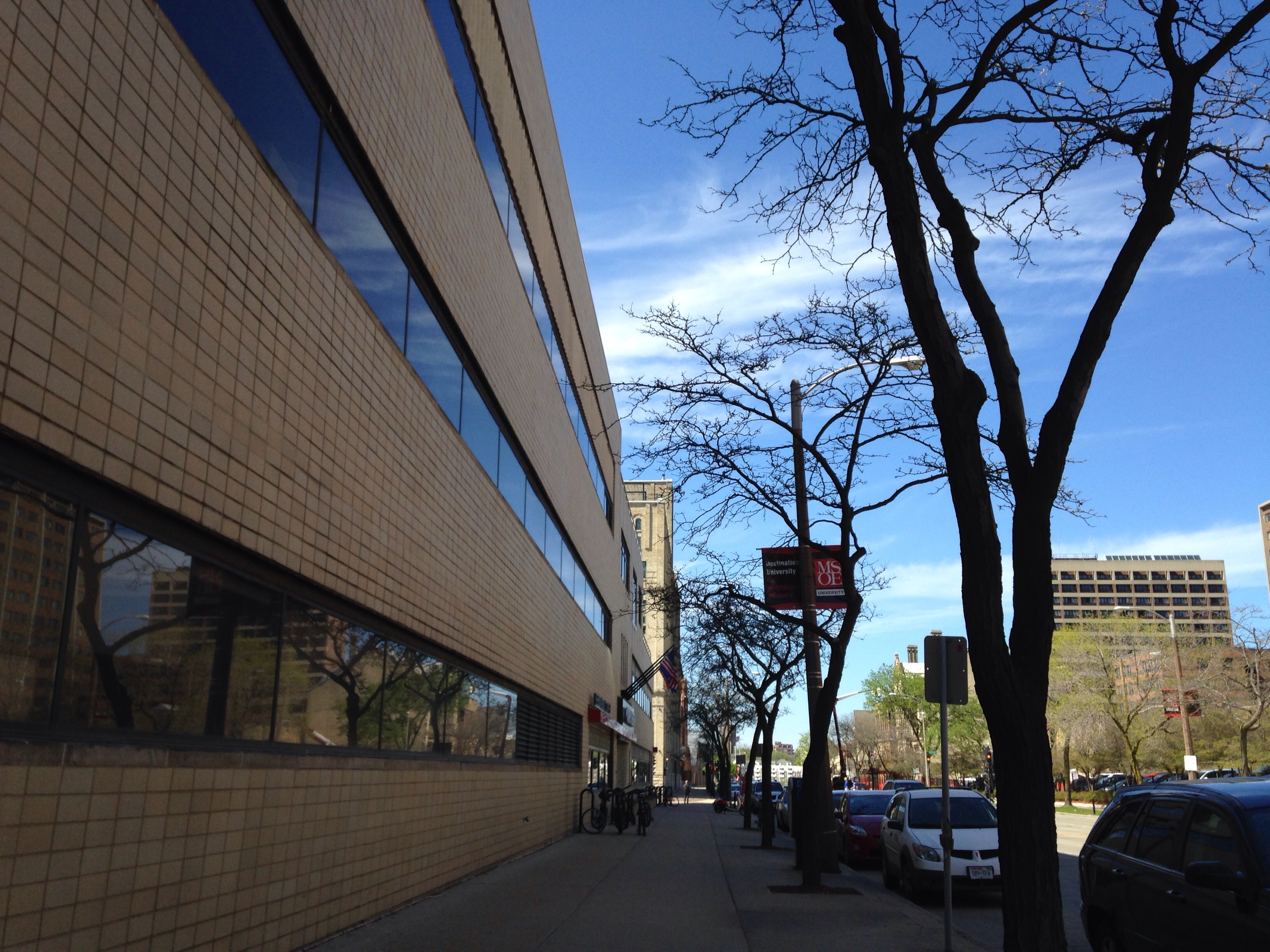
While walking from one building to another under a cheerful blue sky in the cool breeze coming off Lake Michigan this afternoon, though, I did take time out to snap some pics of MSOE’s Campus Center, the former Blatz Brewery Bottle House. This building (an example of Streamline Moderne architecture) is one of my favorites, as I’ve mentioned before, here and here, for example 🙂

So when I saw the sky reflected in the line of windows that sweep along the front of the structure, what else could I do?

German-English Academy reflected in MSOE Campus Center / Blatz Bottle HouseThat’s the German-English Academy Building most prominently reflected in that bottom row of windows, by the way. Wikipedia article (short one) here.

Posted in architecture, Milwaukee, Photography | Tagged , , , , , , | Leave a comment

Fallen Petals in Wet Grass

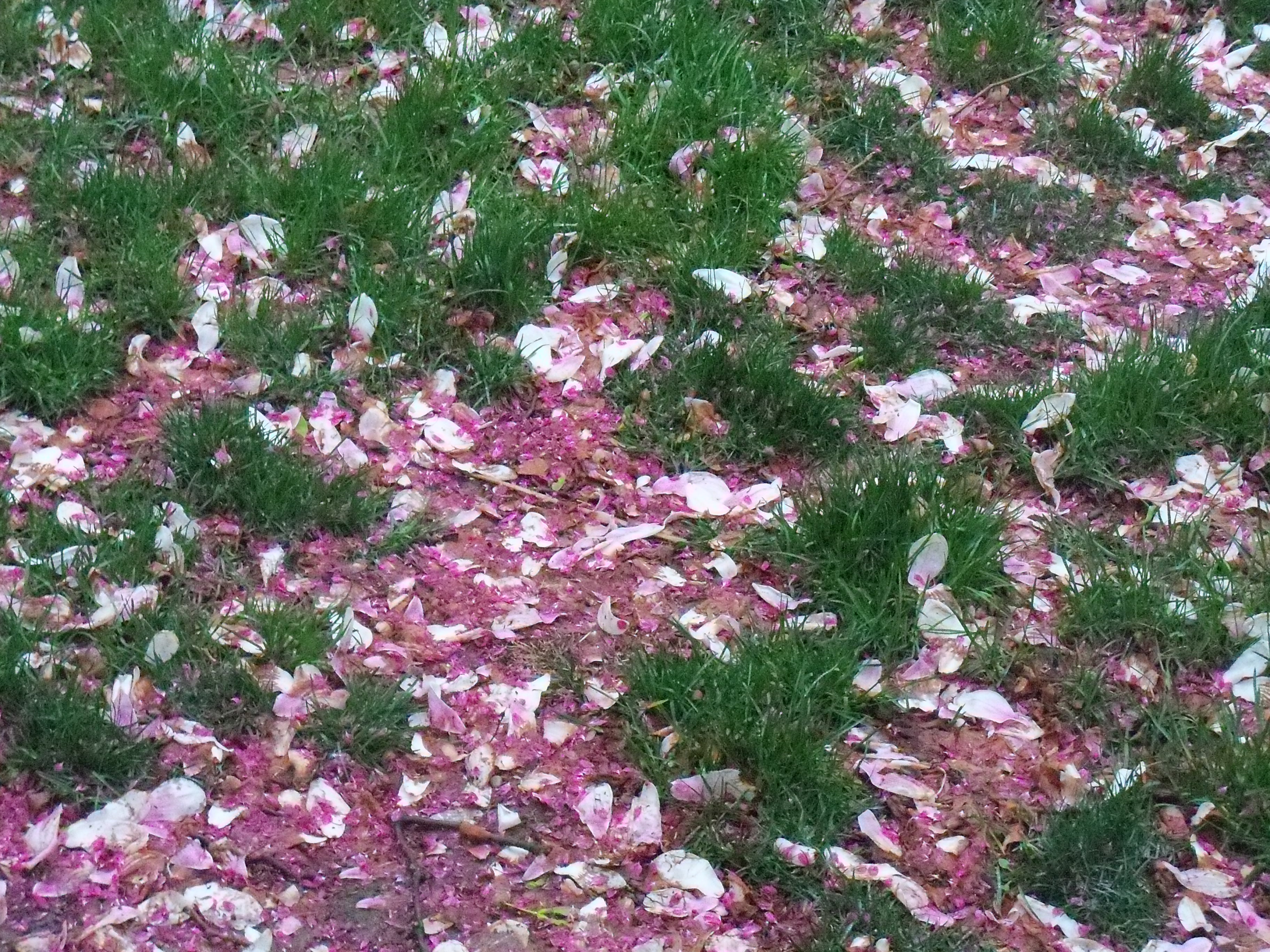
fallen magnolia petals and crab apple blossoms in wet grass

When the spring rains come, the litter of magnolia petals and crab apple blossoms somehow reminds me of the Ezra Pound poem, “In a Station of the Metro”:

The apparition of these faces in the crowd:

Petals on a wet, black bough.

That image! Like a painting, a flash of insight, a glimpse of the eternal.

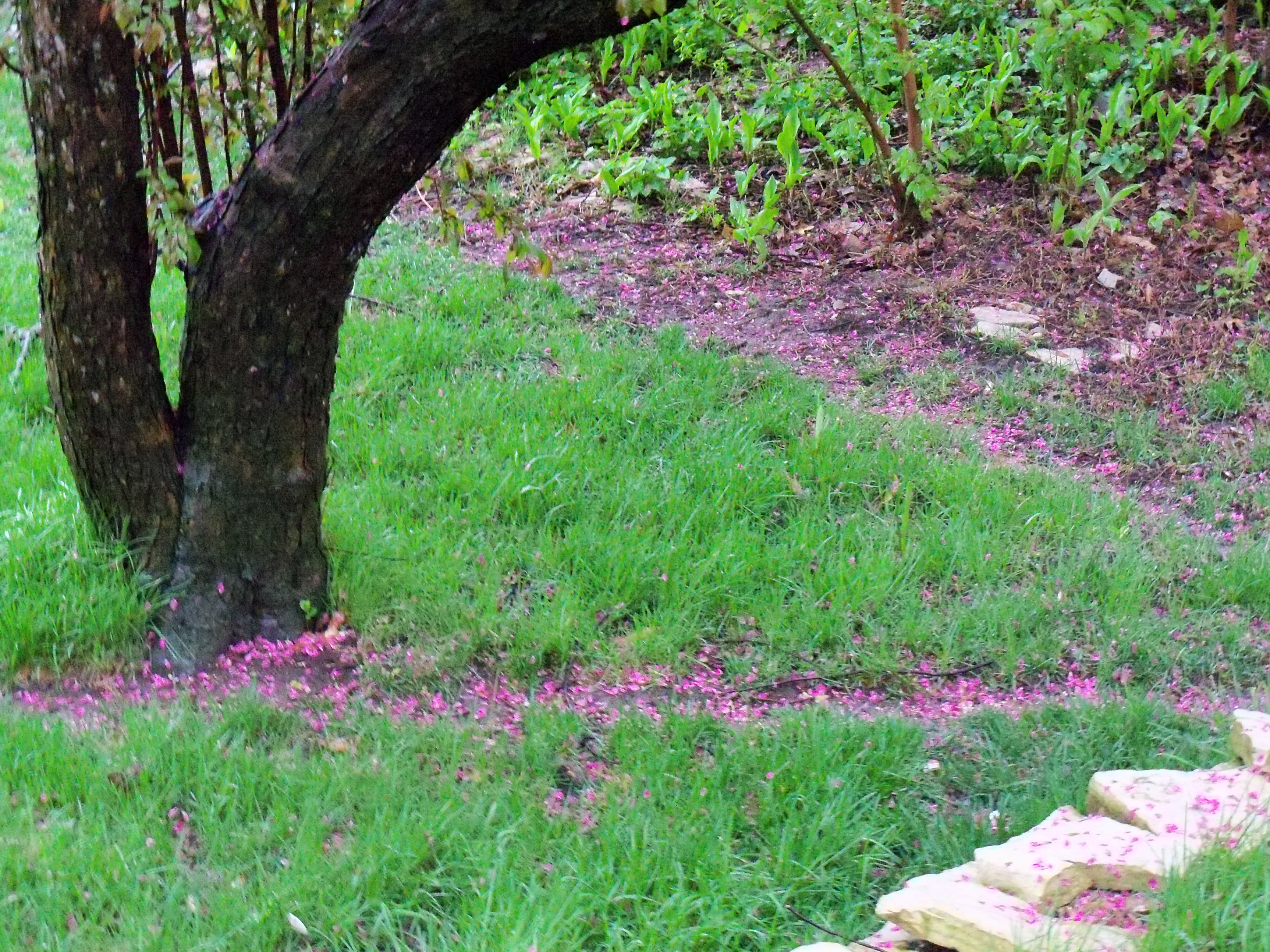
Dog paths strewn with fallen pink crab apple blossoms (beneath wet, black boughs)


Posted in Books and reading, Life, Milwaukee, Nature, Photography | Tagged , , , | Leave a comment

A Shining Cross (and why I’m no Ansel Adams)

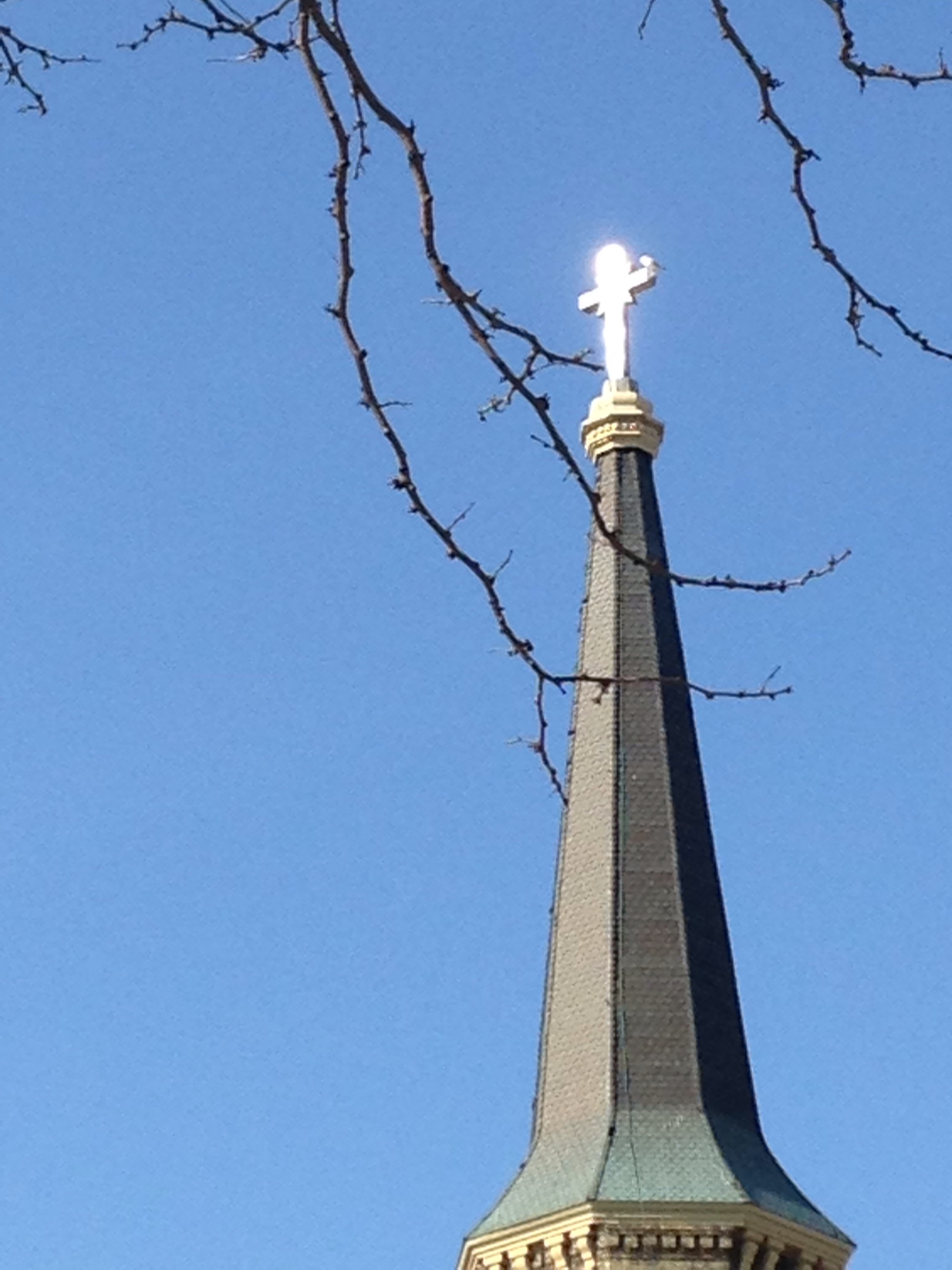
The glint of sunlight reflecting off this cross atop Old St. Mary’s Church caught my eye as I walked back to my office around 9:00 this morning after teaching my first class.

sun shining on glowing cross

Here’s a reverse shot I took a bit farther down the hill, just to give you an idea of how bright the sun is today and how cloudless the sky after a few weeks of windy, wet, chilly weather.

church steeple silhouetted against bright sun

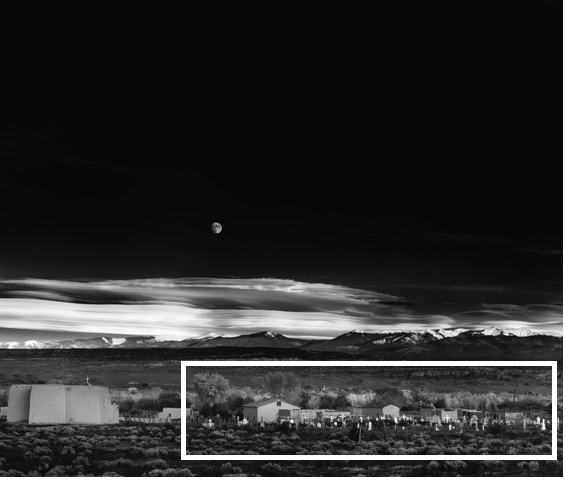
In a way this glowing cross reminds me of some other, far more famous glowing crosses: those of the cemetery in Ansel Adams’ Moonrise, Hernandez, New Mexico.

Moonrise, Hernandez, New Mexico, taken October 31, 1941 (via Ansel Adams Gallery)

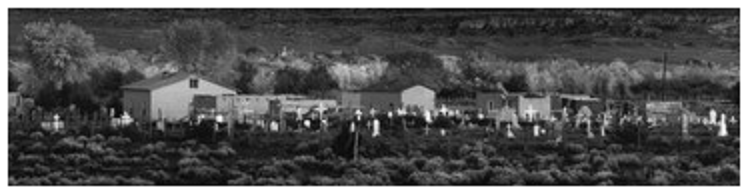
Here’s a close-up area of detail, in case you aren’t seeing the almost supernaturally glowing crosses very well here, although some clarity is lost in my enlargement of this print.

Moonrise - close-up on area of detal outline

Adams described getting this shot in his 1983 book, Examples: The Making of 40 Photographs (via The Ansel Adams Gallery, official source for Ansel Adams’ prints and run by the Adams family since 1902):

We were sailing southward along the highway not far from Espanola when I glanced to the left and saw an extraordinary situation – an inevitable photograph! I almost ditched the car and russed [sic] to set up my 8×10 camera. I was yelling to my companions to bring me things from the car as I struggled to change components on my Cooke Triple-Convertible lens. I had a clear visualization of the image I wanted, but when the Wratten No. 15 (G) filter and the film holder were in place, I could not find my Weston exposure meter! The situation was desperate: the low sun was trailing the edge of the clouds in the west, and shadow would soon dim the white crosses.

I was at a loss with the subject luminance values, and I confess I was thinking about bracketing several exposures, when I suddenly realized that I knew the luminance of the moon – 250 c/ft2. Using the Exposure Formula, I placed this luminance on Zone VII; 60 c/ft2 therefore fell on Zone V, and the exposure with the filter factor o 3x was about 1 second at f/32 with ASA 64 film. I had no idea what the value of the foreground was, but I hoped it barely fell within the exposure scale. Not wanting to take chances, I indicated a water-bath development for the negative.

Realizing as I released the shutter that I had an unusual photograph which deserved a duplicate negative, I swiftly reversed the film holder, but as I pulled the darkslide the sunlight passed from the white crosses; I was a few seconds too late!

I think I may love that story even more than I love the photograph itself. So dramatic!

No such excitement with my own photo, sadly. I just took note of the shining silver cross, stopped walking, pulled out my phone. Yeah, I took several shots from slightly different positions so as to get the most incandescent reflection possible. But no car to ditch, no companions to yell instructions at, no equipment to fumble with, no ticking clock, no setting sun.

Sigh. 🙂

(Update, November 12, 2021: Someone visited this post today, and it’s been a while since I’ve seen this title in my stats, so I revisited it and took a look for the first time in years. And I just noticed for the first time ever that there’s a BIRD!!! sitting atop the cross. I always wondered why the cross looked so distorted and figured it must be a trick of the bright light reflecting off the metal. Nope. It’s a white bird, probably a gull, Lake Michigan being a mere few blocks away. So, FYI 😄)

Posted in Art, Creativity, Milwaukee, Photography | Tagged , , , , , , | 6 Comments

Making a Picture

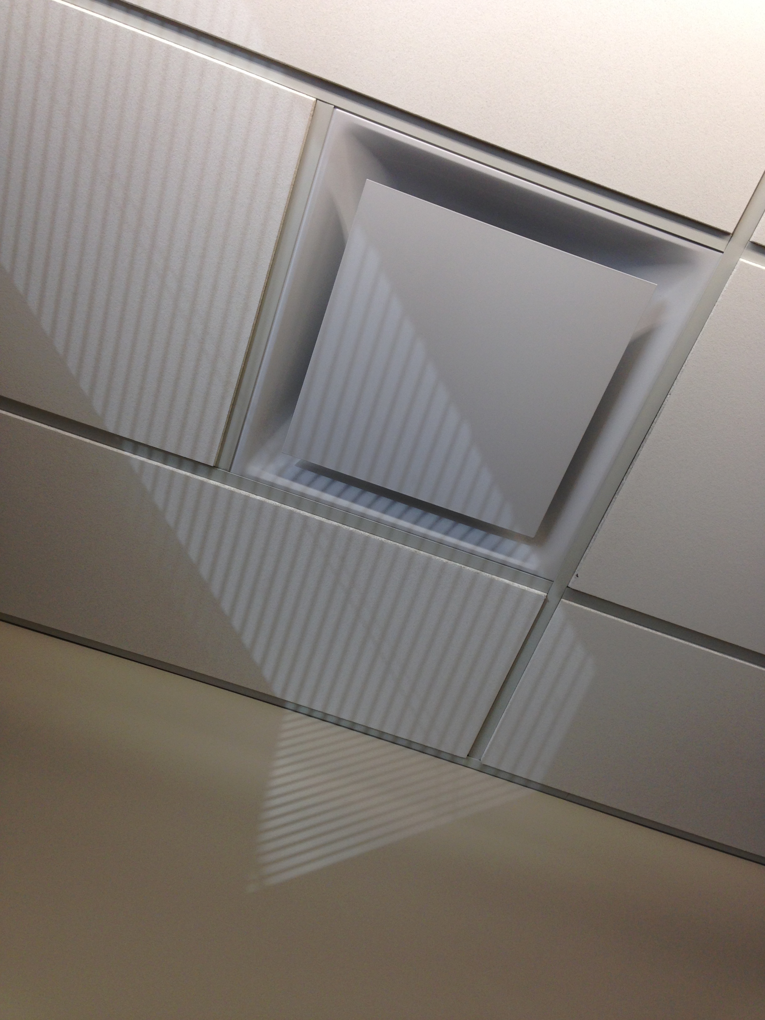
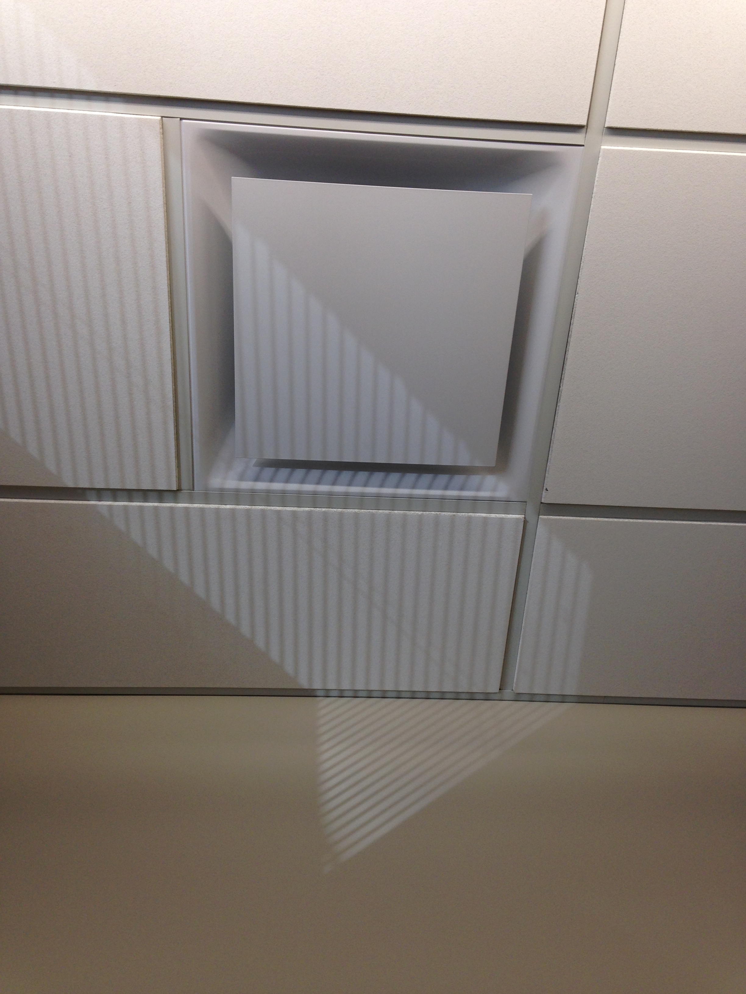
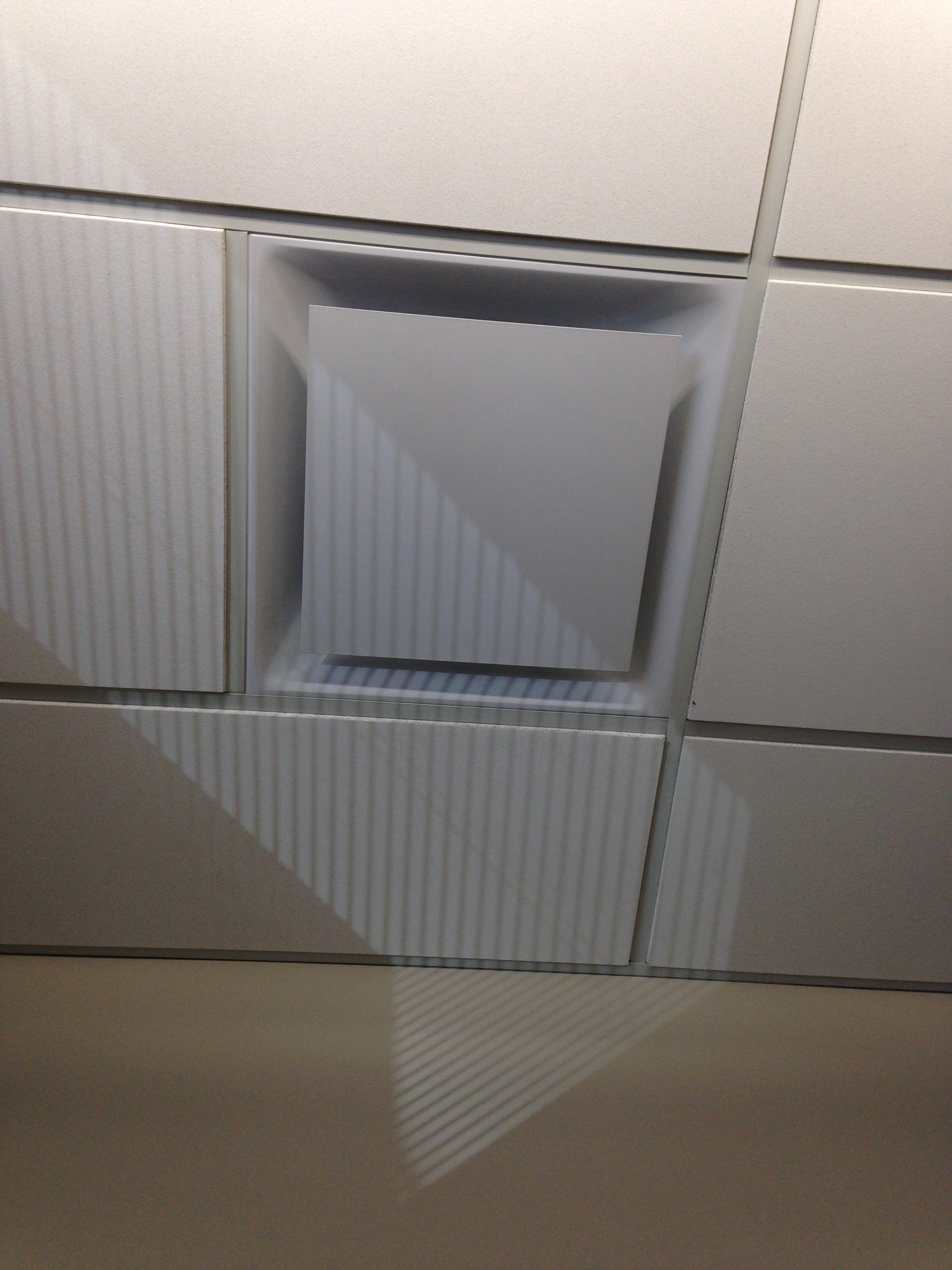
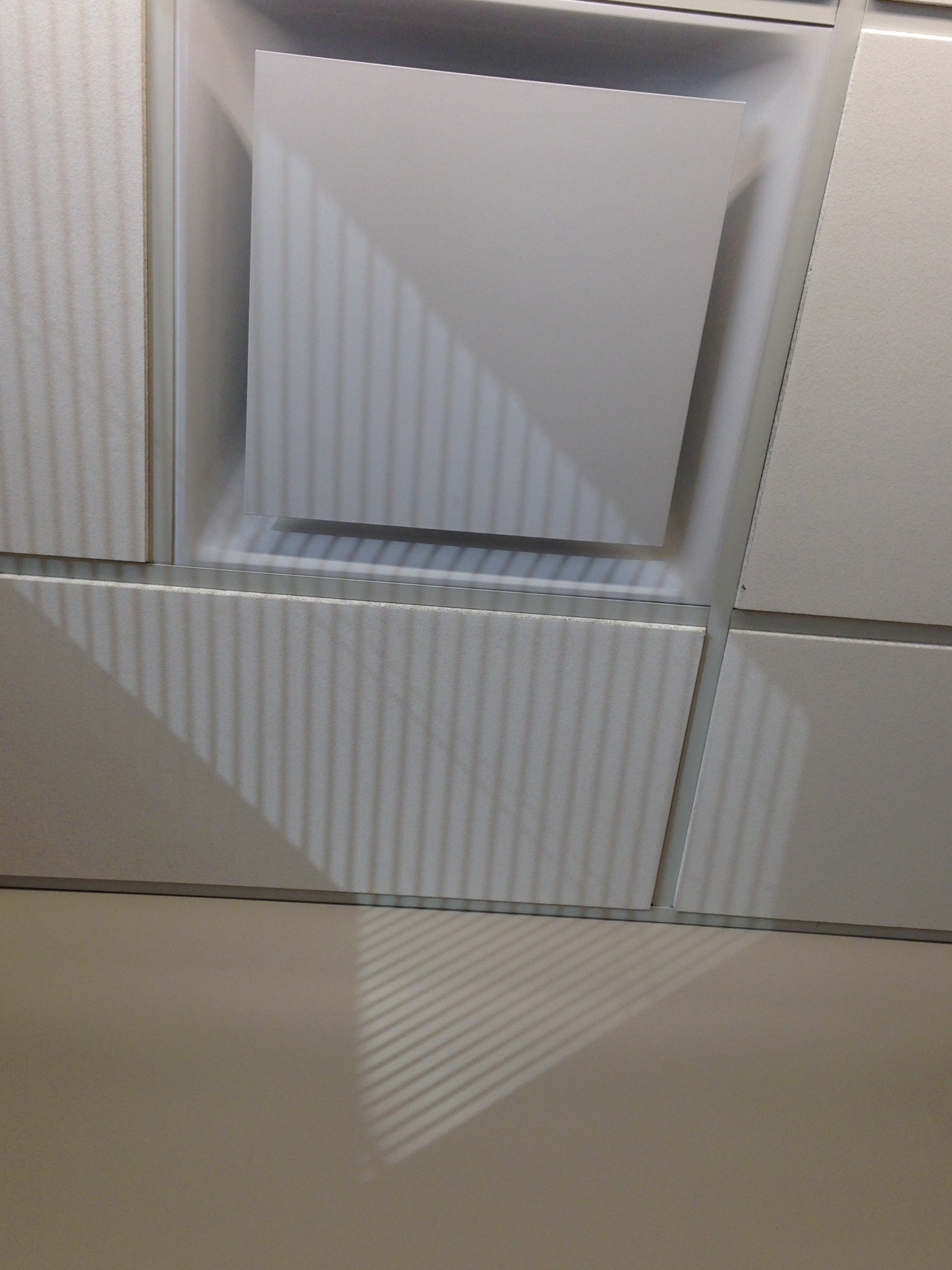
The other day when I posted the “rainbow” light slanting through my office’s Venetian blinds, I mentioned that usually the light coming through is white and casts interesting shadows. Here’s an example of what I mean.

I take a lot of pictures, probably way more than I should mention. Most of them get trashed. I like the photo above. It took a while to get there, though. So I thought I’d share all the “fails” with you, in case you’d find it interesting to walk through my picture-making process.

First, I walked into my office either before or after my 1:00 class and noticed that the sunlight had cast its current pattern of blind stripes on my ceiling. The stripes show up in different locations all over my office walls and ceiling depending on the time of day or year.

Something about this pattern caught my eye. So, second, I snapped several photos with my phone.

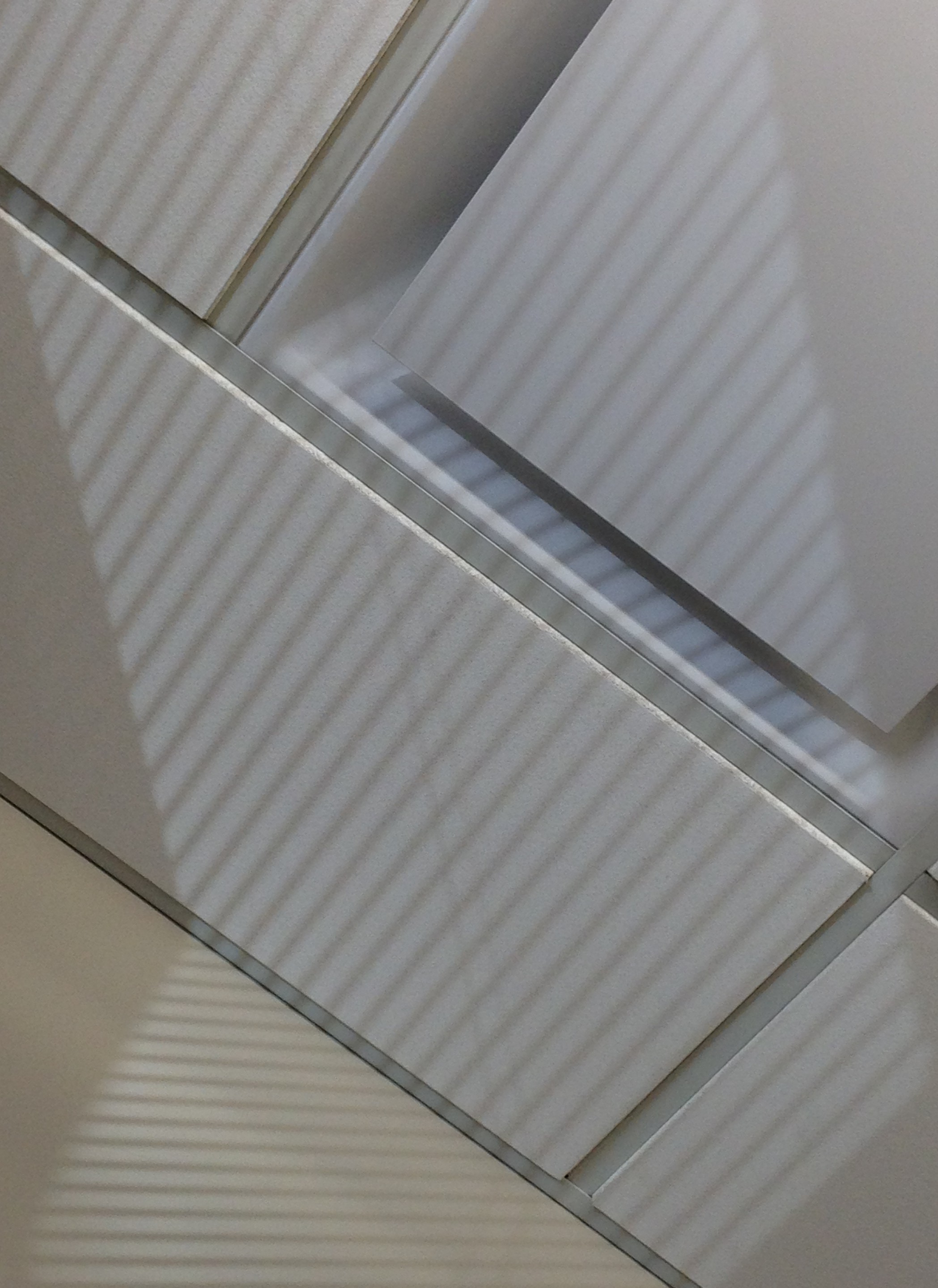
ceiling tile fail 1 ceiling tile fail2 ceiling tile fail 3 ceiling tile fail 4 ceiling tile fail 5 IMG_1626[1]

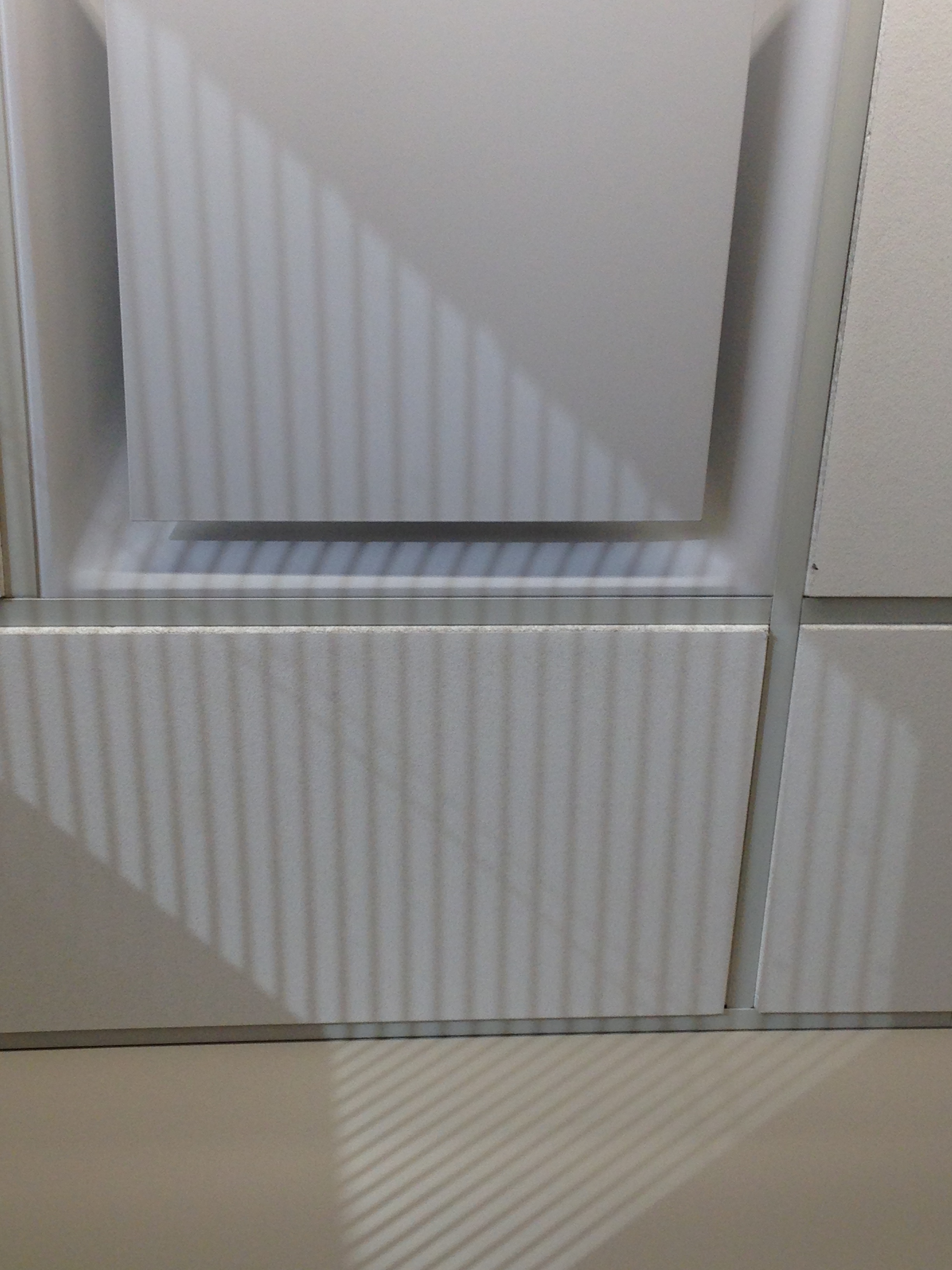
Of all these, I decided I liked the last one best because of the diagonals.

Then, having chosen it as my favorite, I started thinking about the composition of all the various lines and how they might best fit inside a “frame.” In other words, should I crop the photo? And if so, how?

I wanted to merge the patterns of lines into a coherent “whole” as much as possible, so that the ceiling tiles and Venetian blind stripes could be viewed as one single unit instead of two separate overlapping patterns. So yes, cropping would be necessary to create that illusion.

In the end I decided to shave a little bit off the top of the photo and then crop the sides and bottom enough to create a “frame” that would put the edges right at the outermost points of the pattern created by the Venetian blind stripes.

Below are the “before” (left) and “after” (right) versions.

IMG_1626[1] abstract pattern - ceiling tiles and Venetian blind shadows

So, that’s today’s blog post. Not especially “deep” but sort of different and hopefully interesting, too 🙂

Posted in Art, Photography | Tagged , , , | 5 Comments

A Venetian-Blind Rainbow

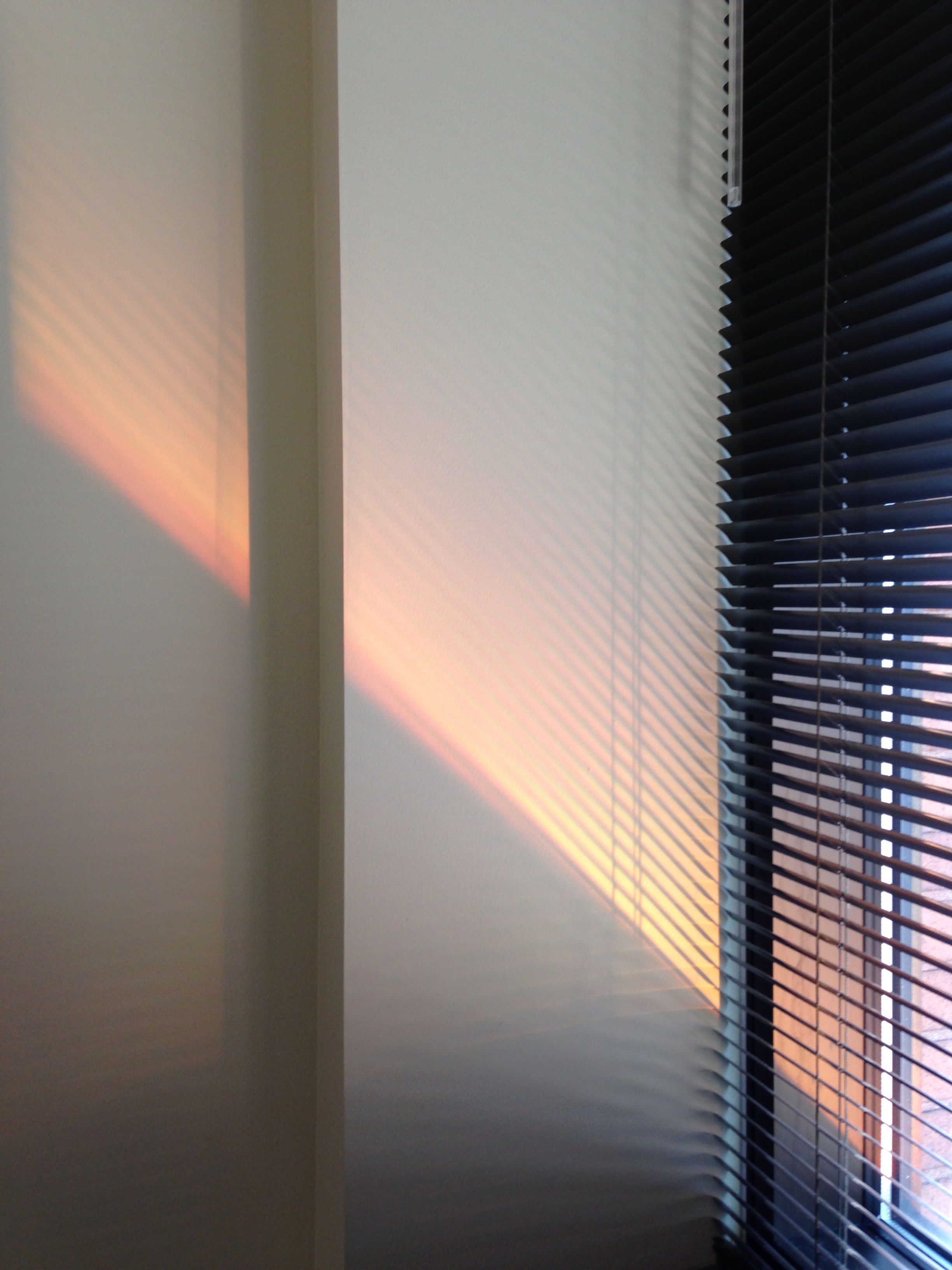
Here’s what I saw when I stopped by my office on the way to my 8:00 a.m. class this morning. Usually the light slanting through the Venetian blind into my office is white, creating interesting patterns of grayscale shadow on my multi-recessed wall. I’d never seen color in that light before, so I snapped this quick photo to document the mix of red, orange, and peach before packing up the gear for my film studies class.

orange light slanting through Venetian blind

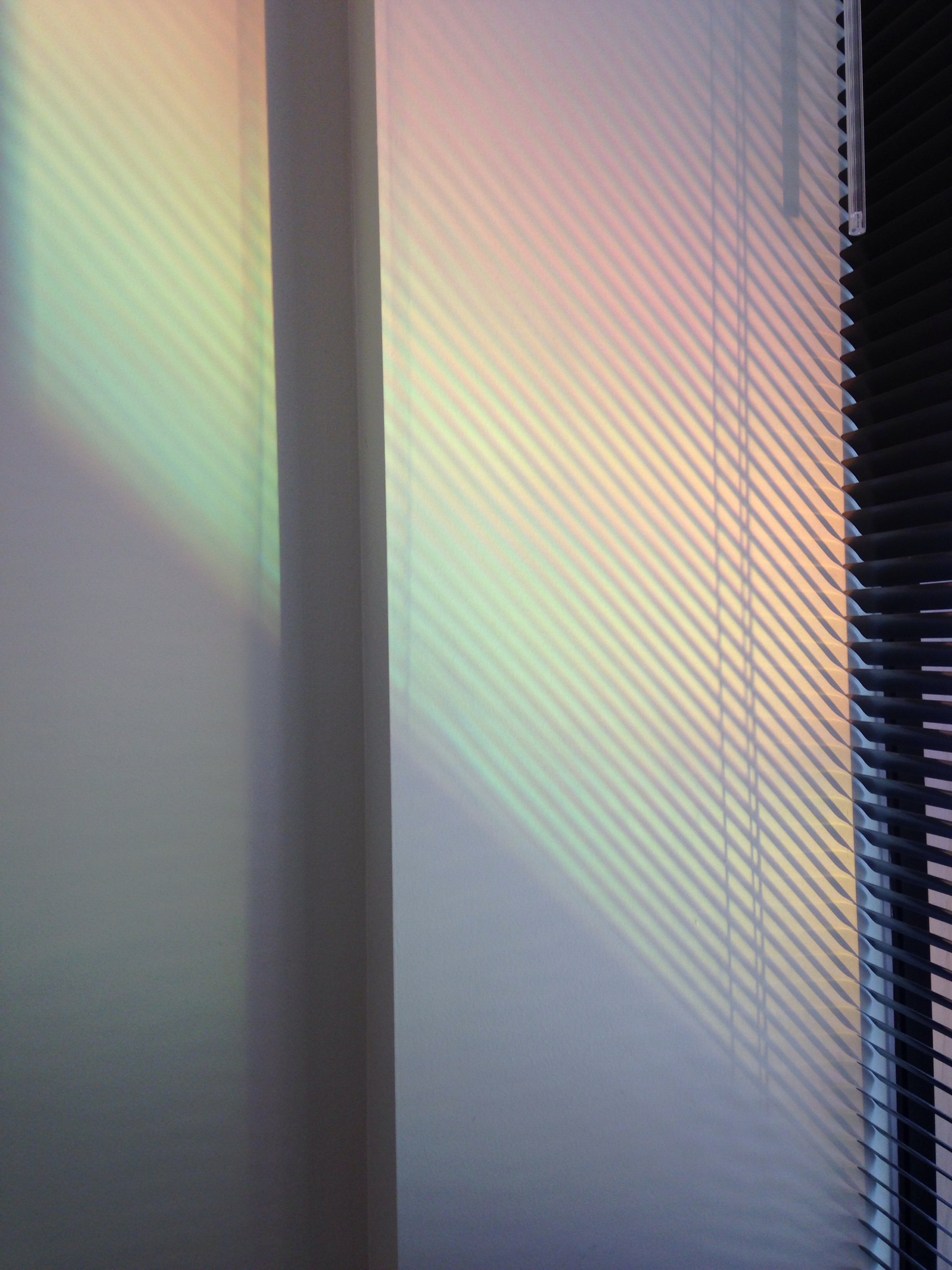
Just as I was about to leave, though, the light  changed again—with an amazing last-minute bonus this time to start off my day. Not just color, but a rainbow!

rainbow spectrum of light through Venetian blind

Posted in Life, Photography | Tagged , , , , , , | Leave a comment

Signs of Spring

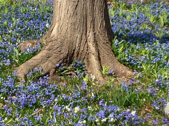
You know it’s spring in Milwaukee when lawns throughout the city are taken over by these lovely carpets of blue flowers. Scilla siberica (Siberian squill) is their official name. They make me so happy!

Siberian squill

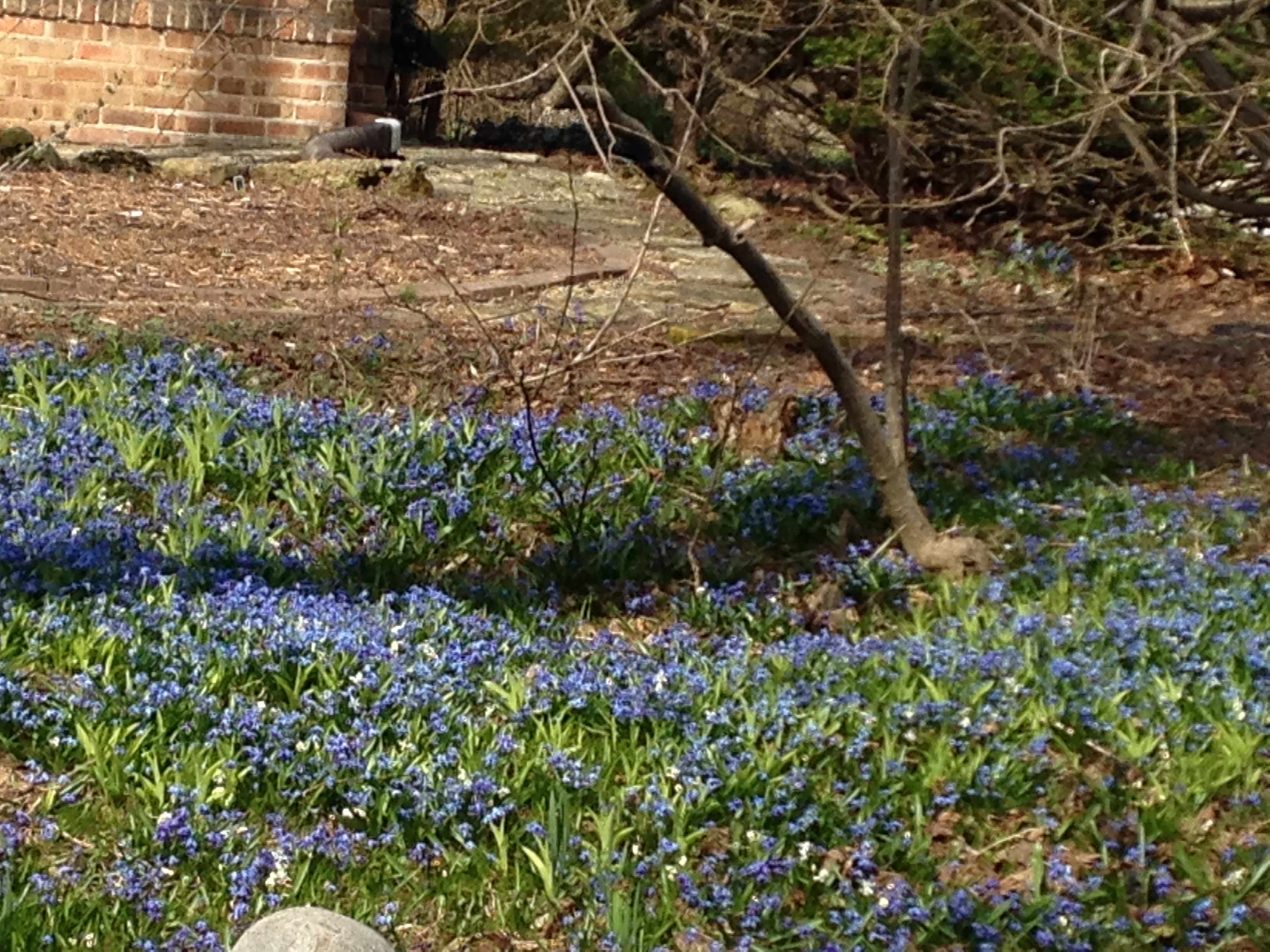
Apparently, though, this pretty flower is considered “invasive” because it “naturalizes” so well (i.e., spreads outward from the spot where initially planted). These blue carpets are sometimes even referred to as “infestations” of scilla.

Silla siberica

A characterization that’s a bit harsh for such a cheerful sight 🙂

Posted in Life, Milwaukee, Nature | Tagged , , | Leave a comment

How “tilt shift” in movies unites form and content

I’m teaching film studies this quarter, and one of the small pieces of information I introduce to help students develop a vocabulary for talking about movies is the concept of “tilt shift” photography.

I’m no expert on the technology itself, except to know that what used to be done with camera lenses and movement can now be done post-production using software. For some basic background on tilt-shift photography, check out the Wikipedia article here.

My students are analyzing films, not making them. So when I teach them about lighting and lens focal length and camera movement, we are primarily concerned with the image within the frame—what we see when we view a movie.

A few years ago I noticed something new onscreen that I’d never seen before. It took awhile to learn what it was called (tilt shift), but I’m really intrigued by its use and what it contributes to my experience of a film.

Basically the effect of tilt-shift photography is to create a visual impression that what you’re seeing on the screen is a miniature set, almost like a doll-house world.

The first place I noticed it was in the opening credits of the BBC’s “Sherlock” television series.

Can you make out the miniaturization of London in this clip? I have no idea why the tilt-shift effect (plus a cool use of time lapse) was employed, but I can tell you how I interpret it. That London is Sherlock’s playground, his game board, and he sees the city as just a tiny, blurry setting against which the clarity of the intellectual puzzles he loves can take over as the central focus.

I next noticed the technique in The Social Network, at the Henley Royal Regatta, where the Winklevoss twins are racing for Harvard’s rowing team in the Grand Challenge Cup. Take a look at the opening 20 seconds of this clip. Can you see the miniaturization effect on the longer shots?

I read an interview with The Social Network director David Fincher (here) in which he said the reason for tilt shift here was practical:

We could only shoot 3 races at the Henley Royal Regatta; We had to shoot 4 days of boat inserts in Eton. The only way to make the date for release was to make the backgrounds as soft as humanly possible. I decided it might be more “subjective” if the world around the races fell away in focus, leaving the rowers to move into and out of planes of focus to accentuate their piston-like effort.

But for me as a viewer, ignorant of Fincher’s shooting schedule and creative decisions, the use of tilt shift in that scene was to make the Winklevoss twins—portrayed in the film as holding very high opinions of themselves and their place in the world—appear diminished. The twins think they’re such big shots, but this race is puny in the larger scheme of things. And their influence on campus, which they think is so significant, is actually equally puny, full of sound and fury and signifying nothing (as seen in their meeting with Harvard’s president).

One last movie where I’ve noticed the tilt-shift technique used to great effect is Jack Black’s 2010 Gulliver’s Travels. The “miniature” theme is obvious and literal in this movie, but I especially like the way tilt shift is employed in the title sequence to convey a sense of size distortion from the very beginning.

So this is the kind of stuff I’ve been doing in my work life lately. I hope you find it as interesting as I do!

Would you like new posts delivered to your inbox? To subscribe, click here.


Posted in Movies and film | Tagged , , , , , , , | 3 Comments