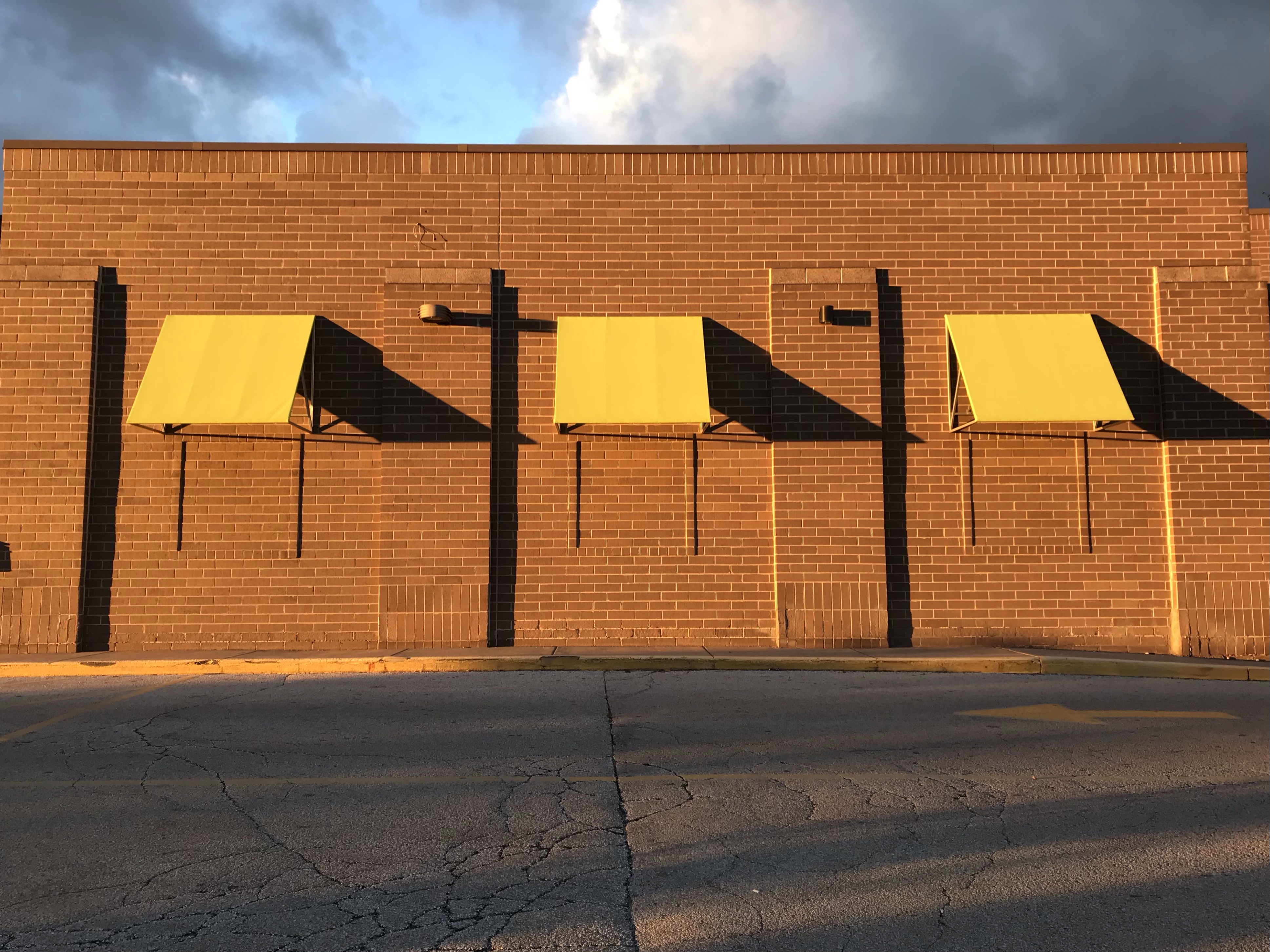
I took this photo after work at the supermarket near my home two Fridays ago. The sun was already low in the sky at 5:30-ish p.m., as it sadly is at at this time of year. But on the plus side, just look at this cool image created by that low-angled sunlight slanting across the parking lot.
Doesn’t it kind of remind you of an Edward Hopper type mashup of light and shadow?
I love Edward Hopper! He’s one of my very favorite artists. There’s something about his stark, clean lines and sharply delineated areas of light and shadow (bright light and deep shadow, I might add) that I find very appealing. Maybe because I tend to take photos of light and shadow myself (only because they jump out at me while I’m going about my day, not because I’m actively seeking those opportunities), I feel a special affinity with Hopper. Like he and I sort of experience the world in the same way. Visually, at least.
In doing some quick poking around online, I found a very interesting 1959 Hopper interview, with several similar light-and-shadow paintings illustrating, on the ASX (American Suburb X) art & photography website (link HERE). This is actually a fun website to explore if you like photography and art, by the way. Main website URL is americasuburbx.com.
Would you like new posts delivered to your inbox? To subscribe, click here.
I have “reblogged“ at least two of these interviews with Nancy Hatfield (of the feuding Hatfield and McCoy families) from Brandon Ray Kirk’s wonderful website where he posts all manner of documents detailing bits and pieces of West Virginia history, especially Logan County. I can’t resist sharing this one as well. It’s so interesting to learn more about this woman and get a glimpse history from the perspective of her unusual vantage point!
When I saw this “poster” today, I realized that I haven’t seen any union promotions in a really long time.
It also put me in mind of this old TV ad. I’ll bet every American above a certain age still knows every line of the International Ladies Garment Workers Union song by heart.
I’ve belonged to two unions in my life. When I was a grocery store cashier for several months in high school, I had to join the Amalgamated Meat Cutters and Butcher Workmen of North America, as it was the union that represented our shop. I still remember their name because, really, who couldn’t remember a name like that, LOL. They used to send me the membership magazine, and I can still recall (if memory serves, all these decades later) bloody photos of meat saws and cuts of beef on the cover. The other union was when I was in graduate school. It was a new thing, voted in toward the end of my time there. I can’t remember if this was the name then, but I just checked and it’s now called The Association of UW Professionals (UW-Milwaukee graduate employee chapter), Local 3535g.
Unions were far more prominent when I was a kid. My dad was “management,” so I saw them as a somewhat undesirable element growing up. Not as “the enemy” so much as a sign that a company had failed in its relationship with workers if things had gotten so bad that a union had successfully infiltrated. Kind of like a virus that infects you if you’re run down and haven’t been taking good care of yourself.
In the past couple of decades unions have weakened and many have disappeared. With the Alec Baldwin on-set shooting incident prompting much online attention to exploitative and unsafe working conditions on Hollywood’s production stages, however, I wonder if unions might begin a comeback in the public’s consciousness.
Would you like new posts delivered to your inbox? To subscribe, click here.
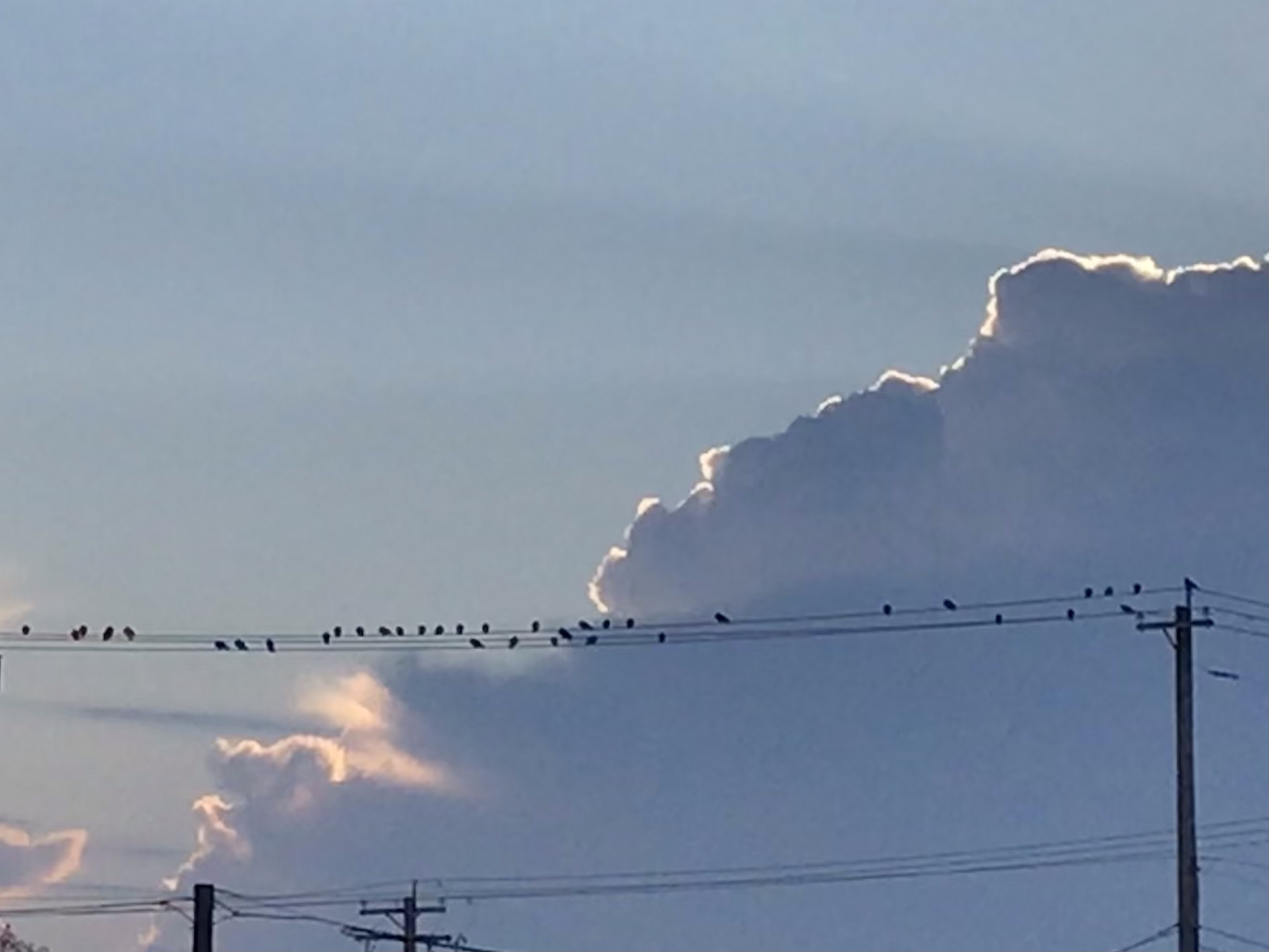
I saw this flock sitting along the wires and loved the sight of their collective silhouette against the cloud and light behind them.
The resolution isn’t great because I was far away and had only my phone (instead of a better camera, story of my life). But I really liked the image and thought I’d share.
Whenever I see a group of dark birds together like this, I pretty much assume they are starlings. We had a ginormous flock of starlings visit our neighborhood several years ago. Every tree, every bush was filled with birds. The “song” was deafening. The sidewalks were a mess afterward with the accumulated defecations of hundreds, if not thousands, of birds. Starlings are commonly considered pests in urban areas. They are not native to North America and were introduced when a fan of William Shakespeare (who mentioned starlings in his works) released about sixty birds in New York City’s Central Park in 1890. (Wikipedia article on the common starling HERE.)
Despite their dirty artifacts (as it were), starlings are so beautiful to watch in flight en masse! You can search online for video. Here’s a gorgeous one from National Geographic.
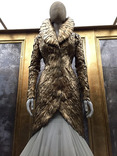
I was showing a student how to use free stock photos to illustrate an online project, and since I was doing the work anyway, I thought I’d put it here on my blog to share with anyone who was interested.
Most of the images on my blog are photos I’ve taken myself, but sometimes I just want a photo that illustrates a post. Like this one, “Paradise Breached,” a short-story writing exercise where I wanted a photo of a creek in the woods. I didn’t have a photo of my own, so I went to Wikimedia Commons (link HERE) to search the free images available. I also could have searched Creative Commons (link HERE) for an image, as that’s another good go-to spot for free images.
The photo I found for my short story was public domain, so I gave the proper attribution in my caption but didn’t have to mention the license I was using it under. Other times, though, a photo will name specific licensing terms under which you are allowed to use the image. Usually you will then need to identify the photographer and/or state which license is attached to the image.
When I first started trying to do this, it was confusing and time consuming to figure out. I’d get the relevant information from the photo source and then sort of follow the format I’d seen other people using to cite the license information on their blogs. It was kind of like the experience of learning how to cite sources using MLA or APA for the first time. It wasn’t completely clear what details needed to be included or how they should be formatted in my attribution.
Then at some point I noticed that images had started making it easy for people to give proper attribution by putting the appropriate info into a box with instructions for how to copy and paste it into your blog or website. This is what I was showing my student how to do the other day and then decided I’d share here just in case you haven’t discovered it yet.
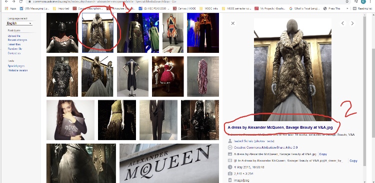
So, step one would be to go to Creative Commons or Wikimedia Commons or even Wikipedia or other online photo source. I went to Wikimedia Commons to get a photo for my student.
First you click on the photo you want, then on the file name. (Excuse my handwriting; done with poor finger control on my laptop screen. Plus, these photos are kind of blurry. I had trouble uploading my original screenshots to WordPress, so I used my phone to take screenshots of my screenshots and lost some clarity in the process.)
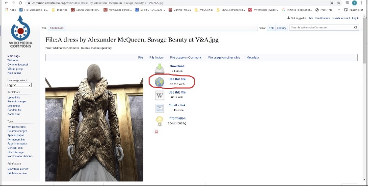
Then click on “use this file on the web.”
Then copy the “Attribution” text and paste it into the caption for your photo on your blog.
And that is basically it.
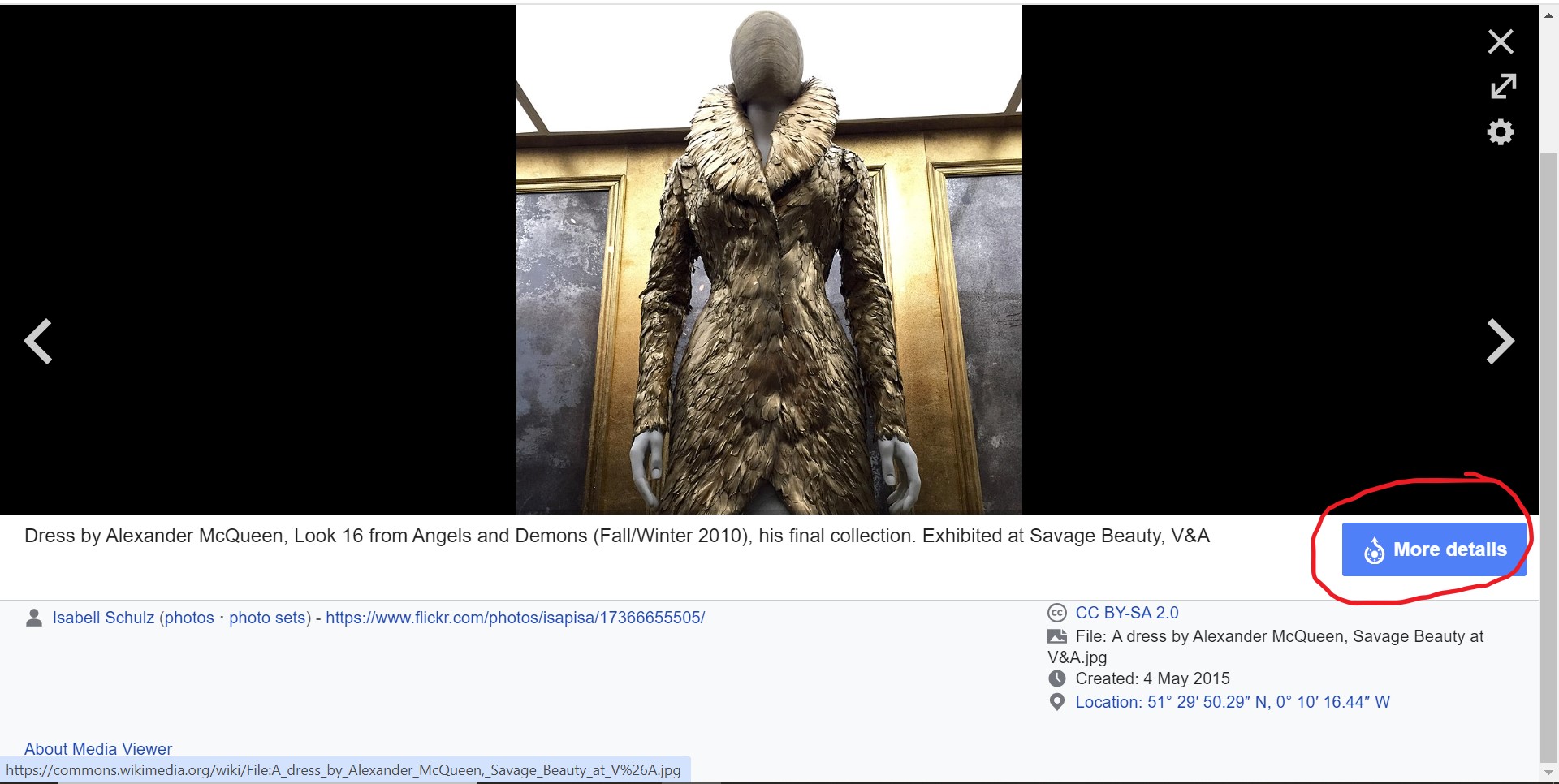
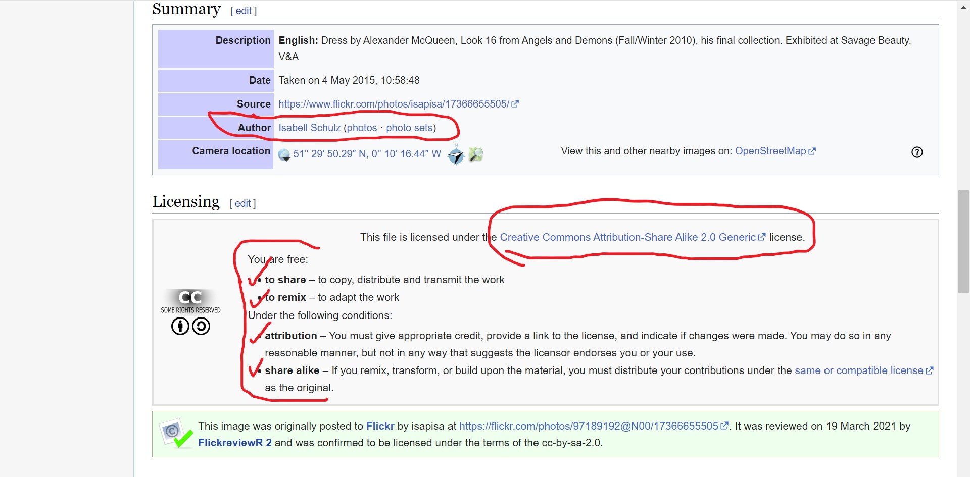
With Wikimedia Commons and Wikipedia, I also like to click on the “More details” button below the image I want to use.
Doing so reveals even more specific details about the image and rules for sharing set by the person who originally posted the image. For example, below you see a couple of handy text boxes containing the “author” name, a link to her Flickr page, and the conditions under which you can share the image.
When you click over to the Creative Commons license (circled above), you see that one of the things you’re als0 required to do (besides citing the author and the CC license) is to provide a link to the Creative Commons license itself (not just cite it).
If I’m using my own photos (like all of these screenshots, for example), I don’t usually add captions when inserting images into my blog. But if I were using a stock photo instead of my own image, I’d select “caption” when I inserted the photo, and then paste the CC 2.0 (etc.) sharing attribution info into the blog post.
Like this, for example.
Isabell Schulz (photos · sets), CC BY-SA 2.0 , via Wikimedia Commons
Note the link in the caption, too. I clicked over to the license from the Wikimedia Commons “More details” page, where I noted their “link” requirement. Then I had to manually come back and insert the link to that license in the caption. I think I’m all “legal” now! 🙂
So maybe you knew all this already, but if you didn’t and you want to try using stock photos to illustrate your blog posts, providing the proper attribution is easy if you follow these steps.
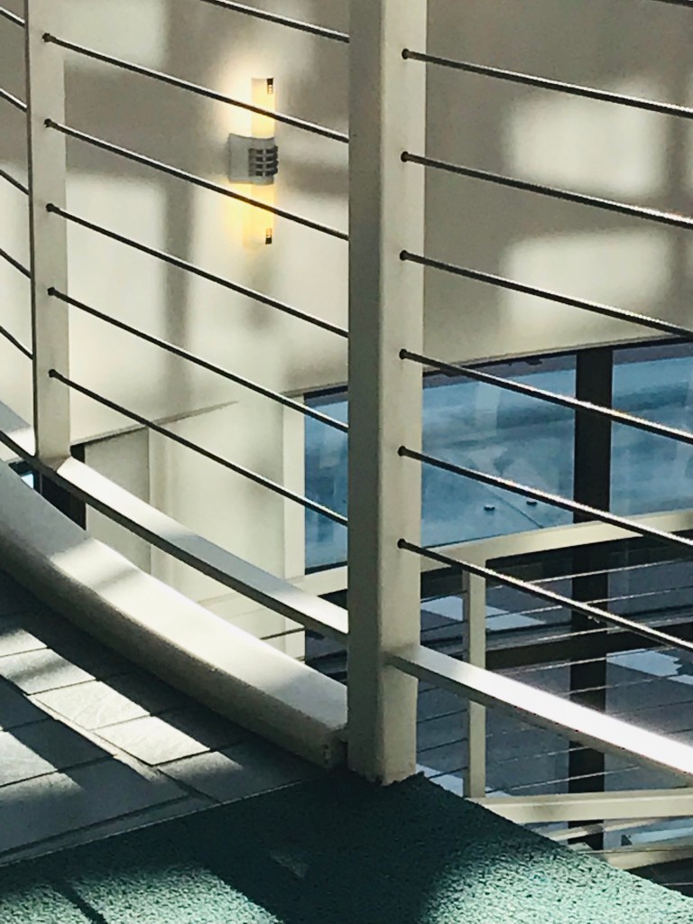
The Grohmann Museum was quiet on the second floor when I left work at MSOE this afternoon. I pressed the button to call the elevator but then, immediately after, decided to step away and take a picture of the stair rails because I liked how the light was shining on them.
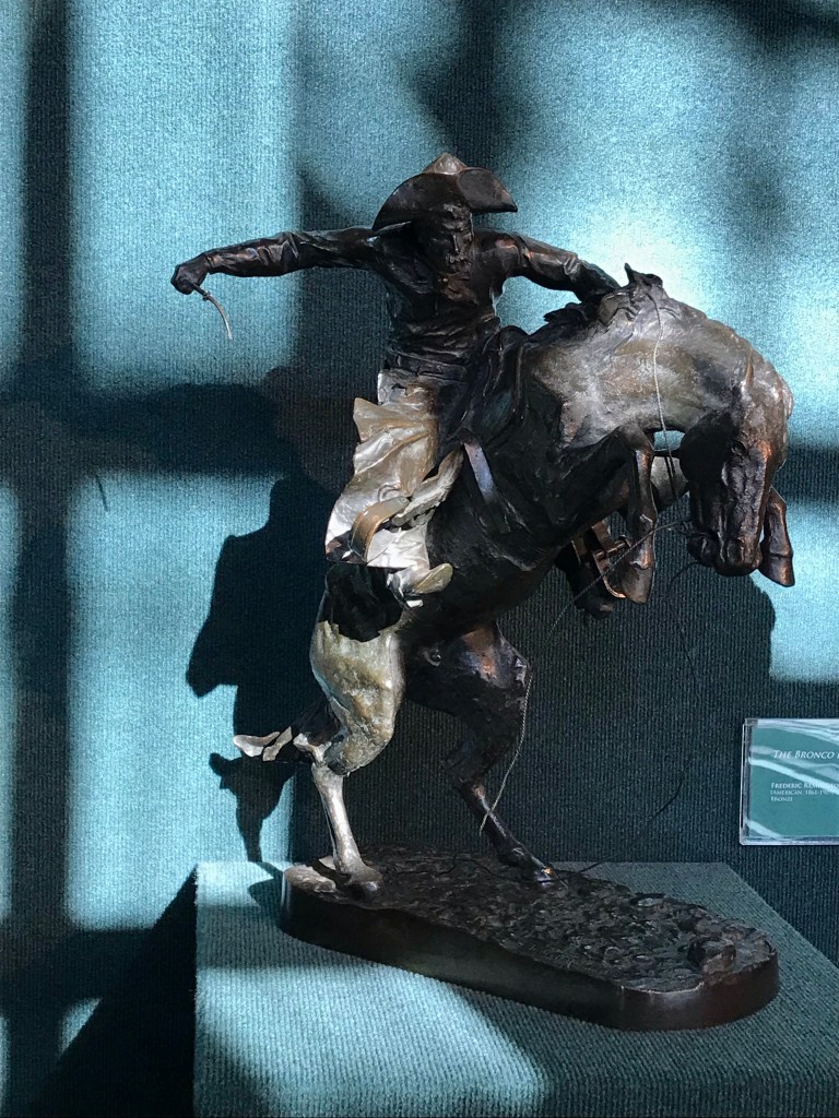
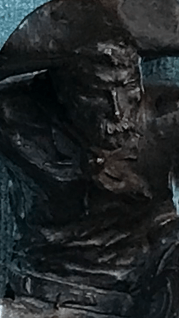
Then I had to call the elevator again because it had come and gone while I was taking the photo. While I was waiting for the next go round, I noticed the interesting shadows cast by the late-afternoon sun on the small Frederick Remington sculpture right across from the elevator. So out came my phone again.
But it was so hard to get the details of the cowboy’s face to show up in those shadows. Plus, I was too far away to frame the image on my screen in a way that matched the way I was seeing it in real life. So I moved closer, then back again in order to get the right perspective, but having to zoom in a little with the lens to compensate.
Behind me the elevator doors opened and closed. A little more fiddling around with my phone till I finally felt set with my picture and called the elevator one last time. Another week in the books.
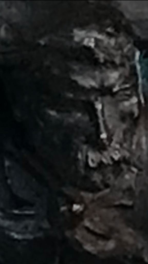
When I got home I took a closer look at my pictures and started fooling around with them. Brightened up the one with the stair rail. Cropped the Remington cowboy. His shadowed features still weren’t very clear, so I tried enlarging the picture.
Cool. Up close the photo looked like a painting to me. I liked that El Greco look in the folds of fabric and the planes of the cowboy’s face. What if I magnified it even more?
A little weird, and starting to be unrecognizable. Even better😄
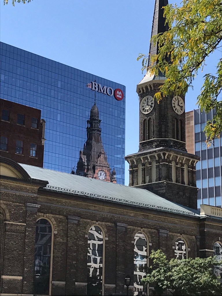
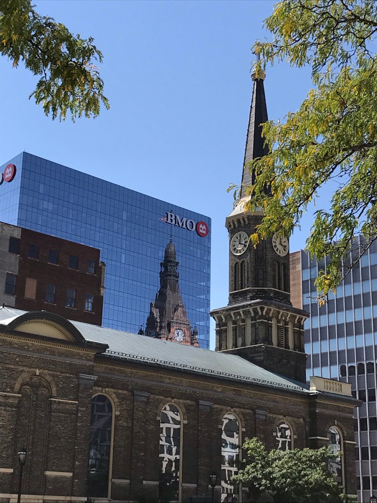
I was walking back from the Library and Science Buildings shortly after noon today and saw City Hall reflected in the BMO Harris building—a reflection I realized was new to me from this vantage point, since I guess I haven’t walked this sidewalk since the pandemic began. Yes, in fact, I just checked and found that the BMO Tower was new in 2020, so that makes sense.
Anyway, I was just really struck by the way City Hall looked in the reflection. Maybe it’s the tint/color of the glass, maybe it’s something about the construction of the windows themselves? But the City Hall reflection in this building’s windows looked different than it does in the windows of other downtown office buildings. (By the way, I’ve shot MANY photos of City Hall reflected in office buildings. If you search my blog for “city hall reflections” you’ll no doubt find a bunch of them😄)
In this first picture today I was trying to capture City Hall itself (well, its reflection) the best I could with my phone. And I do like this photo., although now I can see the little fringe of leaves in the upper left that ought to be cropped out.
But then I wanted to get Old St. Mary’s spire completely in the photo to correspond with City Hall’s, so I took this second photo.
I couldn’t decide which one I liked best, and neither could my family when I asked for their opinions, so I’m just putting them both up.
I posted on our Milwaukee suburb’s local wild turkeys back in May. Here’s video update from the Milwaukee County Transit System on a bus that got behind schedule down in “The Village” thanks to our snooty, slow-footed feathered friends. 😂
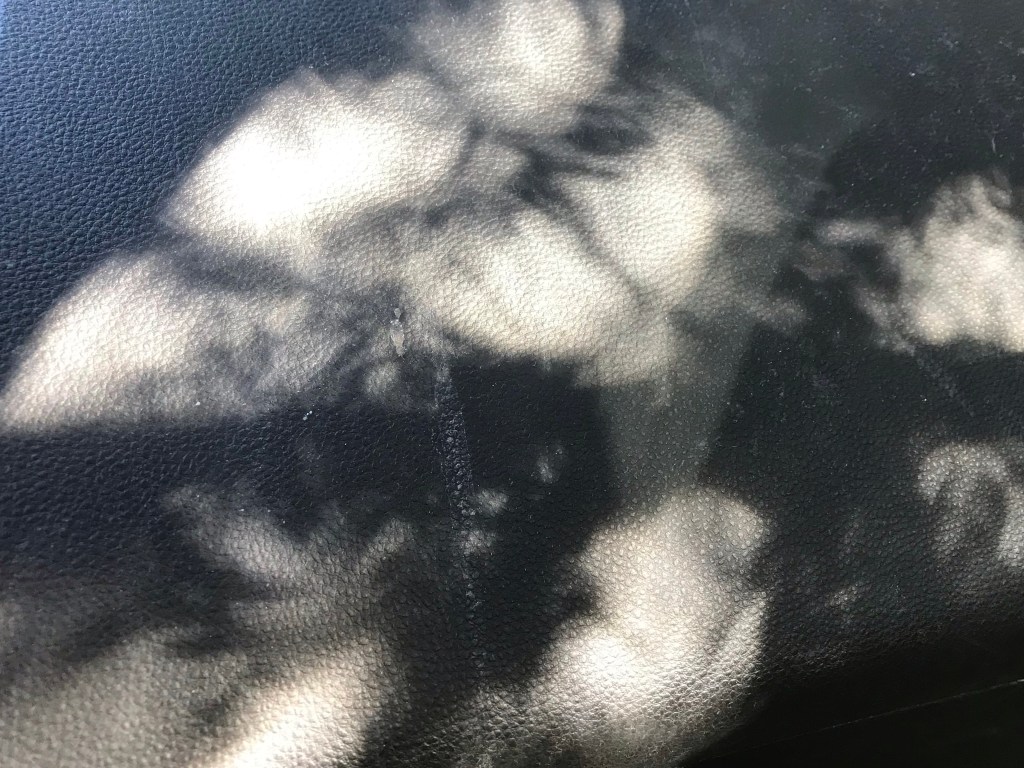
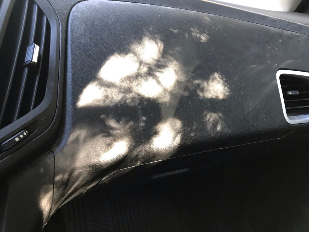
I pulled into our driveway and parked in the shade of our yew tree, then noticed the kind of cool pattern of light and shade on the dash as I was getting my things together from the passenger’s seat.
There’s a white streak of road salt that I wish wasn’t there, probably from a backpack or a pair of boots when one of my daughters was getting a lift. I don’t like the way it bisects that area of black just left of center. But I had no wipes in the car, just a little bottle of hand sanitizer. And I knew there was a risk that the light would be gone before I could run inside for wipes or a wet paper towel. So I took the picture anyway. (Tell me: Would you even have noticed if I hadn’t confessed?)
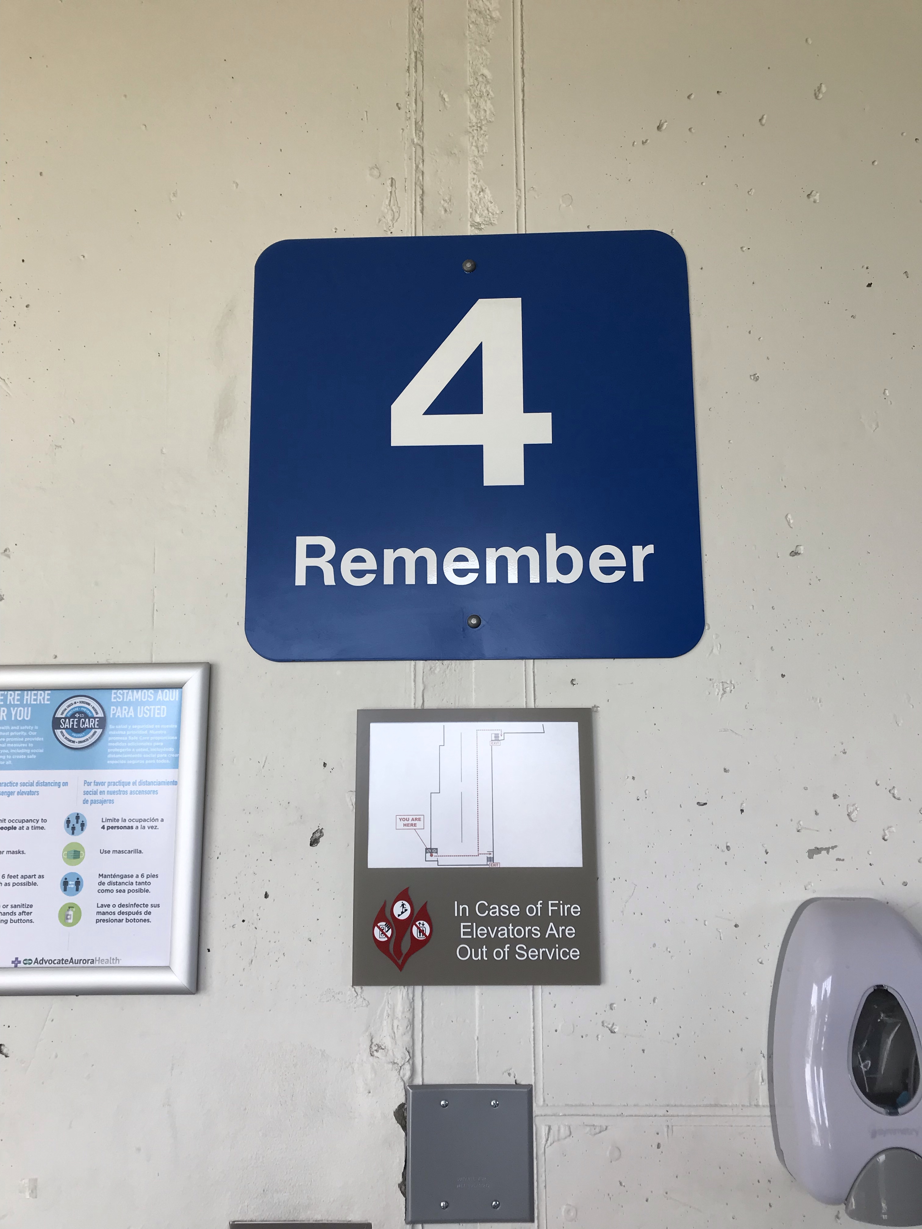
I had to drive someone to St. Luke’s Hospital yesterday for an MRI. (Driving people to medical appointments seems to be the story of my life lately! 🙂 ) After dropping them off at the front door, I entered the parking garage and spiraled up the ramp to find a spot. Then walking to the elevator with my rolling briefcase (so I could get some work done while waiting for the procedure to be finished), I noticed a sign saying what floor I was parked on.
I say “noticed” because I had so many other things running through my mind that I wasn’t actually paying attention AT ALL to which floor/ramp I was on. In fact, I might have gotten into the elevator still preoccupied by other things, without a single thought about where I had parked, if not for this one word.
I had already looked directly a sign with the large numeral “4” on one of the structure’s pillars. Noting it, but in an abstract kind of way. Only when the word “Remember” registered did I realize that I ought to have already taken note of the floor/ramp I was parked on.
That’s nice, I thought, snapping out of my reverie. The instruction to “remember” ensured that I actually did!
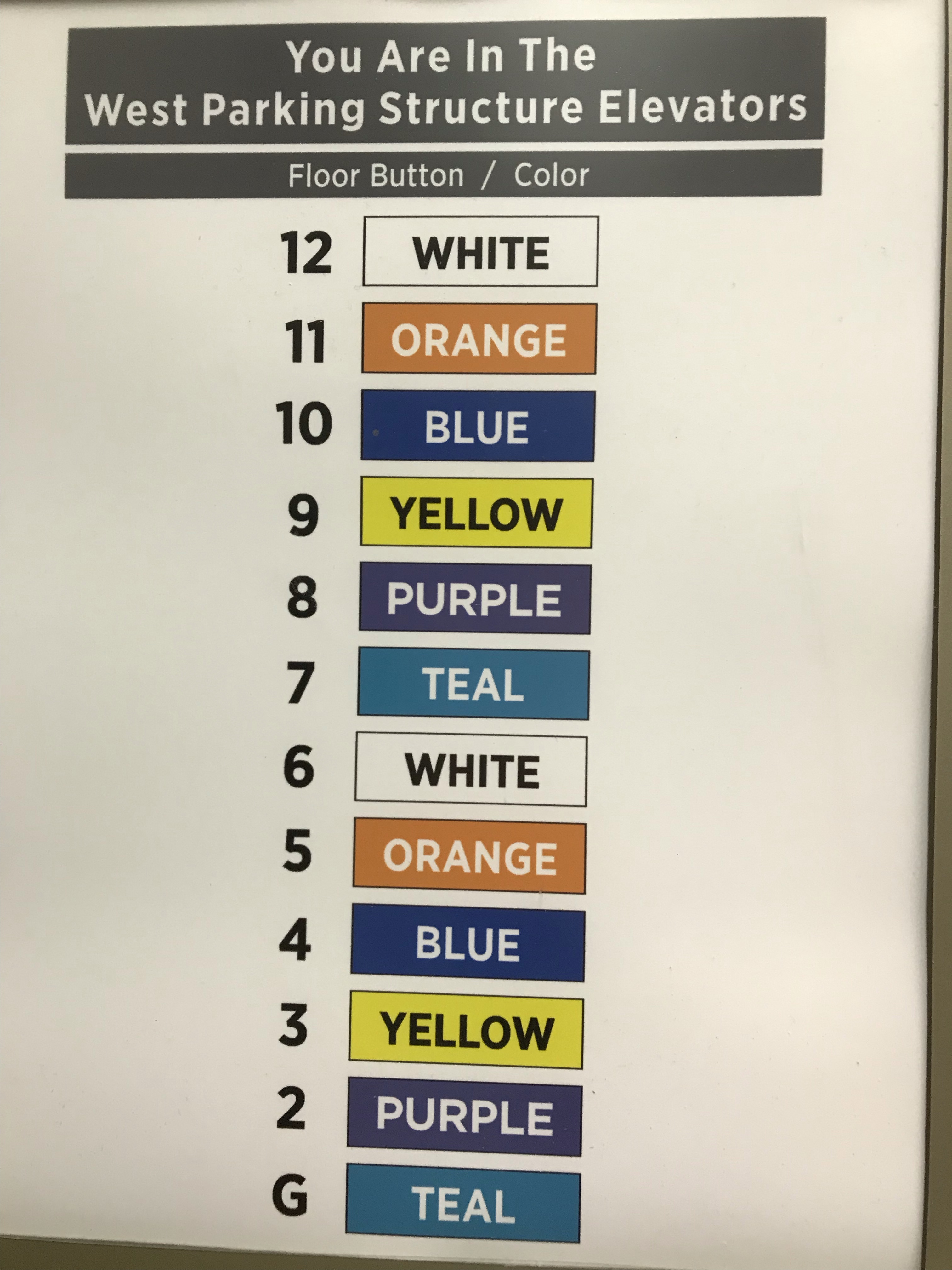
Upon entering the elevator, I got another pleasant surprise. There to one side was another sign. This list of floors reinforces the connection between the ramp number’s numeral and color AND writes out the name of the color inside each appropriately colored box.
I like it when signs use words. Often, I think, designers swing too far in the direction of using nothing but nonverbal symbols (icons, colors, etc.) to convey messages. Apple does it beautifully, but most designers aren’t Jony Ive. Words may be less “elegant,” but they often get the job done more efficiently than images alone.
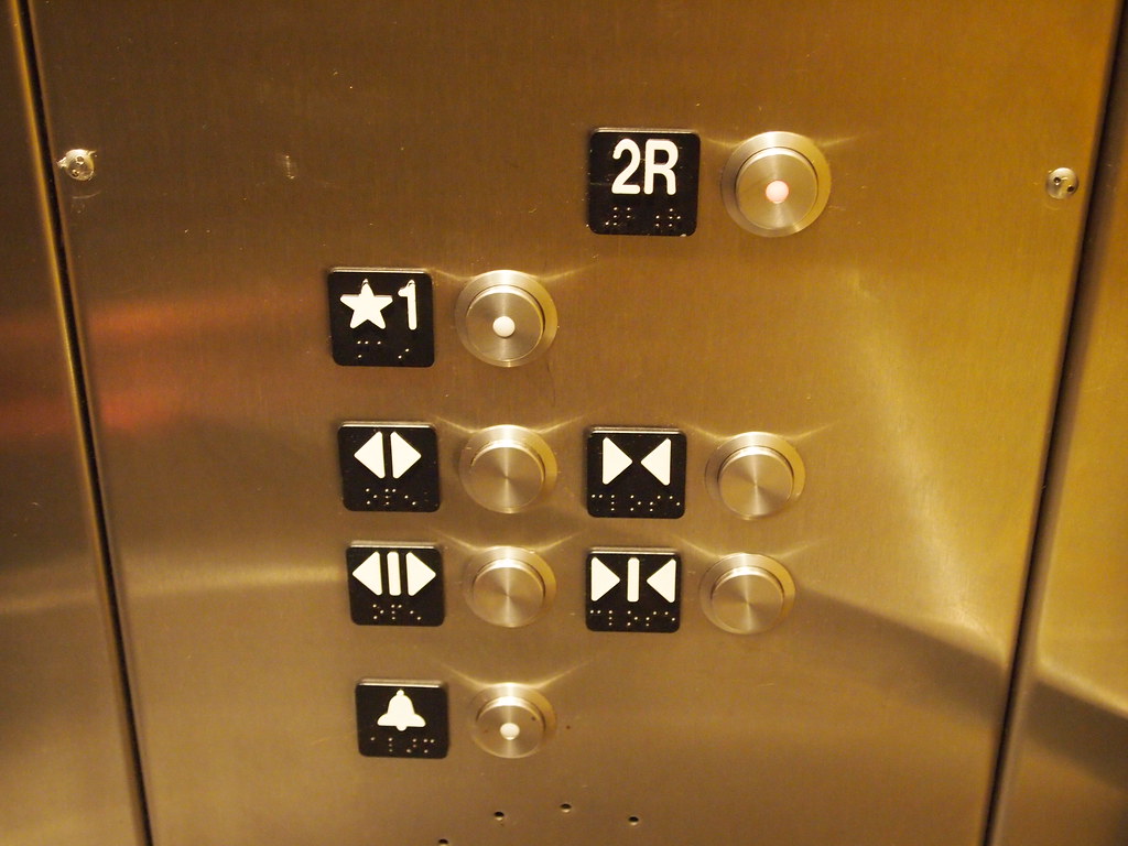
For example, I am completely worthless with these symbols for opening and closing elevator doors.
“Elevator Buttons” by orijinal is licensed under CC BY 2.0
These “arrow” icons have become ubiquitous in the past few years and seem to have completely replaced the words “open” and “close.”
But how often have I frantically tried to figure out which set of arrows means “open” as someone races to catch the elevator as the doors are sliding closed? I can never translate the concepts fast enough to help that poor person out.
Possibly using the arrow icons benefits illiterate people or people who don’t understand English, but adding the words “open” and “close” beside the arrows—or even including the words as another set of buttons (because why should we need TWO different iterations of arrows, as shown in this photo, if symbols are so much better than words?)—would be far better for me, not to mention all the people who have missed the elevator because I couldn’t “read” the symbols fast enough.
Decisions about signage fall under the umbrella of what I think of as UX (user experience) design, except that UX is almost exclusively understood nowadays to mean digital experiences only. That’s too bad, because designing and curating experiences of all kinds is going to become increasingly important moving forward into the digital future. It seems to me that there’s way too much fragmentation and confusion surrounding the idea of UX in nondigital contexts.
Sometimes nondigital UX is called simply “experience design.” I’ve seen that referred to as “XD.” Here’s an article from the XD Agency (styled “THEXDAGENCY” on their website) titled “UX VS. XD” that talks about the differences that they see between the two fields.
Here’s another article, titled”10 Principles of Physical Experience Design,” by Ripon DeLeon, Director of Physical Experience Design at Capital One. He uses the acronym PXD to refer to the concept of designing experiences in the physical world.
And to muddy the waters even more, here’s one from the Interaction Design Foundation on “The Classic Types of Experience.” According to this article there are many kinds of experience, including physical, mental, emotional, social, and spiritual.
Yet another term used to describe this idea of designing experience is “Experience Architecture,” or, to use letters, “XA.” Here’s the Wikipedia article on experience architecture (link).
Obviously there’s lots of ambiguity in the still-emerging subfields of the overall domain of experience design. And as the Web 4.0 (Internet of Things) and beyond takes shape, there’s bound to be even more confusion, because virtual and augmented reality will conflate our experience of both physical and digital worlds in ways that boggle the mind too much even to speculate on.
Sorry for rambling! I started with a couple of parking lot signs and then lost track of where I was going once I began thinking about how comprehensive yet inadequate “UX” is as a term for the design of human experience in a world that has one foot planted firmly in analog soil and while the other floats suspended in a digital sea of zeros and ones.
My main point is that good design demonstrates caring and empathy, and St. Luke’s deserves props for signage that embraces these principles. Many people entering a hospital parking structure are probably distracted (or distraught) enough that they’ll have difficulty remembering where they left their car. Adding a gentle instruction to “remember” on ramp markers and placing a color-coded list of floors inside the structure’s elevator should improve the odds that this already-stressed group of people will be able to locate their vehicles when they return.
Would you like new posts delivered to your inbox? To subscribe, click here.

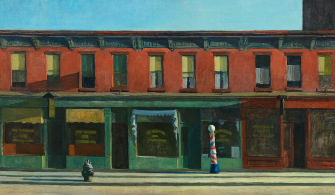 Edward Hopper’s “Early Sunday Morning” – Whitney Museum of American Art (visit: https://whitney.org/collection/works/46345)
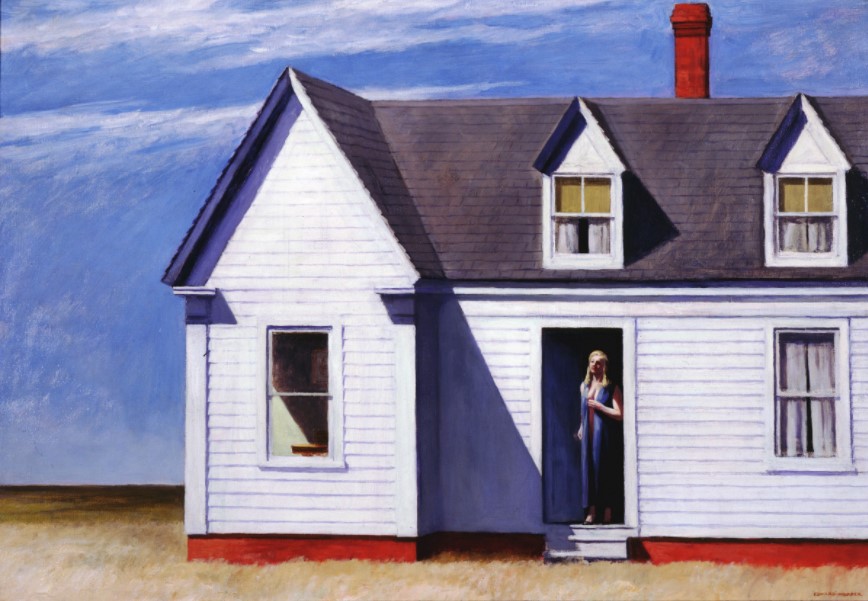 Edward Hopper’s “High Noon” – Dayton Art Institute (visit: https://www.daytonartinstitute.org/exhibits/edward-hopper/)