These are some tricky ones, and even people who kinda-sorta know them will still call me up to ask which spelling to use in a particular sentence. (Which, in fact, someone did just the other day.)
The way most people remember these is that “it’s” with the apostrophe is a contraction: “it is.” It’s the same with “who’s”: “who is.” But I remember them from the opposite direction, and if the spellings of these two pairs give you trouble, you might try thinking of them as I do. To wit:
“It” and “who” are pronouns. Just like “I,” “he,” “they,” “we,” and “she.” And the possessive form of a pronoun does NOT have an apostrophe:
I → my
He → his
They → their
We → our
She → her
It → its
Who → whose
If you can remember that “it’s” and “who’s” are contractions AND that “its” and “whose” are possessive pronouns, you’ll double your chances of getting those spellings right.
I stand corrected. Having merely seen the film and not read the Suzanne Collins novels, I completely based my assumptions about District 11 on what I saw in the movie. Now I’ve done a bit more digging and discovered that District 11 is an agricultural district. Not a mining district. Oops.
Totally changes things.
Or does it? When Rue dies and the man I assume must be her father acts out his anguish in a way that sets off the rioting, the location site doesn’t look agricultural to me. As a viewer of the film, not as someone familiar with the book, I made my “district” associations with those images of rioting alone, without the knowledge that reading would have provided.
I’m so drawn into the story at this point that I really need to get my hands on Suzanne Collins’s trilogy of novels 🙂
I was finally able to watch The Hunger Gamesabout a week ago and was extremely impressed by the film’s visual design – the locations, costumes, sets, props, makeup, etc. Immediately I began thinking about writing a post arguing that the film should win the Academy Award for Art Direction.
The term “production design” refers to the creation of a movie’s overall look and aesthetic feel. Mostly this involves everything that is placed before the camera (also known as the film’s mise-en-scène): sets, costumes, props, lighting, and even acting when a performance somehow contributes to a film’s visual thematic motifs. Although a production designer obviously must work in collaboration with the director and producer, he/she is pretty much in charge of designing the unified visual experience that best artistically amplifies a film’s theme.
An example of effective production design that comes to mind is the 1974 Roman Polanski film Chinatown. In this movie about drought and California’s water wars (not to mention murder and incest), the film’s visual aesthetic conveys a sense of oppressive heat and the physical exhaustion that accompanies it. Scenes shot outdoors all serve to remind you of that theme. The buildings are blazing white, the grass is scorched brown (with one notable exception), the air is still, the sky is cloudless, and the unrelenting sun is almost always directly overhead. Watching the film, you can almost feel the parched, suffocating atmosphere.
I’ve also seen some surprisingly comprehensive production design at work in television commercials, notably Lilly’s Cymbalta® ads, in which nearly everything – nearly all building exteriors and interiors, clothing, props (e.g., coffee mugs, books, cars), and even some actors’ hair color – is a shade of blue, green, and red/rust. Watch for them; these ads usually run during the evening network news broadcasts.
Actually, I just found a couple of these ads on YouTube. You want to pay attention to the predominance of multi-shaded green, blue, and red/rust/pink hues. Then also look for the product logo and company name. It’s interesting to realize that blue and green are the colors of the drug’s logo, and red is the color used for the Lilly company name.
While the older term “art direction” sounds like it’s referring to sets, costumes, props, and makeup, the new term, “production design,” more accurately captures the broader scope of responsibilities. A film’s visual aesthetic goes beyond traditional art direction to include design elements such as an actor’s performance (in ways that reflect the film’s theme), the “pacing” and juxtaposition of shots set through film editing decisions, and artistic (rather than functional) lighting design.
The Hunger Games’production design gives viewers a déjà vu feeling of instant familiarity with the far-flung locales of the film’s fictional world. Instead of just one uniform look for the entire overall film, the movie’s visual design is created by a jigsaw puzzle, or maybe more of an amalgam, of complementary “cues” working together through a brilliant mix of styles to create recognition (“re-cognition” in the literal sense). The places in this fictional world all feel so real!
Because we’ve seen them before. Sort of.
Katniss’s home in District 12 has a poverty-stricken, 1930s Appalachian coal-country feel. Faded, tired, and worn. At first I thought this look was achieved primarily through post-production color grading, but every time the film’s action returned to District 12, I scrutinized the mise-en-scène and decided instead that the washed-out color seems more the result of pre-production design decisions about sets, costumes, makeup, etc., than a post-production chemical or digital process. The actors’ hair color seems relatively uniform in color (mostly brown), as does their clothing (mostly drab shades of gray). Interior and exterior sets are a dusty gray, as though covered with coal residue. Everything is weathered, sagging, neglected.
Even decisions about the casting of extras and supporting players who populate the world of District 12 appear to have been made in service to the overall design element. Every adult face in Katniss’s world seems lined with a pervasive Dorothea Langequality giving testimony to the hardscrabble subsistence of a life associated with the mines.
Update: Actually, now that I’ve watched this movie like a million times, I can tell you that the same crew of extras used for District 12 is also used for the Capitol. It’s really, really interesting to see how costumes, hair & makeup, and acting (yes, once you start watching for it, you realize that extras do act) can completely transform these background performers!
Beyond District 12, the film has other notable design elements that caught my eye. One is the smooth, streamlined Art Decointerior of the bullet train that Katniss and Peeta ride to the Capitol of Panem – a stylistic aesthetic especially well chosen here for the way it reflects the frictionless speed of maglevtransportation.
The Capitol of Panem itself is excessively grand in scale, a somewhat cold city with colossal classical elements that remind me of ancient Rome in some ways and the “White City” of the 1893 Chicago World’s Columbian Exposition in others. You can search Google Images for “1893 Chicago World’s Fair” or “World’s Columbian Exposition” to see photos that show what I mean. Also, hereand hereare two really nice YouTube video/slide shows showing the White City in its glory. (Nearly all of which lay in ruin just a year after the fair’s end.)
Adding to the eclectic mix of styles in this film are the clean, curved, elegant lines of Art Nouveau and Empire Stylewhich are seen in some interiors and in the table at film’s end bearing the bowl of nightlock (an allusion to Socrates’ demise?).
Empire Style table (via Wikipedia)
Interestingly, the Empire Style was itself was a reinterpretation of the Ancient Roman Republic’s style during the rule of Napoleon I during the First French Empire, so there’s another throwback to the Ancient Rome motif.
Katniss’s Mockingjay pin, a symbol of her district, looks to me like a mix of Art Nouveau and socialist realism. And, actually, once you start thinking about socialist realism, the logical next thing to consider is the huge scale of official government spaces in the Capitol, which exhibit a totalitarian pagentry worthy of a Soviet military parade or a 1930s Nuremberg rally of the Nazi party faithful. It’s also worth mentioning that the huge, heavy concrete structures of the Training Center and the City Circle (site of the Tributes Parade) are examples of “Brutalism,” a mid-20th-century architectural style often associated with totalitarianism and the Soviet Union.
Inside the Hunger Games control room, where Tributes are virtually monitored and manipulated, the environment is a stark white, high-tech, sci-fi space reminiscent of 2001: A Space Odyssey. In the scenes where Tributes are getting their finishing-touch makeovers, the interiors remind me of The Wizard of Oz, where Dorothy and her friends receive Emerald City makeovers of their own. Remember the Tin Man getting buffed by the giant powder-puff wheel and the Cowardly Lion having his mane styled? (“Snip, snip here / snip, snip there . . .”)
President Snow’s garden reminds me of the Red Queen’s garden in Lewis Carroll’s Through theLooking-Glass. Effie Trinket, who comes to District 12 to select the Tributes and accompany them to the Capitol, is a kaleidoscopic mix of 1940s fashion, Betty Boop lips, and the strange bleached-eyebrow trend of recent years (Lady Gaga and Kelly Osbourne).
And, finally, though it received just a thin sliver of film time, District 11 deserves mention. When little Rue is killed, riots ensue in her home district. Not until I saw that footage did I make a connection with South Africa. Although I have not followed the political history of that nation closely, whenever I have heard the words “riot” and “district” together, they have always been in connection with South Africa. And usually those riots, like the rioting in The Hunger Games, have been associated with mining districts, factory districts . . . poor districts that are as racially segregated as District 11 appears to be. While many countries contain segregated areas where poor workers toil in miserable conditions for the benefit of the elite classes, South Africa actually codified this reality in official policy.
Did Suzanne Collins intentionally set up the political geography of her novel to resemble South Africa’s? Or was this a design decision by the film’s creative team?
In any case, it is brilliant.
The District 11 rioting is a tiny, tiny piece of the overall film. Yet, like all the other tiny pieces of design in The Hunger Games, the footage of this rioting works almost at the level of “code” – the type of signifier described in the post-structural technique of literary analysis created and demonstrated by Roland Barthes in S/Z (1970).
All we see is a snippet of District 11 rioting, with black men pulling things over and everything going up in flames. But because these shots are so similar to real-life news footage and because we already know that these District 11 men are workers in a poor mining district (note: actually an agricultural district, but impoverished nonetheless), movie audiences will most likely recognize the “code” references to South Africa and automatically invent an entire fictional backstory that is never actually articulated in the film itself.
Whether the District 11 rioting accurately or inaccurately reflects actual events in South Africa is almost beside the point. What really matters to the experience of the film is the way production design in The Hunger Games triggers viewers’ associations, through response to these “coded” visual images, with the archetypal idea of apartheid in South Africa.
So to wrap up this rather long post, let me just say that not only should The Hunger Games receive the Academy Award for Production Design, but the film also deserves to be nominated in multiple categories and win the statuette in several.
A reviewin this morning’s “Review” section of The Wall Street Journal alerted me to the recent republication of one of my favorite childhood series, the “Little House” books by Laura Ingalls Wilder. This new collection of Wilder’s nine books is published in a two-volume edition with supplemental texts by Library of America.
The collection retails for $75, but Amazon Primehas it listed for $47.25.
My siblings and neighborhood playmates loved these books so much that one of our favorite childhood games was “pioneer.” We made a covered wagon in our basement using clotheslines and a sheet. An outdoor variation was the game of “boat” in our back yard, in which we were runaways floating along some body of water on our “raft,” which was a blanket secured to the ground against the breeze with bricks at its corners.
What appealed to us most about the “Little House” books was the resourcefulness of Laura’s family. It was that same resourcefulness we found in The Boxcar Children, the Nancy Drewmysteries, and The Bobbsey Twinsseries.
In fact, I’m starting to realize that “resourcefulness” is a running theme with me; it’s a quality I really like in a character. I love Alfred Hitchcock’s films, and part of the appeal for me is how resourceful his characters are, something I’d never realized until the gazillionth time I’d watched Marnie.
In that film’s opening minutes (watch for Alfred Hitchcock’s cameo at the five-minute mark), Marnie’s employer, Mr. Strutt, is reporting her crime to the police (she has cleaned out the company safe and skipped town). When important client Mark Rutland (played by Sean Connery) stops by, Strutt expresses to him his anger and confusion that “Marion Holland” (Marnie’s alias) could have done such a thing to him:
Strutt: I knew she was too good to be true. Always so eager to work overtime. Never made a mistake. Always pulling her skirt down over her knees as though there were a national treasure. She seemed so nice, so efficient, so . . .
Rutland: Resourceful?
And think of the Grace Kelly character in Rear Window. She is in love with Jimmy Stewart’s photojournalist character, but he won’t marry her because he can’t imagine her suviving outside the rarified environment of her work in New York’s fashion-magazine scene. Kelly is so anxious to prove she can fit into Stewart’s peripatetic, world-traveling lifestyle that she packs her entire overnight needs into a purse-sized “suitcase” and does the dangerous legwork necessary to sneak into Raymond Burr’s apartment and get the evidence needed to prove he murdered his wife.
As the film ends (watch the last two minutes here), we see Jimmy Stewart dozing in his wheelchair with two broken legs. A seemingly no-longer stylish (and therefore now marriage-eligible) Kelly lounges on a daybed nearby. Wearing jeans and loafers, she is ostensibly reading an adventure-oriented book titled Beyond the High Himalayas.
But after a quick glance over at Stewart to make sure he is asleep, Kelly quietly puts down her book and picks up an issue of the high-fashion Bazaarmagazine, settling back into the cushions with a small smile to enjoy her indulgence.
Today was a sunny, breezy day in Milwaukee. But the sky looked so strange!
Mostly this was due to many different types of clouds coexisting oddly in the same space. Puffy, flat-bottomed cumulus clouds sailed like a scattered armada across the bright blue portions of the sky, but their peaceful progress was randomly punctuated with stuttered white skid marks. To the west, thin wisps like veils draped alongside wavy-patterned cirrus clouds that recalled women’s marcelled “bob” hairstyles from the 1920s. To the east the clouds were broad streaks; some resembled a watercolor wash, while others were opaque smears, like a thick coat of gesso applied with a palette knife.
And then, directly overhead, was this weird phenomenon: a large grayish cloud slightly blocking the sun and ringed by a rainbow “halo.” I’d never seen anything like it before, so of course I had to whip out my trusty iPod Touch to snap some photos.
Can you see the “rainbow”? (Please excuse my fingers in the first picture 🙂 )
All I can figure is there must have been enough water in that one particular cloud to make the light refract. Very strange, but then again, today’s sky was chock full of strange clouds.
According to the article, Martin, a self-taught pianist who could play by ear, was responsible for many of the catchy hooks that opened Beatles’ songs. He also introduced strings to their music, first with a Baroque quartet on “Yesterday” and later with the driving rhythm heard in “Eleanor Rigby” – a new kind of sound inspired by the fierce, urgent strings of Bernard Hermann’s famous Psycho score (warning: the Psycho audio/video link contains black and white stills from the film – with one rather cheesy 1960 horror movie effect, but still . . .)
One heartbreaking piece of information in the Wall Street Journal article: after years of 14-hour days in the studio, Martin is now unable to hear music and must read lips and use hearing aids to carry on a conversation. It reminds me of Beethoven, who was completely deaf by the time he composed and conducted his Ninth Symphony – a portion of which, in one of those beautiful, circular twists of fate, puts in an appearance near the end of the Beatles’ second movie, Help!
I hope you’re not tired of photos. Because here’s another one I took this morning of the fire escape winding down the side of Milwaukee’s City Hall. The only camera I had with me (again) was my iPod Touch, so I hope you can see what I saw – specifically, the way the fire escape intertwines with its own shadow all the way down, creating a lacy, spiraled pattern that resembles the DNA double helix.
DNA structure and bases – from the National Genome Research Institute genome.gov (National Institutes of Health). Via Wikipedia
I took this photo on the walk to Starbucks this morning. I liked the contrast between these two buildings’ actual and reflected windows. Windows upon windows.
Because the idea of taking a picture hadn’t crossed my mind until the minute I looked up and saw this, I had to use my iPod Touch, which was the only “camera” I had with me. Too bad. My photo didn’t turn out nearly as well as it would have with my real camera and a longer lens. I could “see” the photo I wanted in my mind’s eye, but using the iTouch meant standing in the middle of a (not too busy) downtown street in order to approximate the way a better lens could have captured the image from the sidewalk.
When oncoming traffic sent me scurrying to the opposite curb, I unintentionally took the picture below when my thumb brushed across the virtual shutter release by mistake.
Ironically, I like this accidental photograph even more than the picture I took on purpose. There’s something appealing about all those lines and planes at odds with each other. What do you think?
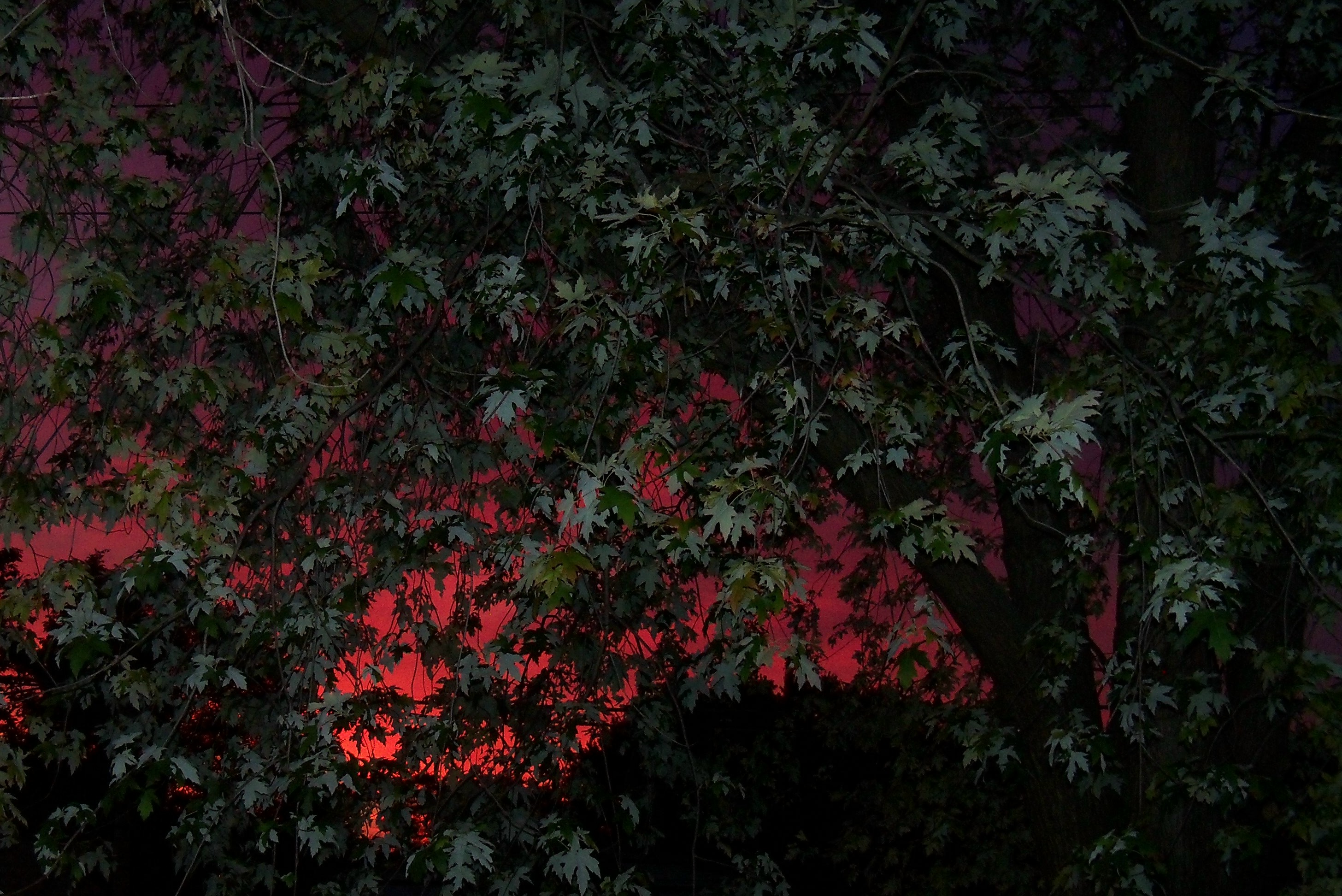
I’m not sure whether Milwaukee will be feeling the effects of Hurricane Isaac’s weather system soon or not. But sunrise this morning was VERY red. The sky looked almost like the glow of a wildfire out West, except there is nothing to our east but Lake Michigan. So if a storm arrives within the next day or so, I guess it won’t be a complete surprise.
A few minutes later the red glow had faded to a strange light pink. Normally sunrise is tinged the yellow-orange color seen at the lower left corner of the sky in the photo below.
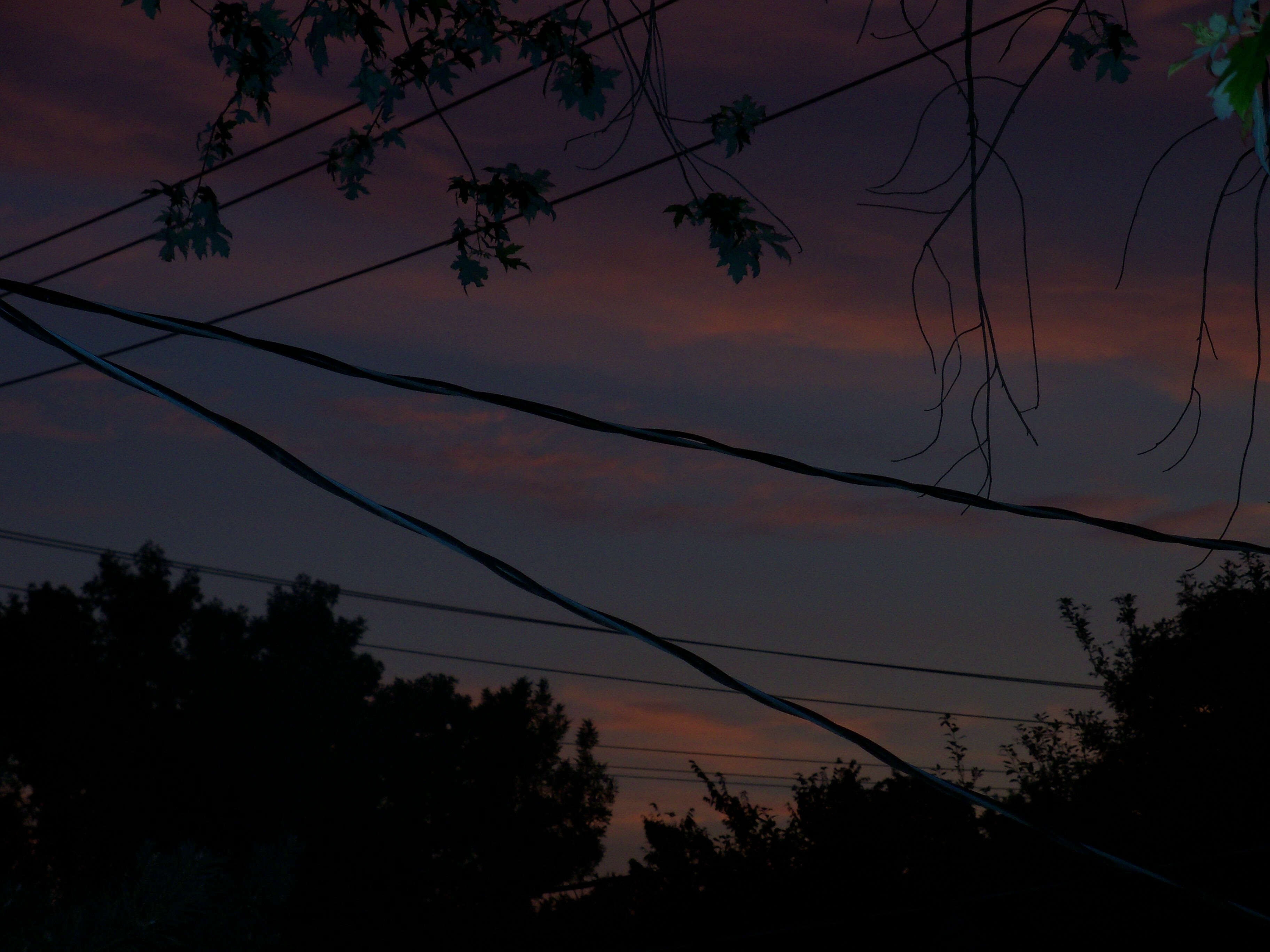
After taking the photo above, I faced north and slightly east to take another, just for fun, so I could get the contrast between the pinkish sky and swooping, criss-crossed black power lines.
There is a difference between “may” and “might.” I don’t think the distinction is taught in school, and because neither is the kind of word that would call attention to itself when used incorrectly in conversation, it’s not usually a recognizable grammar deficiency. However, I see the two confused in newspaper articles all the time. Because even most journalists don’t know the difference (see this New York Times “After Deadline” blog/column on the topic by Philip B. Corbett, the deputy news editor in charge of the newspaper’s style manual), perhaps “may”/“might” is a helpful topic to blog about today.
“May” and “might” are a special type of helping verb called a “modal.” “May” goes with present-tense verbs; “might” goes with past tense. Similar examples of past/present modal pairs include will/would, can/could, and shall/should.
If I read a newspaper article with a sentence like, “The toddler may have drowned,” I assume we don’t know yet if that’s what actually happened. The toddler is missing and was last seen near a body of water, so it’s possible he may have drowned. But if the story ends with a photo of the smiling toddler in his mother’s arms, I’m confused to discover not only that he is alive but also that everyone has known it all along.
The reporter should have written, “The toddler might have drowned, but an alert teenager saved him.” (Thank goodness! 🙂 )
Here’s a sentence with another scenario: “Rescue workers say the toddler, who slipped into the drainage ditch during yesterday’s storm, may still be alive if the sewer grate at Smith Road was intact.” The situation sounds hopeful. We need to check the status of that sewer grate. If it was intact at the time the child was swept away, then he may have survived and we’ll find him wandering nearby, frightened but okay.
But suppose the story does not have a happy ending? Suppose the child has already been found dead in a creek fed by that drainage ditch, and the missing sewer grate has been identified as contributing to the tragedy. In this case, using “may” instead of “might” not only conveys the wrong impression but, worse, also raises false hopes.
One word can make all the difference between accurate and inaccurate reporting.












 Katherine Wikoff